The What
Katherine Riley wrote a piece about replacing traditional legends with colored text in a title. She also introduced a new featrure in Flourish that would make each piece added as a legend in the title have the option to be used as a filter. I am a big fan of setting up a visualization this way when there are only 2-3 legend items, as it is reduces clutter and immediately resonates with the reader. I wanted to see the different ways interactive, filterable titles could be implemented in Tableau.
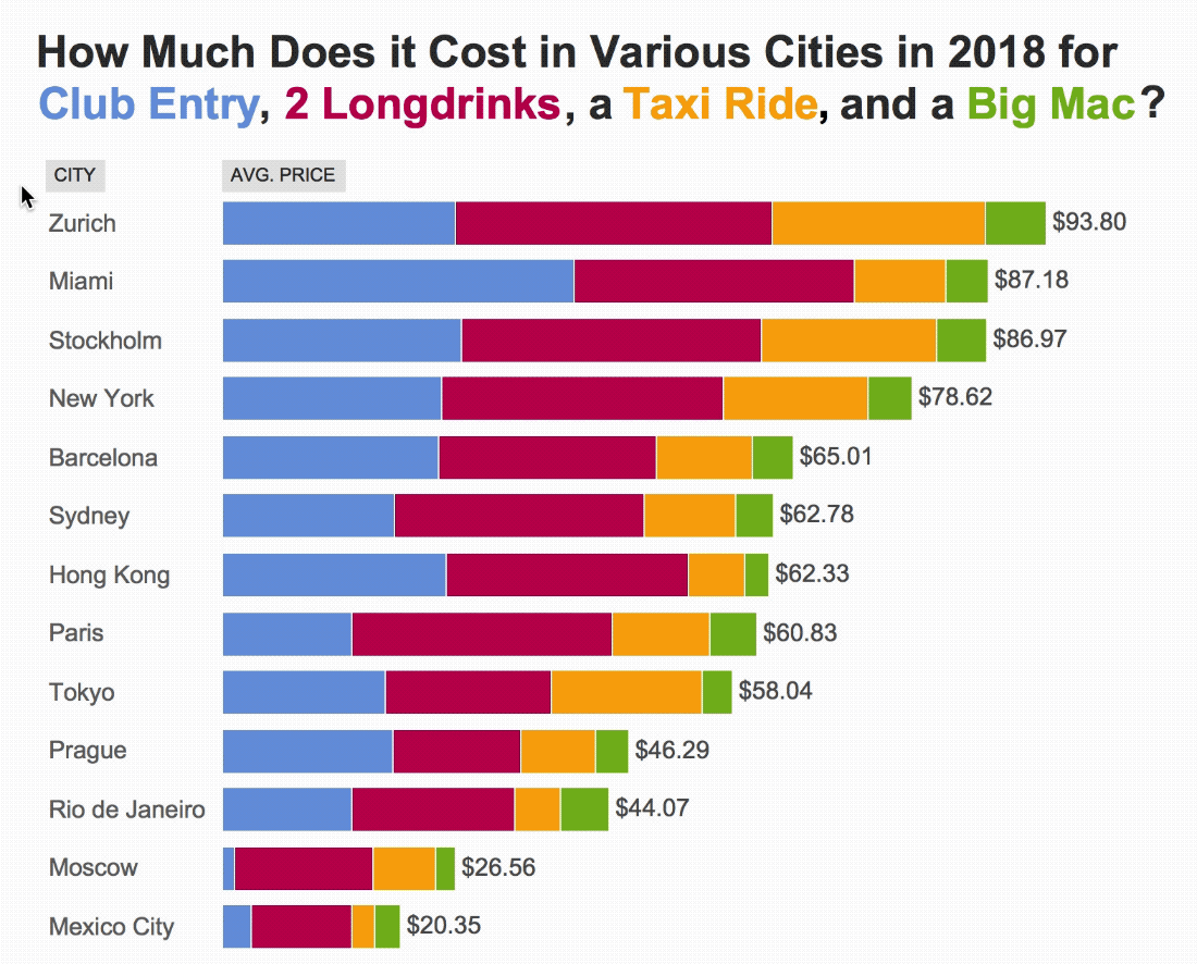
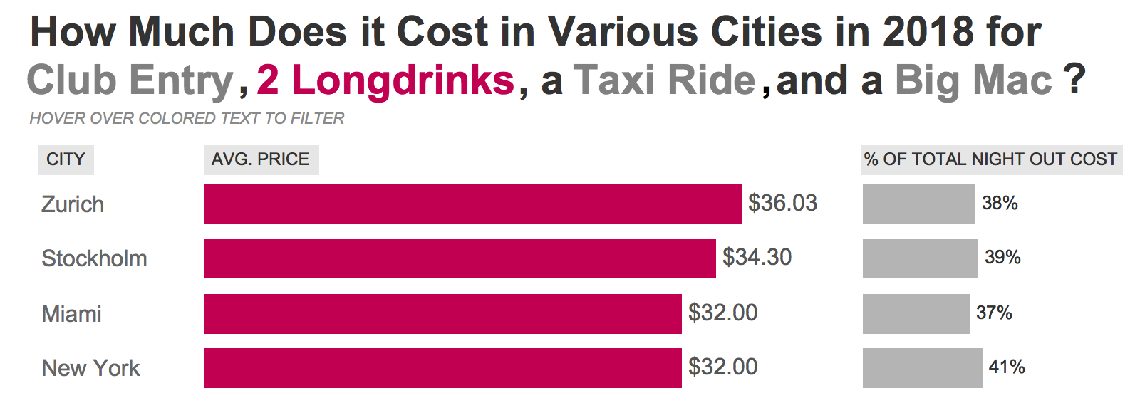
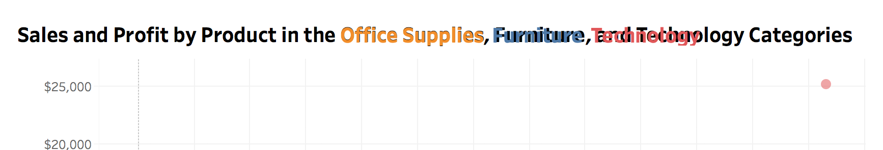
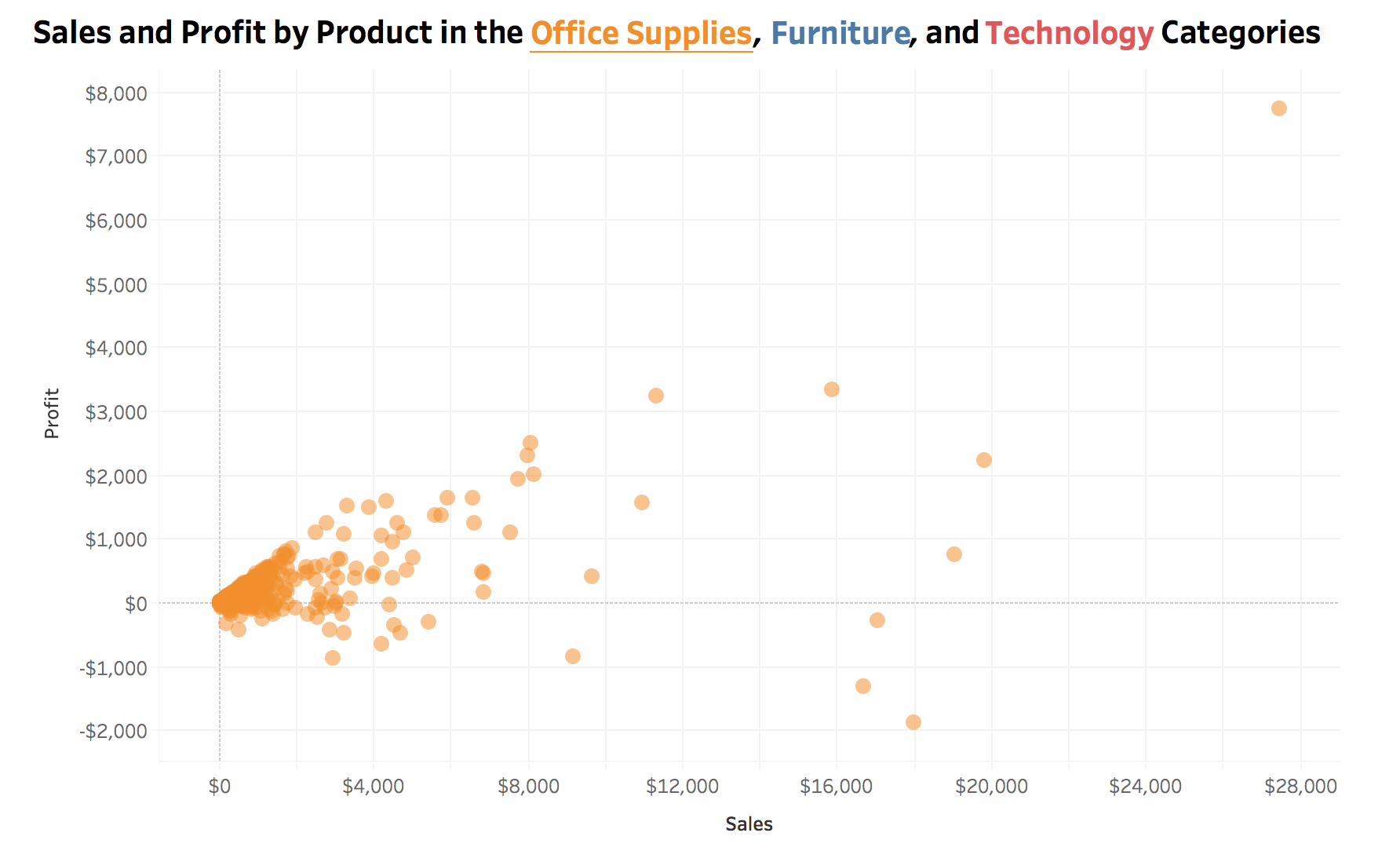
This week’s Makeover Monday (week 48 2018) provided the perfect data set to test out this methodology on. Here is my final result:
The Decisions
When creating my visualization there were a few things I had to think through when deciding how to set it up. If you desire to implement this type of interactivity, think through these different options when determining what the best end result is for you and your audience.
Filter Actions vs. Set Actions
The first decision to make is to use set actions or filter actions. Both action types will allow you to hover or select a value and change the corresponding chart. However, there is more flexibility with set actions.
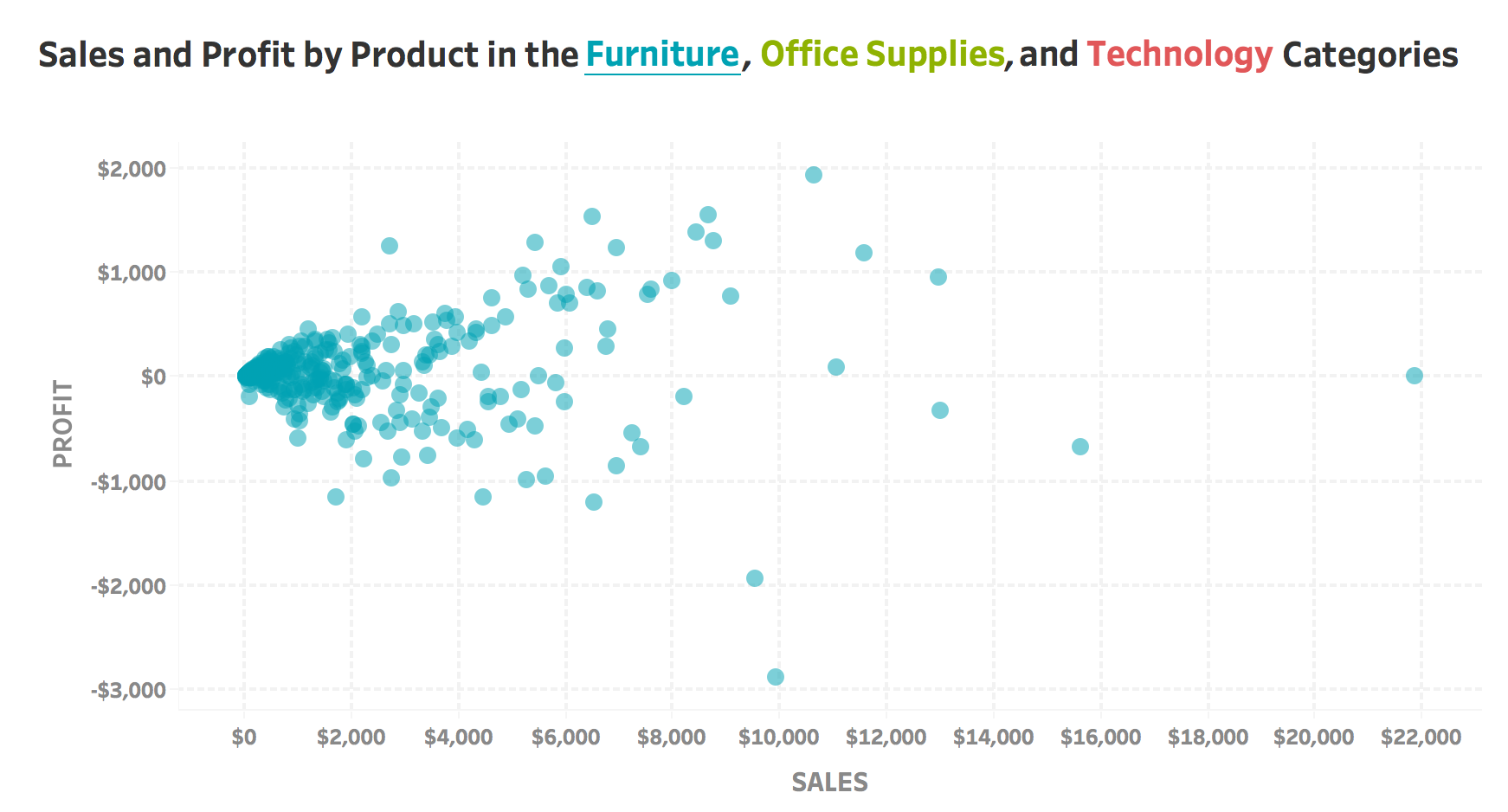
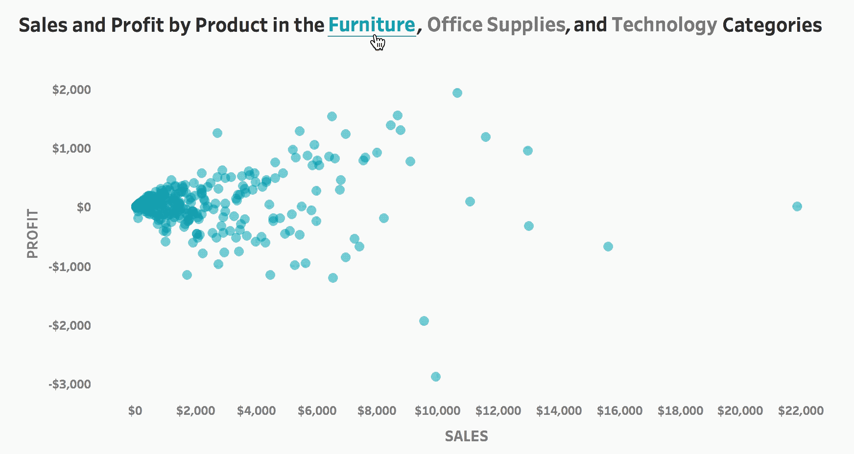
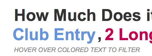
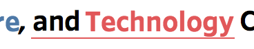
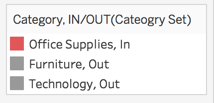
In this example using filter actions, my mouse is on top of the word furniture (Tableau underlines text when a chart with mark type of text is hovered over). The scatter plot below filters to only furniture points.
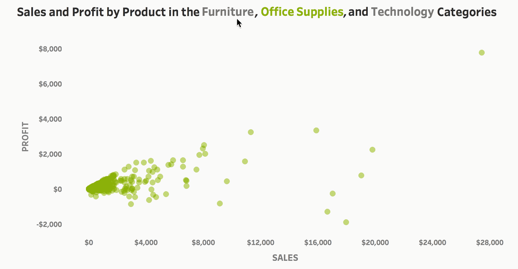
In the example below using set actions, my mouse is once again hovered over the word furniture. Upon hovering over a category, that value is added to the set. Then, I can take advantage of knowing which values are in the set and apply additional formatting, such as color to the title. In this example, office supplies and technology grey out, instead of remaining colored like above. 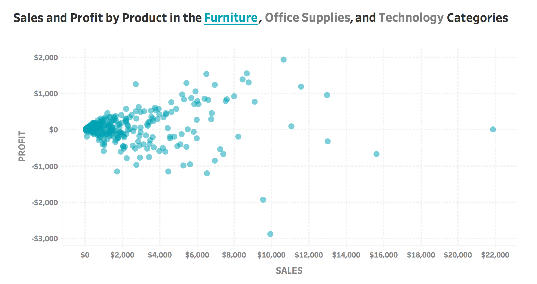
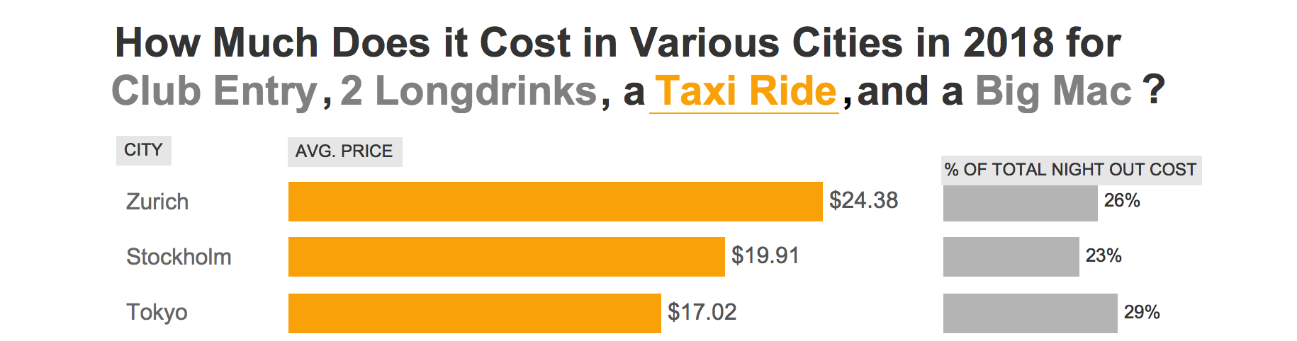
Set actions also allow for additional information added to your visualization. In my Makeover Monday example, I was able to add a % of total night out cost. This was easy to add because all I had to do was create a bar chart with my cost metric, add IN/OUT of the set to detail, change my cost metric to % of total, and hide the values out of the set.
Hover vs. Click (Select)
The second decision to make is to decide what action the user should take to filter the appropriate charts. Does it make more sense in your desired user experience to have the user click (select) which category to filter by or hover?
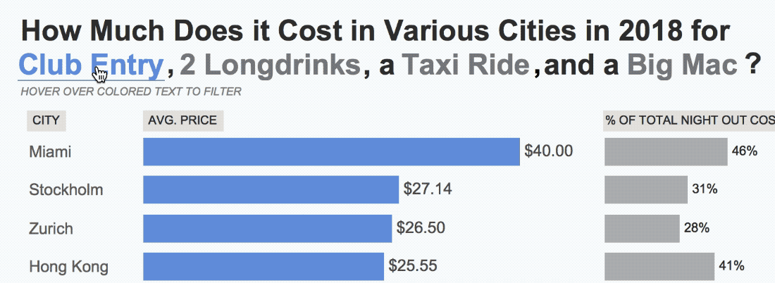
When the action is set to run on select, Tableau’s default “selected” mark formatting appears. In this instance that is the light blue highlighting of the selected category. The highlighted text helps make it clear that something is selected, but the color (which can’t be changed) can clash with the design of your visualization. To undo the selection, the user has to click on the category again. Additionally, the non-selected categories opacity is turned down upon clicking.

Hovering allows for the ability to quickly switch back and forth between different categories. However, hover actions are currently flickery on Tableau Public, which can lead to a less than ideal user experience. To see what I mean, look at my Makeover Monday example. It is set to hover and will flicker when switching back and forth (and occasionally get stuck).
Keep Values vs. Add All Values
The next decision is to decide what happens when the user unselects a category. This decision point really only matters if the action is run on hover as an action run on select should add all values (in most use cases). If a user hovers over “furniture” and filters the graph, what should happen when they move their mouse towards the graph?
One possibility is that the filter sticks on furniture (keeps values). This way, the user can dig into the visualization further (say, they wanted to look at the tooltips for specific products in the filtered view). However, this creates the problem of how do users get back to the overall view? The best options I’ve found are a) the user uses the undo button on the dashboard toolbar or b) add an additional set action on select that adds all values to the set.
The second possibility is the filter returns back to the overall view when an item is no longer hovered over. This option works well when labels are shown on the filtered view and the user can get all the information they need from looking and don’t need to further interact.
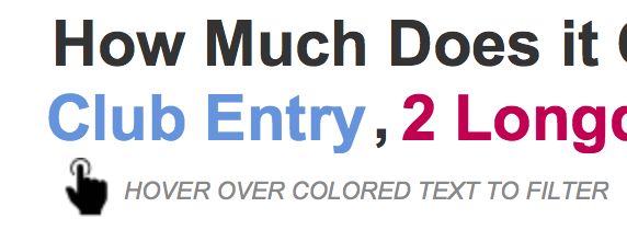
How does the user know to interact with the title?
Most people will not inherently realize the title is interactive upon looking at it and will need some type of cue.
The easiest is to add text below the title that says something along the lines of “hover over colored text to filter”.
A lot of people gloss over instruction text, so adding an icon next to the instructions may draw more attention
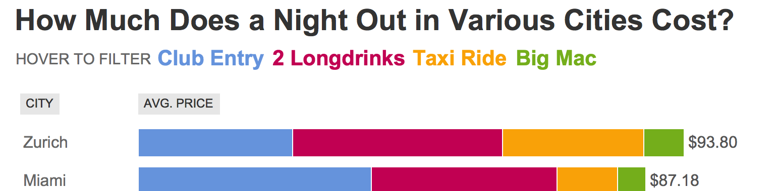
An additional option is to restructure the title/legend. This method allows for the items to not have to be intertwined with the verbiage of the title and instead displayed in the line below (while also making it easy to add filter instructions).
The How
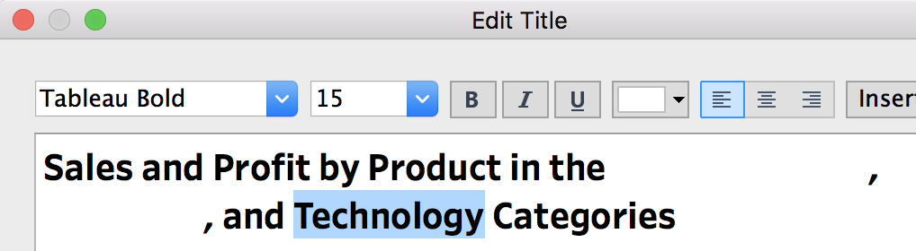
- Determine what the title of your visualization will be. I am going to call mine “Sales and Profit by Product in the Office Supplies, Furniture, and Technology Categories”.
- Create a new worksheet to use as the main visualization and add the title created in the previous step into the title of the worksheet.
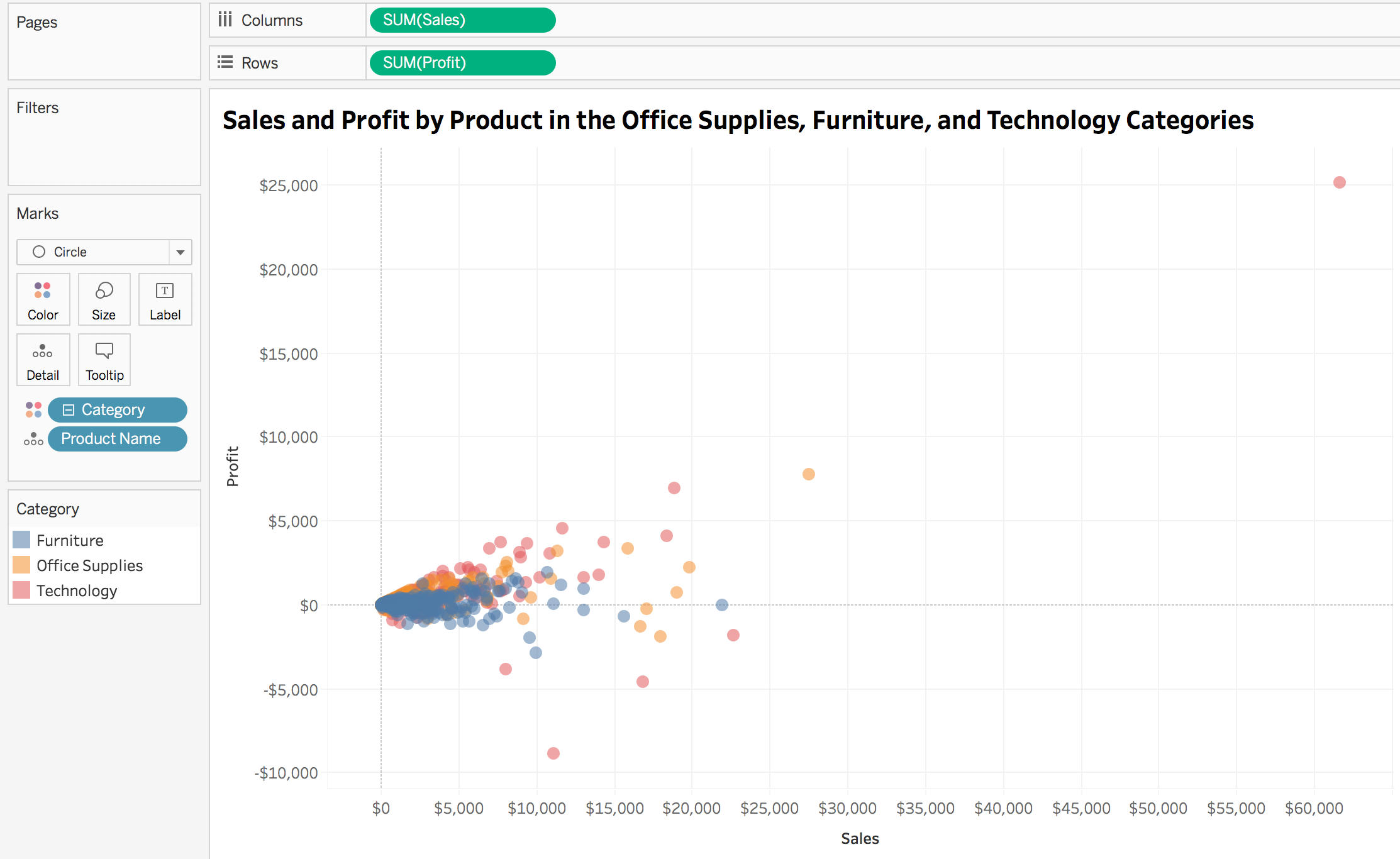
- Create a new worksheet called “Title: Filter”. This will act as what the user uses to filter the visualization created in the previous step
- Add the dimension used to filter to the text mark. Change the font size to match that of the title in the worksheet created in step 2

- Create a new dashboard and add both of the worksheets (with a fit of entire view).
- Change the background color of the Title:Filter worksheet to none and overlay it on top of the visualization
- Office supplies matches up pretty well with what’s underneath! However, furniture and technology are off due to the commas and “and”. Go to the title:filter worksheet and created a new calculation called “Spaces”
if [Category]="Office Supplies" then ""
ELSEIF [Category]="Furniture" then " "
ELSEIF [Category]="Technology" then " "
END
- Add the spaces calculation the text mark and place it in front of the category field
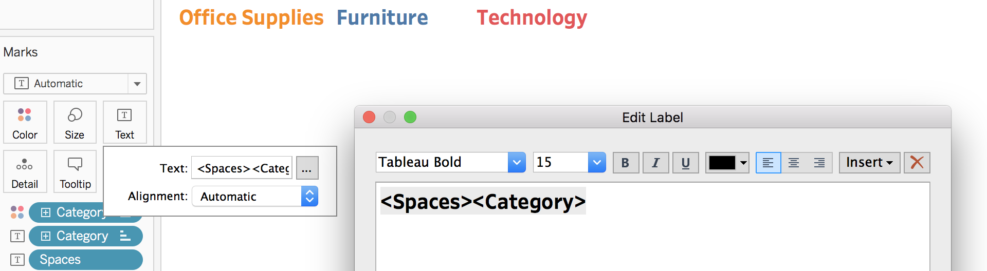
- Adjust how many “spaces” are in the calculation until the two worksheets align
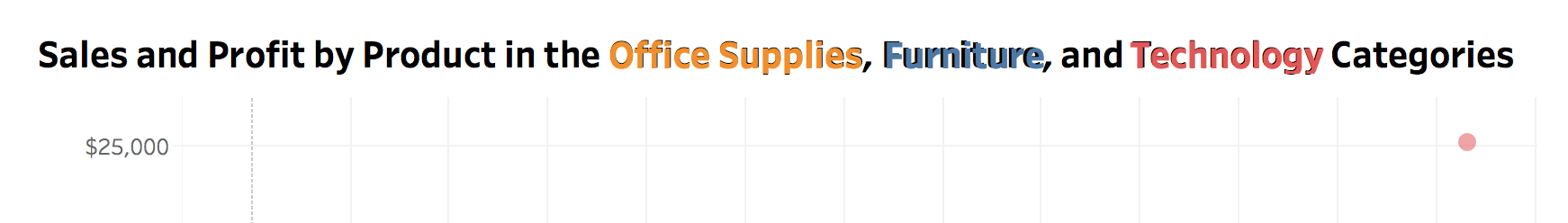
- Edit the title the visualization and change office supplies, furniture, and technology to a color of white
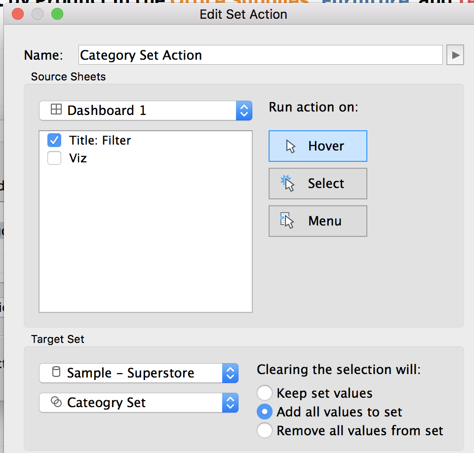
- Create a new set based on category. To do this, right click on category in the dimension shelf and select create > set. Name the set “Category Set” and select all values
- On the dashboard, add a new set action (or filter action if prefer that route). This can be done by going to worksheet > actions > add action > change set values. Run the action on hover (or select), with clearing the selection adding all values to the set (or keeping, depending on your preference). Only run the action on the title: filter worksheet.
- On the visualization worksheet, add category set to the filters shelf
- Now, on the dashboard, hovering over a category will filter the worksheet
- To get rid of the pink underline appearing under “and”, add a new textbook with the word “and” with a white background and place on top.
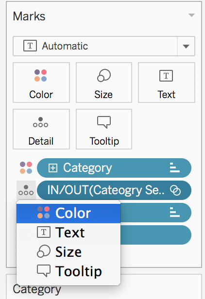
- To grey out the non-selected categories, add “category set” to detail on the title: filter worksheet. Then change the mark to color
- Update the color legend accordingly. You may need to change the dashboard action to “keep values” to allow for you to easily change the colors
All done! To view or download my Makeover Monday example using this methodology, click here.