An Accounting Major Goes to a SEO Interview & Lands an Analytics Internship
My journey to a career in data visualization began in April of 2014, when I, an accounting major, begrudgingly went to an interview for a SEO summer internship. I was a sophomore in college and too young to land an accounting internship. So, I thought, why not apply for an internship at a marketing agency? I had studied web design and development for two hours a day for three straight years in high school and spent my freshman year of college as a graphic designer for the fitness department. I loved being creative, but ruled out a career in web/graphic design because I wanted a job that would make a greater impact (how many college students really read the posters I had created on the dorm room walls? And why didn’t I get to be involved in the strategy behind what information was going to be displayed?). So, I switched my major to accounting with the idea I could use my mad number skills to fight crime. I loved the thrill of problem solving and working with numbers. However, I decided I wanted to experience the agency vibe before committing to a life of debits and credits (and no creativity).
The interview started with two men introducing themselves. “We run the analytics implementation team,” they said “and we write code to collect data related to what people are doing on websites.” I was intrigued, albeit confused as to why we weren’t talking about SEO (thanks HR for the bad info!). I had no idea what analytics was or that troves of data existed relating to online behavior. Nonetheless, I blindly accepted the internship.
About a month into the internship I was asked to look into this thing called Tableau. As an intern, I was excited by any opportunity that came about that allowed me to do actual work instead of trying to pretend to be busy. The other tools documentation I had been reading, such as Adobe Analytics, was dry, scattered, and overall unhelpful to a newbie. I was pleasantly surprised when I went to Tableau’s website and found a repository of getting started videos. I spent the next few weeks watching, following along, and learning as much as I could. I was then tasked with determining if Tableau was a right fit for the analytics department, including creating a dashboard in Tableau Public (since we hadn’t purchased any licenses yet). In order to prove Tableau was the right tool, I also had to (attempt to) build dashboards in JavaScript based tools, such as Google Charts.
It was a task I was excited for, but I had no idea how to report information in a useful way or even what information the audience was looking for. A few of my colleagues had heard of Ryan Sleeper and recommended I check out his blog. After reading Ryan’s posts, that talked about the technical pieces required to implement a solution but also the user experience and design elements that make a visualization successful, I became obsessed with learning as much as I could about data visualization. I had finally found a field that combined the three things I was interested in: design (and creativity), development (and problem solving), and decisions (people could use my work to make an impact). I no longer had to silo myself into one track. As soon as I went back to school in the fall, I switched my major to Information Systems and never looked back (metaphorically speaking).
A Look Back at My First Year of Visualizations
A lot of the dashboards I created in my first year of discovering data visualization were on Tableau Public and using fake data… so I still have a lot of them to look back and reflect on. I even have some of the visualizations I created using various JavaScript charting tools and Photoshop. I enjoy looking back and seeing how far I have come, both in terms of technical and design skills. Improving my design skills, led me to challenge myself in terms of what I could execute. Improving my technical skills, opened my mind to new ways of creating experiences. I also want this to serve as inspiration for those who are just starting their journey, that with practice, dedication, and time, you too will be able to look back four years later and see how much tremendous progress you have made.
June 2014
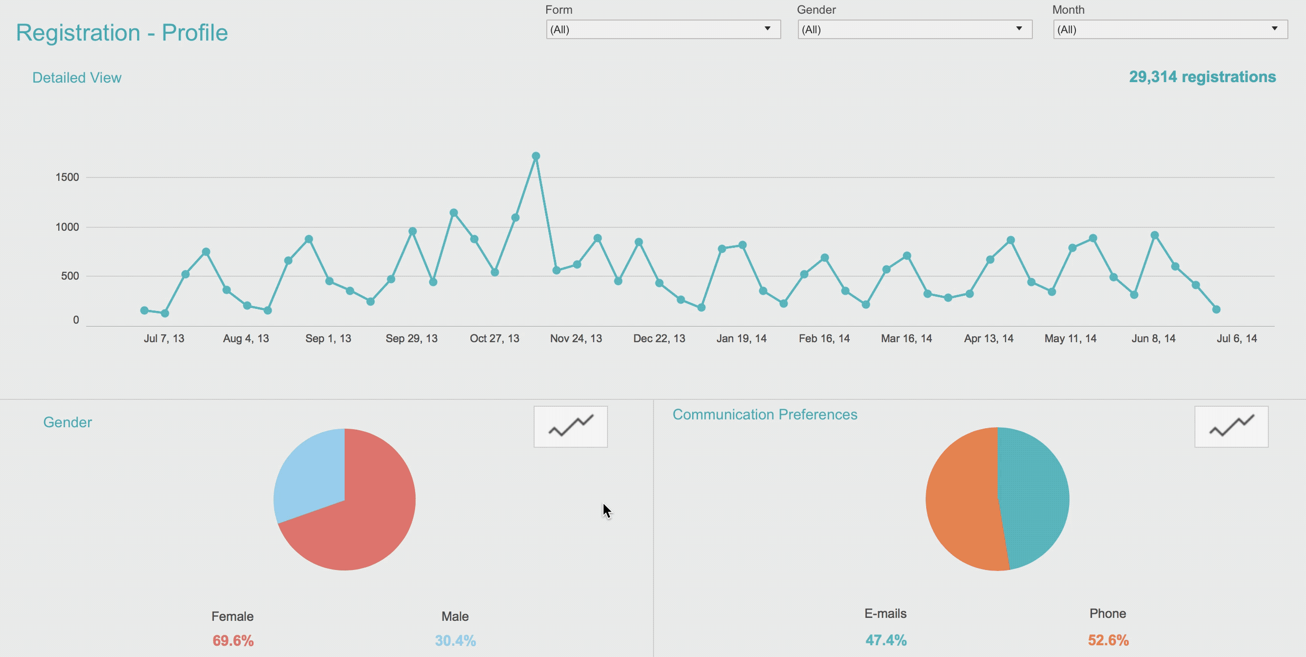
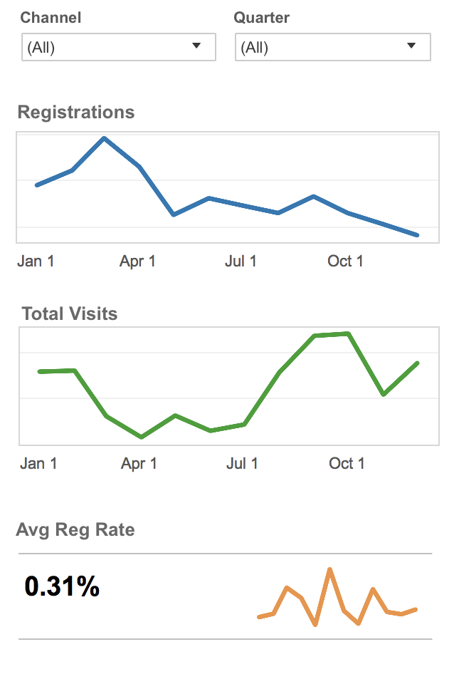 My First Dashboard!
Tool: Tableau Public
Purpose: Create a dashboard that would allow the audience to understand traffic and registrations to a specific website… all from their phone!
Commentary: I was a little embarrassed to include this dashboard, using default colors and lines, at first. However, this was truly the first thing I ever built in Tableau. I realized that while this may not be the most sophisticated or pretty dashboard, it is still very functional. The audience of this dashboard was use to seeing clunky Excel reports, so giving them access to information (on their phone) was still a big first step!
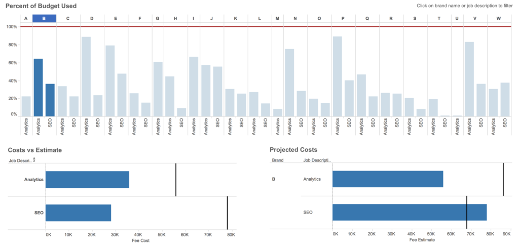
Estimate vs. Actuals
Tool: Tableau Public
Purpose: Create a dashboard that would monitor costs verses projected estimates, broken down by brand (A-W) and department (analytics vs SEO).
Commentary: Dashboard actions! Allowing the user to drill down into specific brands helped showcase the power of Tableau and began to open my mind to all the possibilities Tableau offered. If I were to build this now, I would use color to indicate which projects were at risk of going over the estimate. I would also use BAN’s to allow for a high level overview of percent of budget used.
July 2014
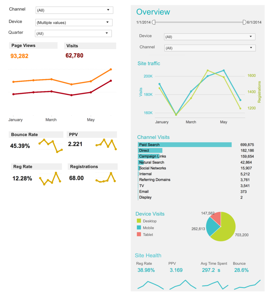
Mobile Dashboards
Tool: Tableau Public
Purpose: Create a dashboard that would allow the audience to understand traffic and registrations to a specific website… all from their phone! However, this time, include more information visually.
Commentary: The information is much cleaner (and prettier) than my first attempt a month earlier. Seeing a pie chart does make me cringe a bit, but at least it’s only three slices.
August 2014
Registration Demographics
Tool: Tableau Public
Purpose: Build a dashboard that allowed the user to understand who was registering on their website and be able to drill down into specific demographic groupings
Commentary: I had seen on another tool demo, the ability to click on an icon next to a breakdown (such as gender) and be able to see the trend over time broken down by that dimension. So, I wanted to give that a go in Tableau. It definitely wasn’t very pretty (lots of actions + separate worksheets for each breakout), but this was the first time I began thinking through how to deliver a quality user experience.
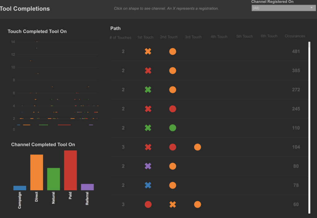
December 2014
Website User Behavior
Tool: Tableau Public (top), Google Charts (bottom)
Purpose: Visually display visit(s) to a website, as well as users’ behavior. Example: You go to a website from a link on Twitter, then return the next day using Google. That would show up as Social>Natural Search in the data. And if you registered on the second visit, that would show up as Social>Natural Search*
Commentary: This was the first assignment I was given that required me to SERIOUSLY think about data visualization. My initial idea was to just use symbols and colors to map out every single path. I quickly learned this feature could be helpful for certain users who want to dive deep, but most people are going to want a summarized view. I attempted to do that on the left. However, I was unable at the time to figure out to make the “Touch Completed Tool On” aggregated and so it shows a mark for every single path (for which there are a lot)… yikes! However, I like to think this was because of my Tableau skills and not that I thought that view would be helpful. This prompted me to attempt to recreate the entire dashboard using Raphael.js + Google Charts. Access to loops made it much easier (and less code) to spit out the path visuals and to aggregate in new ways. Plus, at this point I updated the icons to represent something meaningful to the user (instead of an X to show registration, it was a common icon used for registration). This is one of those datasets that I could make ten more iterations on and continue to find new ways to bring light to the actionable insights.
April 2015
Google Charts
Tool: Google Charts
Purpose: So you built these cool dashboards in Tableau….. do we actually NEED to pay for Tableau? Can we just recreate them in free JavaScript charting tools?
Commentary: I love a good problem to solve and there is nothing more satisfying than getting your code to run exactly how you want it to. However, this dashboard took me WEEKS to figure out and build. This was partly due to my skill level, but I knew I could have created this in Tableau in a day. This was a good exercise for Tableau’s worth… and with how rapidly changing requirements and requests are, this method was not going to be the best way to satisfy users (at least if they had me building them)
May 2015
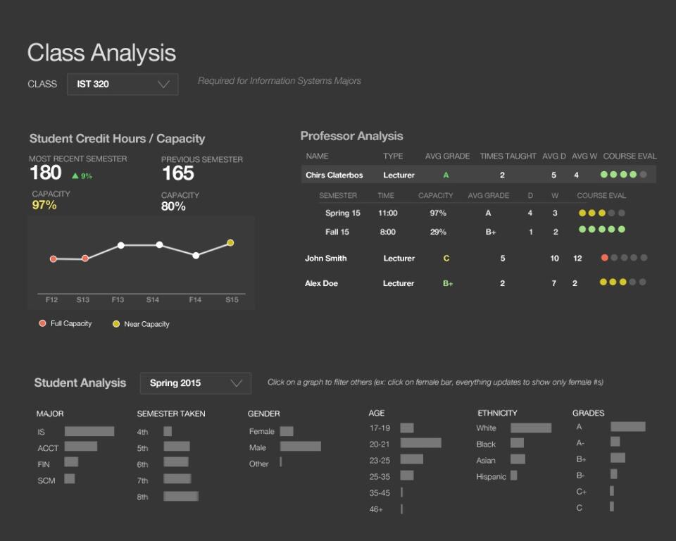
Class Analysis
Tool: Photoshop
Purpose: Build a mockup of a dashboard that a university could use to analyze class performance and the variances between semesters (student makeup + professor).
Commentary: I still love the way this dashboard looks and how much information it packs in. The only thing I would change today would be the red/green/yellow color palette and ensure the same colors aren’t used for both capacity and course evaluation. I also don’t know if it would be possible to make a table look this way in Tableau … but I really like this drill down view.
To see my visualizations from 2016 onwards, check out my Tableau Public.