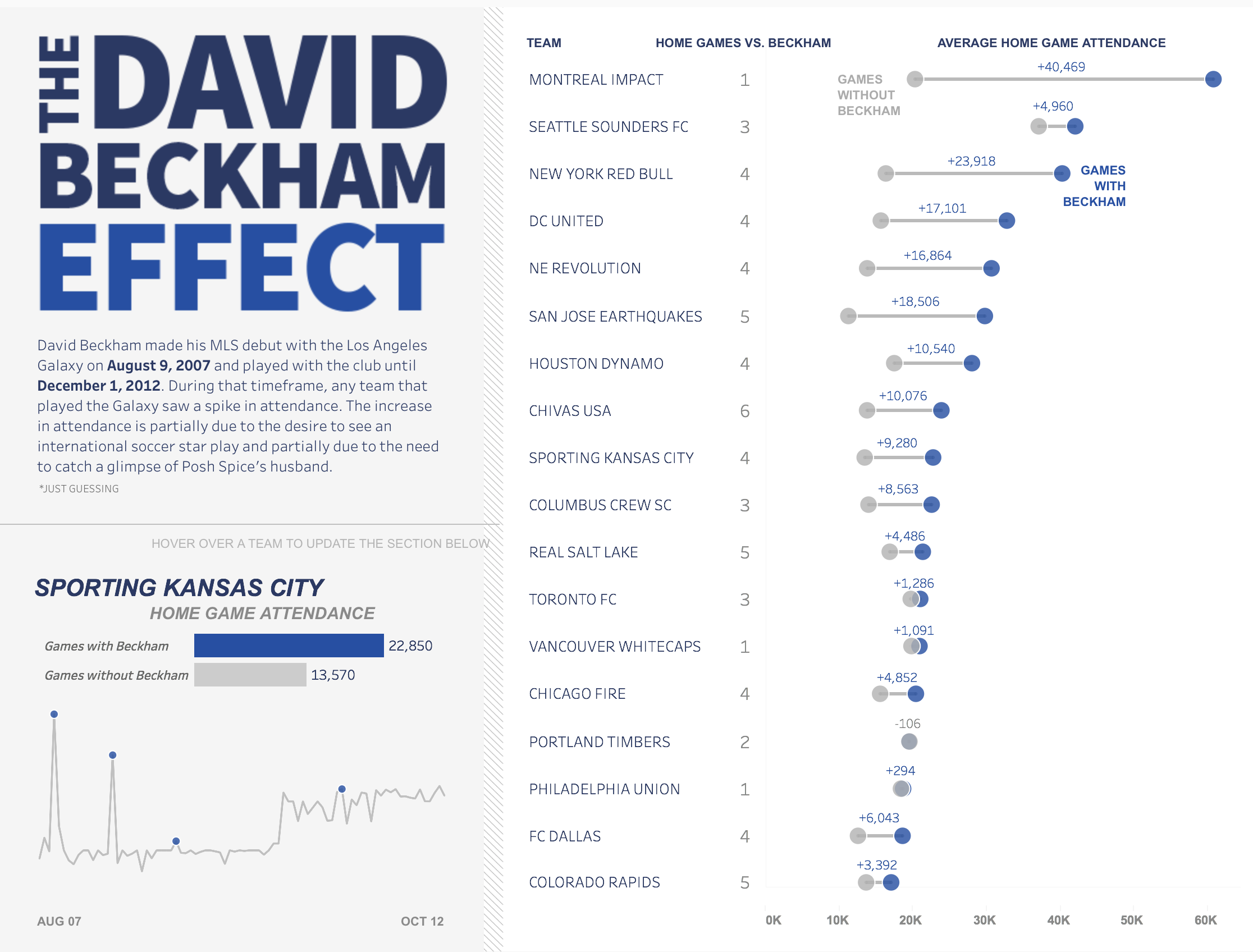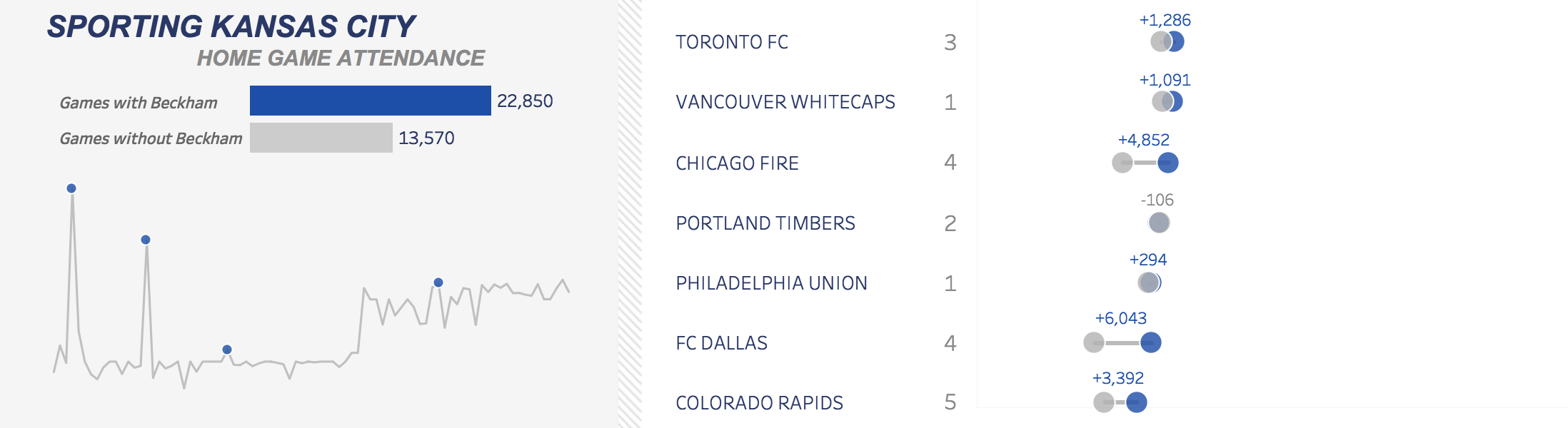
The November #SportsVizSunday challenge involved looking at MLS data, including attendance from 1996-2018. My initial thought was to create a visualization around my home team, Sporting Kansas City. I distinctly remember soccer being of very little relevance, the Wizards rebranding to SKC and getting a new stadium, and then soccer taking off in popularity around the KC area. So, I wanted to see if the data told a similar story. I started plotting attendance for all SKC home games and wound up with something like this:
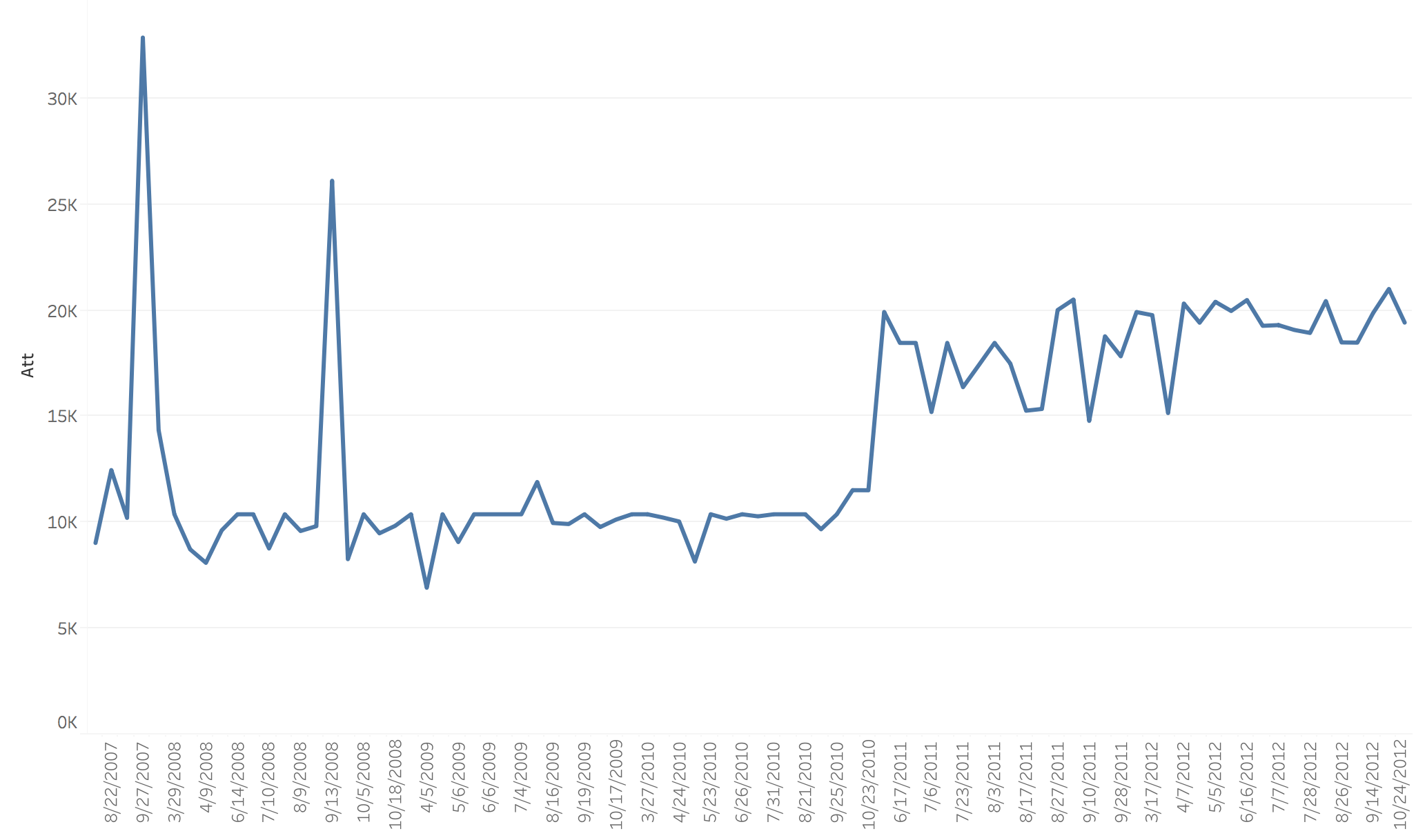
My initial reaction was what in the world happened for those two huge increases?! I looked at who the opponent was and as soon as I saw it was LA Galaxy, I immediately knew why: David Beckham. I then became curious…. did every team see a huge spike in attendance when the LA Galaxy came to town?
My first iteration looked like this. I tried to use the LA Galaxy colors and use a big dividing stripe to break up the two different sections. Sports graphics on TV have a certain aesthetic to them I wanted to mimim, but there was something that didn’t feel quite right.
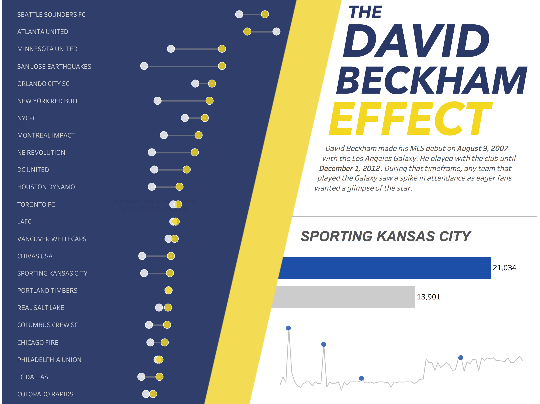
I ultimately ended up scrapping the layout and colors in favor of a more simpler design, which can be viewed on Tableau Public here: