Categories
d3.js svelte

How do we compare?

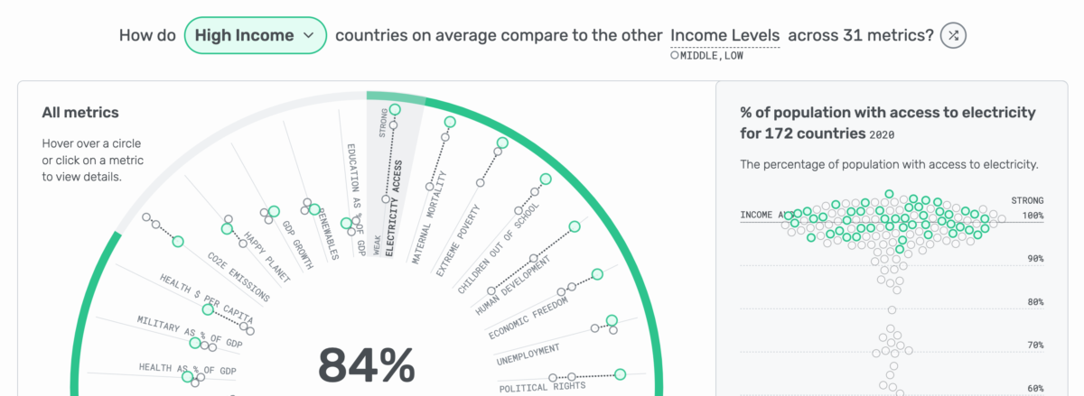
This interactive dashboard encourages users to focus on one area – a country, region, or income level – and see how it compares to its counterparts across a wide range of metrics. It provides multiple ways to interact and explore – the user can search for a country of interest, use the shuffle button to randomly select a focus, or change the selection via tooltips. For best experience, view on a large screen. Recognition: Winner of the World Data Viz Prize

Categories
d3.js

The Inside Scoop of Ben & Jerry’s

As two frequent ice cream consumers in different countries, with different preferences, we were curious to know more about our favorite ice cream brand, Ben & Jerry’s. We wanted to know how our options in the U.S. and U.K. differed and what we were missing out on by only buying our favorite flavors. To answer these questions we collected the necessary data, including consuming 35 pints of ice cream ourselves. This light hearted visualization will have you screaming for ice cream! Recognition: The Pudding Cup

Categories
d3.js

How Russia’s invasion transformed one Ukrainian city

Vox and Polygraph created the story and design. They engaged Hesham Eissa and me as collaborators to consult on the story as well as develop it from start to finish. From the piece: “[we] traced a route through Kharkiv, parts of which were heavily bombarded. It was an effort to document the before and after, not just of the physical space, but of how war has — and hasn’t — transformed these places and the people tied to them”

Categories
d3.js svelte

Kelce Comebacks

On the New Heights Podcast, Jason Kelce said “We just had our first double-digit comeback win in the 4th quarter in my entire career” to which his brother, Travis Kelce, said “Shut up that is not a real stat”. This visualization analyzes all of the fourth quarter comebacks throughout both of their careers and determines if it is a real stat. Recognition: Jason Kelce said “This is well done Lindsey, and I must say, much more thorough research to reveal the actual numbers. Very nice!”

Categories
d3.js svelte

The Big Five Oscar Nominations

Dive into the history of the Big Five Oscar awards – Best Picture, Best Director, Best Screenplay, Best Actor, & Best Actress – and see the most frequent combinations.

Categories
d3.js three.js

Travel Restrictions Today

It has become a challenge to keep track of the rapidly evolving international response to COVID-19, especially when it comes to travel restrictions and the daily changing regulations. This interactive app is designed to make it easier to visualize who is in lockdown, who has closed borders, which countries have outbound travel bans, recent travel related news, and more!

Categories
Blog d3.js

How to Learn D3.js with No Coding Experience

Categories
d3.js

Running in Color

Running shoes are available in almost every color and shade, from light blue to neon yellow to dark red (and everything in between). However, this doesn’t necessarily mean every color is available to both women and men. But how different are they? To find out, we analyzed the running shoes available on RunRepeat in the US.

Categories
Tableau

Oscar Watch

Which movie will take home the Oscar at the 2019 Academy Awards for Best Picture? This visualization explores how the eight movies nominated for Best Picture have performed so far in awards season, in the box office, and with fans/critics.

Categories
Tableau

Kansas City is Mahomes Town

Patrick Mahomes, the 23 year old quarterback for the Kansas City Chiefs, has thrown 29 touchdown passes in the first nine games of the NFL season. The Kansas City franchise record for touchdown passes in a season is 31, set by Len Dawson 54 years ago. The NFL record for touchdown passes in a season is 55, set by Peyton Manning in 2013. Use this visualization to look at every touchdown pass thrown by Mahomes, including the yardage and receiver.