If I were to give an acceptance speech, à la Tony’s, for winning the second Iron Viz feeder of 2019, it would go something like this:
I was not expecting to win, the creativity and quality of the other entries was astounding. IronViz showcases the best work the data visualization community has to offer and it is an honor to be chosen as the feeder winner. I never thought the community would be interested in my viz, or how I created it, and mostly documented my progress by taking a picture of my computer screen with my phone.
Second, I’d like to thank the 2019 Broadway revival of Oklahoma! for being my inspiration to enter. Every idea I had along the way was fueled by my obsession and knowledge of the show. I probably sang “make up your mind LaurieLindsey” to myself 1000 times when I couldn’t make a decision.
Last, I’d like to thank Central Park for being the grounds on which I wandered whenever I needed to step away from my computer or think through an idea.
I will leave you with one closing remark. It took me four years to have the courage to enter Iron Viz. I got over my fear of what the small chance of winning could mean by following an idea I had. I learned so much about my Broadway passion pursuing the viz and it is one of my favorite visualizations I have ever created. Don’t wait, enter now.
Initial Idea
The only reason I entered Iron Viz was because I had an idea. At the time the music theme was announced, I had seen the new Broadway revival of Oklahoma! four times. The show was 2.5 hours long but the recently released cast recording was a mere 58 minutes due to reprises and dialogue not being included. Hamilton on the other hand was completely sung through, and recorded, as evidenced by the 2 hour and 22 minute soundtrack. This would make a great viz I thought…. now how do I get the data?
I have never been a person who enjoys finding data and any required collection or cleaning is usually enough for me to stop pursing an idea altogether. However, I saw that Skyler Johnson posted on his GitHub examples of how to pull data using Python & the Spotify API. I lasted about 5 minutes of trying to install Python on my computer before I turned to using an online Python IDE. However, it worked like a charm!
Once I saw what metrics the Spotify API showed for each track – valence, energy, danceability, speechiness, etc., I immediately began exploring those. I quickly forgot about record length and moved on to comparing the different metrics for the new edgy Oklahoma! revival verse older more traditional versions of the show.
However, I quickly realized it was more interesting focusing on what made a Broadway cast recording unique compared to other music albums – the songs are placed together to tell a story and take the listener on a journey. I experimented with the different metrics.
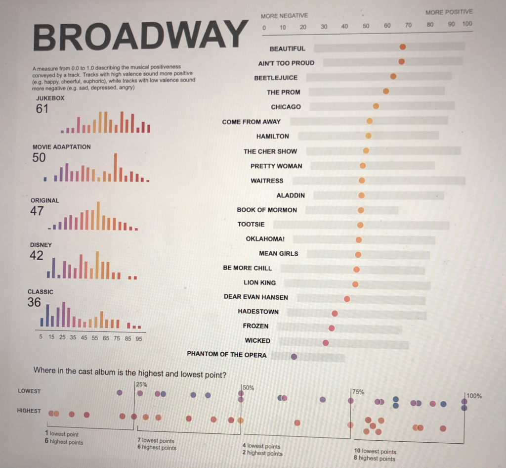
I found that valence (a measure from 0.0 to 1.0 describing the musical positiveness conveyed by a track) was the metric that most closely matched my experience with each song in the album and the show as a whole. Oklahoma! starts out happy and upbeat and slowly gets darker and darker. Then, a spike occurs – right after intermission, with the show ending on a high note. I was so inspired by this realization, that I tweeted it out:
Still have a *long* way to go, but this is the closest I’ve ever come to having an idea AND supporting data for #IronViz ? pic.twitter.com/p3Mgy1hk1k— Lindsey Poulter (@datavizlinds) July 13, 2019
Before I went all in on this idea, I wanted to see if other musicals told a similar story. Did they all follow the same pattern? Were they all different? The next show I looked at was Beetlejuice:
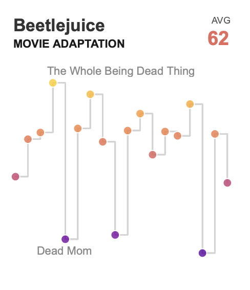
This was a completely different pattern than Oklahoma! Instead of working towards a low point, it consistently went from a high point to a low point back to a high point. I was hooked as I looked at each show’s recording and the patterns.
However, I knew that the ‘audience’ (aka the Twitter community and Iron Viz judges) was not going to be people who had seen almost all the currently running musicals like I had, so I needed to find a way to still make it intriguiging. Additionally, would anyone enjoy going musical by musical, track by track, looking at the patterns? But, as with most things I build for fun, it was mostly for my personal enjoyment, so I didn’t let that sway me in any way. I did, however, think about two things at this moment:
First, how would I show all the musicals? Was it more interesting to show one trend at a time and have the user select which show they want to look at? Or was it easier to see the patterns with small multiples? I will admit that generally I go for a more interactive approach, to allow the user to select what they are interested in, and to save space. In a previous viz I built, I used a parameter to allow the user to choose a ranking, but then overlaid an animated gif to show the change/differences.
I decided to do a small multiples, to switch it up, and because I thought it would tell the story better to see the trends side by side. Do all musicals follow the same pattern? Is it easy to pick out intermission in all of them? Is there a clear climax and happy resolution? Showing all musicals was also a way to make the visualization more inviting, as users unfamiliar with musicals wouldn’t have to choose something they have never heard of and could instead get a better understanding of Broadway collectively. I admittedly was probably influenced by the general ‘long form’ feeder trend when making this decision too.
The second thing I knew was that my small multiples was going to be the very end of my viz. That much detail was too much information to jump into right away. I needed to set the stage for what valence was and provide high level, introductory information about the valence of each musical. I take the same approach on the majority of visualizations I build, whether that be for fun or in a business setting: use the top to establish the main metrics and information necessary to understand the visualization, use the middle to add some context to the main metrics, and use the end to show detail about the main metrics. I like to follow this format because it allows the reader to stop at any point and still have information to take away.
Creating the Introduction
I start a dashboard by creating all the visualizations and getting a rough idea of the layout. Then, I do supporting information (such as titles, legends, annotations, and descriptions), formatting, and final design touches.
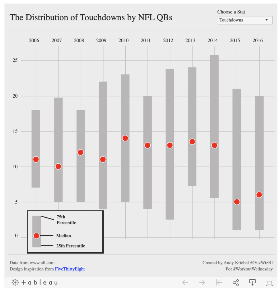
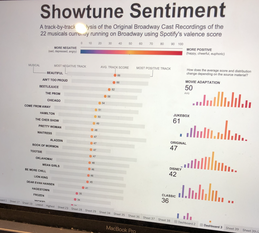
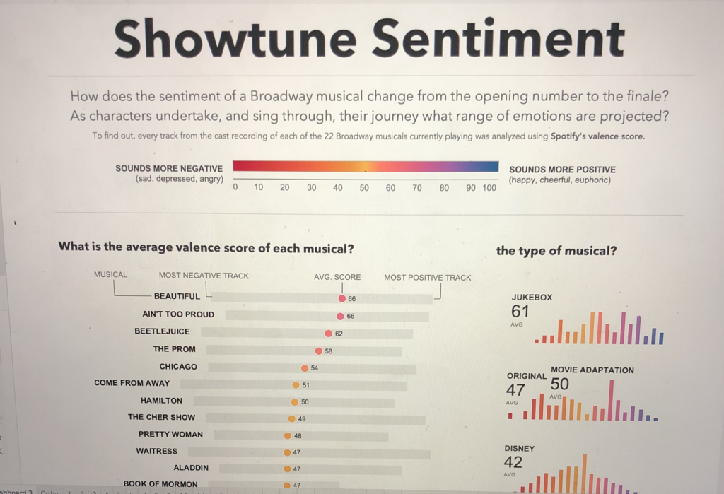
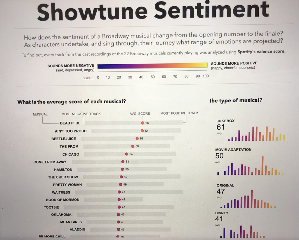
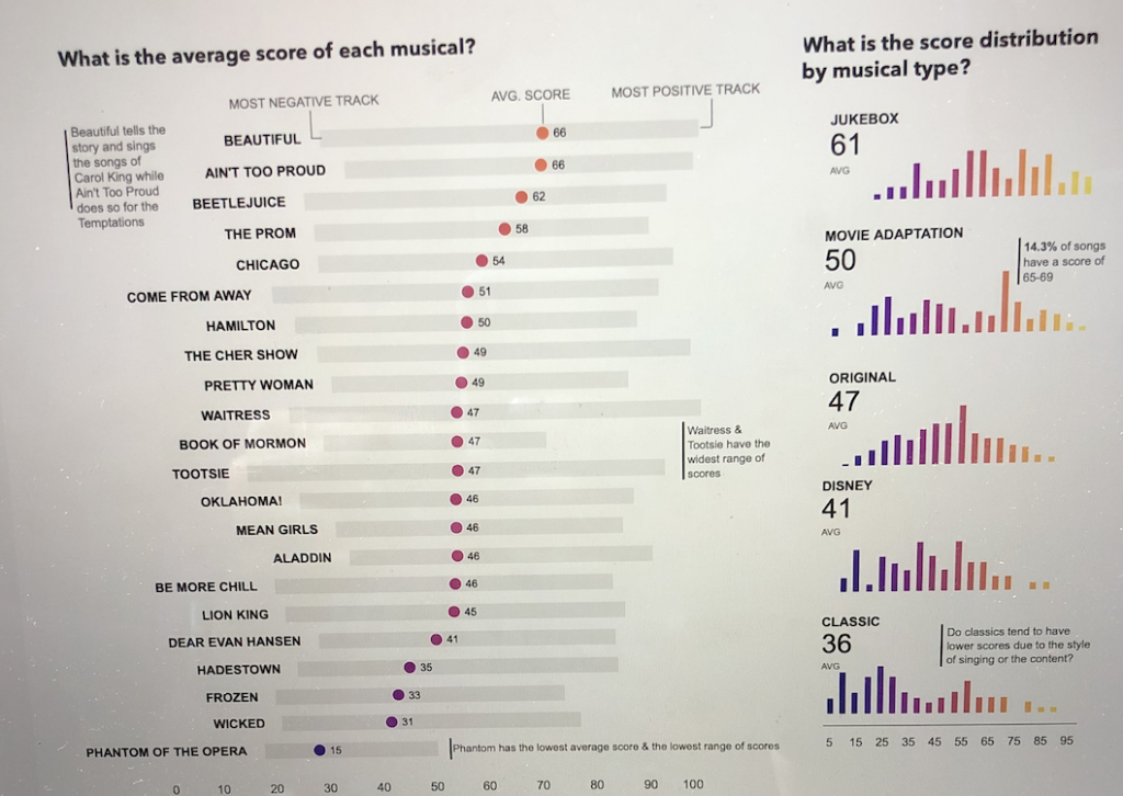
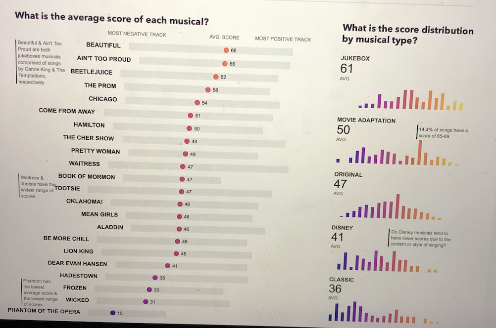
I knew right away that I wanted to show the average valence for each musical. I (somehow) remembered this Workout Wednesday from 2017 and really liked the look of a circle with a bar. I also thought it would add value to be able to see the range of scores. Does a show have a wide range of songs? Or, is there some homogeny in the album as a whole?
I tried it out and was happy with the insights I could get out of it right away. Book of Mormon, Waitress, and Tootsie had a very similar average valence, but such different ranges! Phantom of the Opera was a definite outlier. I turned on the labels to see which show was which and was really happy with how the labels look. Normally, I left align everything, but I liked the way the text served as another visual indicator of where the lowest scoring song in each musical was. It’s especially striking to notice the cut in beginning with Tootsie and ending with Aladdin.
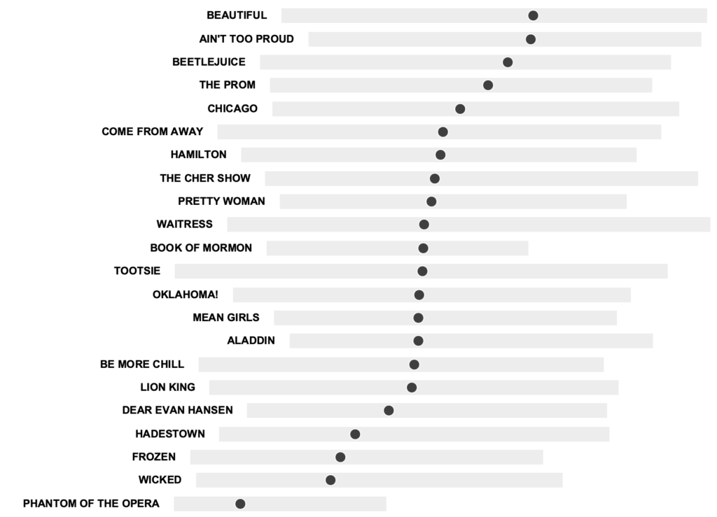
I then noticed that Beautiful and Ain’t Too Proud were the two shows with the highest average valence. Both of these shows are considered Jukebox Musicals, shows where the songs are well-known popular songs. Beautiful is all Carole King songs while Ain’t Too Proud is all The Temptations songs. I also assumed the Disney shows (Frozen, Lion King, Aladdin), geared generally for younger kids, would sound more positive, so it surprised me when that wasn’t the case.
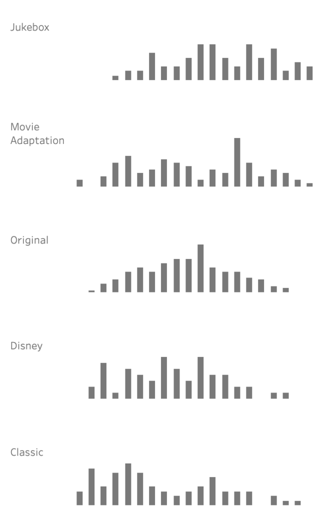
This led me to the creation of my next section as I wondered how does the valence vary by “type” of musical (a classification I kind of made up myself). I wanted to see the same things as before, the average and a distribution. I decided to bin the valence values and see what type of trend I could create. Lo and behold, I liked the story this told.
At this point, I was feeling REALLY lucky. My obsession with Broadway was paying off and I was creating charts with ease. I felt like I needed one more component to add. Some type of ‘middle section’ that provided more context before jumping into the small multiples.
Creating the Middle
This is definitely the section I struggled with the most. I created a note on my phone and throughout the day – or walks – I would make notes of things to explore. It included:
- Does one character have all the songs with a low valence?
- What’s the difference between the opening number and the average?
- Is the lowest point a solo?
- How does the valence change by the # of people listed on the track?
- How many minutes of sadness are there?
The questions above mainly revolved around looking at characters. Unfortunately, the data I had only included the first person listed on the track. So I either needed to ditch the idea or collect more data. My aversion to data collection led me to think of more ideas.
As a good researcher does – I turned to message boards. I saw a post about shows with the best 11 o’clock numbers and that immediately peaked my interest. I didn’t want to have to decide what that was for each musical, so I started to see if somewhere on the internet, someone else had. However, I stumbled upon the Wikipedia definition of an 11 o’clock number – “a big, show-stopping song that occurs late in the second act of a two-act musical, in which a major character, often the protagonist, comes to an important realization.”
Late in the second act. I decided the best methodical way I could confirm or deny this point was looking at what point in the album the lowest point happens (since, let’s be real, most important realizations are not usually associated with a positive emotion). Since every album was different lengths, I broke this into percentages. Right away I could see the lowest points happen toward the end!
But then I wondered… where does the most positive point happen? I didn’t have an exact hypothesis on where it would be. An upbeat opening is common, but so is one right after intermission…. but then again most musicals end happy? When I plotted it out, there was much more of a spread compared to the negative songs. I decided I still wanted to keep this to contrast the negative point. It helps show that a big, negative, turning point moment is placed more intentionally in the story than the most positive song.
After I decided I wanted to include the negative and positive position graphs, I then struggled with deciding what’s next? Is it okay to jump into my small multiples? Do I need a more interesting visual? All I have so far are bars, lines, and circles!
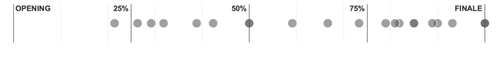
I turned to my favorite source for data viz inspiration, Pinterest. I saw this dot unit plot from the WSJ and thought something like that could be interesting to include.
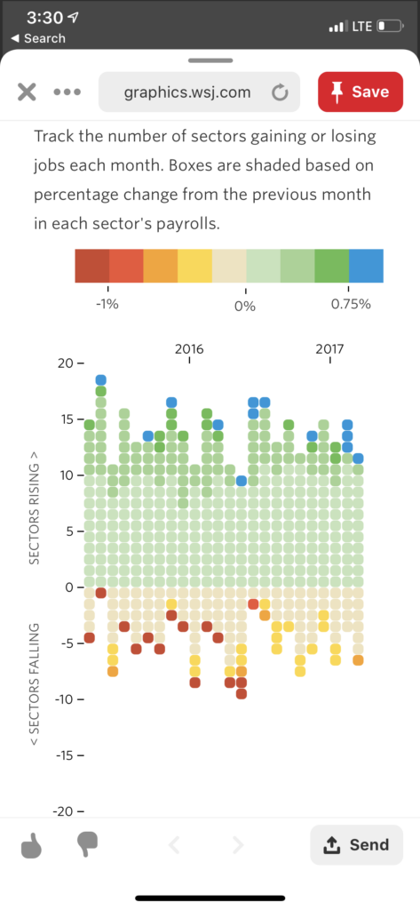
One column for each musical, one circle for each song, any song with a valence score below 50 would be below the X axis, anything with a valence score above 50 would be above the Y axis.
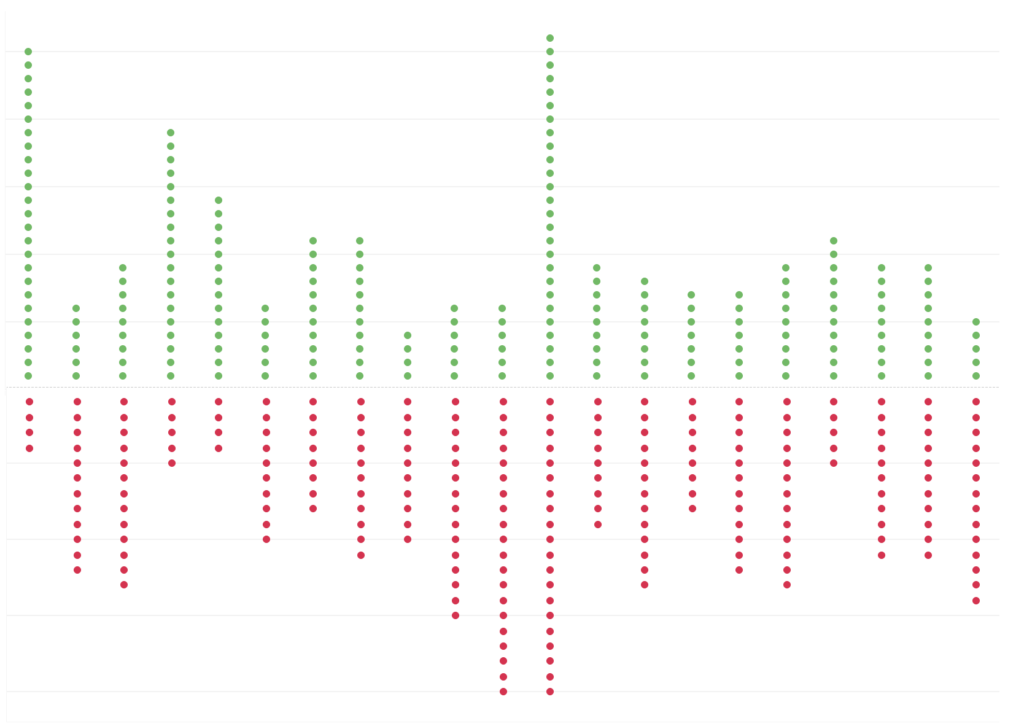
I didn’t hate it. But, I didn’t think it added any additional value beyond what I already had. The different lengths of the albums made it hard to compare and tell exactly what was going on. So, I decided that meant it was time to move on.
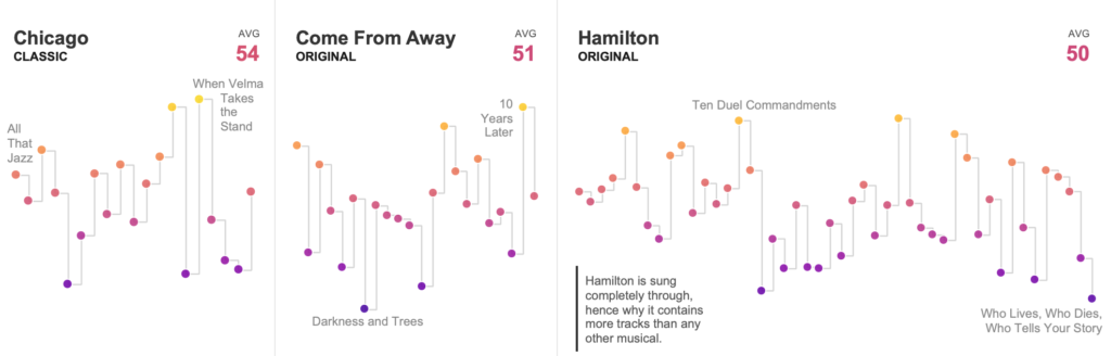
Creating the Small Multiples
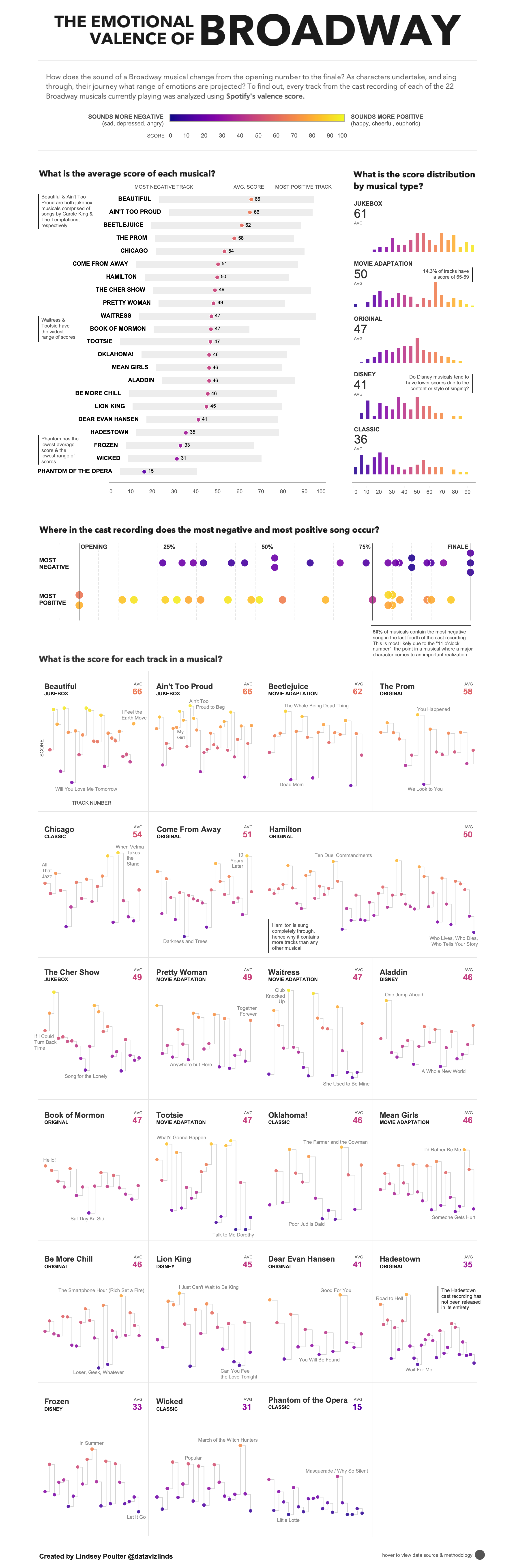
This section didn’t take much time conceptually since I knew it was going to be a small multiples stepped line chart. I wanted this section to provide additional detail but also tie in to the previous sections. I never listed which musicals were a classic or movie adaptation or original, so I made sure to call that out. I also added the average score to make it obvious that the small multiples was sorted by highest to lowest.
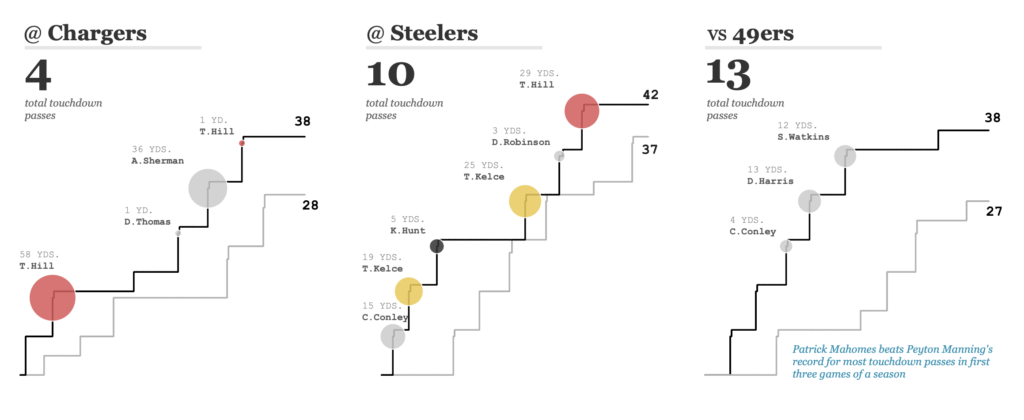
I thought about changing the size of the circles to represent a secondary metric, like I did in my Kansas City is Mahomes Town viz. However, I decided that it would be too much to try to introduce something new. Plus, I was limited on space, so sizing each circle would impact the clean look and feel I was going for.
It did however take me some time to build because I made each small multiples its own worksheet. I wanted to make custom adjustments for musicals such as Hamilton where the album length was almost double every other album.
I decided I was happy – for now – with what I had and decided to move to my favorite part: layout, formatting, and final touches! I created my base visualizations pretty quickly – they were very simple after all. I then spent WAY more time on formatting and deciding what NOT to include.
Layout and Design
Once I knew what charts I wanted to use, I moved onto figuring out the layout. The pattern I followed in creating my visuals made it pretty clear the order of my visuals, but I still had to decide where to intertwine titles, text, and legends.
This was my first draft:
I started with a placeholder title, a copy of the Valence description, and each of my visuals. I applied a default Tableau color palette to test out assigning a color to valence. I liked the start, but my biggest issue was the awkward white space between the category bar charts and average of each musical.
I used the axis on the top of the visual as a way to draw attention to what the numbers meant. However, if I wanted to use color to also represent 0 to 100, I needed to figure out a way to add a color legend that wasn’t repetitive of the axis labels.
My initial thought was to use lines to annotate and provide context. In the lowest and highest point section, I added a line below each percentage group to indicate that the annotation was for that entire section. Just as this section was the hardest for me to figure out what to do, this was the hardest section for me to find a style I liked. I didn’t like the way the reverse L looked and it was too wordy.
My second draft looked like this:
I completely redid the header section and tried to think of a title. I didn’t think anyone would understand what the word valence meant, so I replaced it with sentiment. This went nicely with “Showtune” as this is the word generally used for theater songs. I thought it would be better to introduce the piece with a large title, followed by a one sentence explanation. The color and score was such a big part of my viz, I wanted to find a way to display what it meant front and center. I took the 0-100 axis and line and moved it above the color legend.
I also switched the order of the two charts and I liked the way this looked so much better (and as you can see from the picture, floating everything meant to test if I liked how it looked, I didn’t align anything).
The last thing I tried on this version was labeling what each point (avg score, most positive track, etc.) on the average by musical chart meant, including adding lines to point to what was being described.
My next iteration I focused on titles and font:
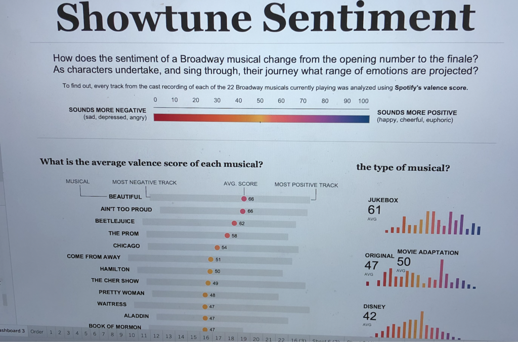
I like starting my visualizations with a question as a way to give the user something to try to answer and help them quickly understand what they will learn. I changed the large summary text to questions and added additional information below in a smaller font. The titles of each of the visualizations were also changed to questions.
I changed all titles to Georgia and kept the rest of the text Arial. I was trying to keep my title fonts web safe, but I just couldn’t resist from trying the titles in my favorite font Avenir. I then took a screen shot of the titles in Georgia, Avenir, and Arial (as evidenced by what is being used in this blog post) and went on a walk. I would glance at each at random times to see what stood out the most. Avenir won by a long shot. To get around it not being web supported, I used images for each title.
The next thing I played with was color
I didn’t hate the Tableau color palette but was interested to try one of the ones introduced to me by Jacob Olsufka in his Color Palettes for Tableau viz. The Viridis options were said to be color blind friendly and I liked how they went from a dark color to a bright color, as this better aligned with the meaning of my scale than the Tableau one.
I tried Viridis and Plasma because they went from dark blue/purple to yellow. Dark blue/purple is generally associated with sadness while yellow is associated with happiness, which matched the valence meaning. I tried the default Viridis one first… but it felt too dark?
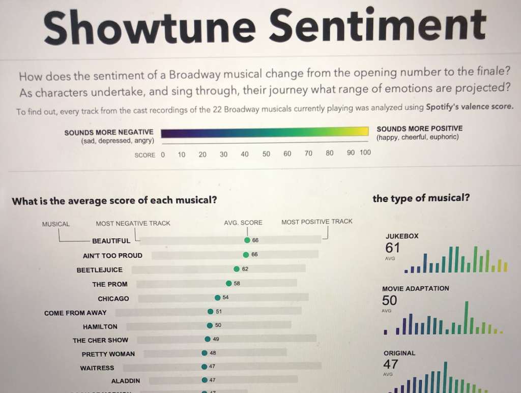
Once I saw Plasma…. I knew that was it.
Lastly, I focused on annotations
I had to decide how they should look and what pieces to actually annotate. I love using annotations because they are a short, simple way to convey information to users. However, Iron Viz is about the story, so I questioned if annotations were enough to convey the message I wanted to tell, especially since the audience wouldn’t be familiar with Broadway like I was. I thought about ways I could add blocks of text but I decided that I wanted to let my visuals speak for themselves. I would simply add annotations to point out what was most interesting to me or where additional context would help understand the data point.
I knew pretty quickly which things I wanted to annotate and this was my first pass at labeling each piece.
However, this majorly threw off my vibe. The text was sporadic and didn’t flow with the “shape” of the section. I decided to move all of the annotations on the average score of each musical section to the left to allow for consistency. I really liked how much this changed the shape of my visualization. It allowed the user to know to look to the left to see information, but it was also easy to not focus on it. Additionally, placing the annotations in a line added to the line theme I was going for. Once this clicked for me, I knew I had to follow the same theme on the right side and right align the annotations. I also moved the lines pointing to the the most negative/positive/average as they seemed like a distraction.
The last piece of annotations I had to determine was the small multiples. I originally wanted to write a one or two sentence insight about each musical. However, after discovering that was difficult to do for the musicals I hadn’t seen… and admitting if I was a viewer of my dashboard I probably wouldn’t read them, I went down a different route.
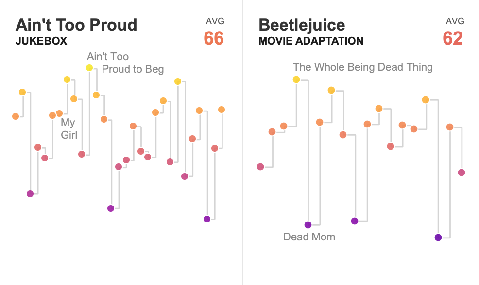
I decided to call out the emotional moments in each musical. I generally labeled the lowest and highest valence points, however I did make some adjustments. I wanted someone unfamiliar with each musical to read the song title and be able to make some connection about why that song was really positive or negative. For example, in Beetlejuice, the actual lowest point is Home (19). However, I thought labeling Dead Mom (25) was better because for the familiar, it was a big plot point, and for the unfamiliar, it was easier to see why a song about death was negative. For Ain’t Too Proud, I labeled the most popular Temptations songs on Spotify.
Finishing the Viz
Once I was happy with how my visualization looked, I stepped away for a day. I wanted fresh eyes to see if I missed anything or if there was any ideas I should implement before I publish.
The biggest last minute change was the title. I really wanted Showtune Sentiment to work – and I really liked the catchiness of it. However, the more I thought about, I didn’t think sentiment was an accurate word to use. Sentiment implied the meaning of the words, while valence was based off of how the words sounded. I decided there was no catchy way to put Broadway and valence together, so I kept my title very matter of fact. However, I did add ’emotional’ to it in hopes that would make it easier to use context clues to understand what valence meant.
After the title change, I was really really happy with my viz. I enjoyed the process of creating it and learned a lot about my favorite shows along the way. However, I doubted myself if it was truly done. Should I add the ability to choose any of the Spotify metrics at the beginning and the viz updates? Does it need to be more interactive to be engaging? Do I need more text or fancy charts? Should I add links to Spotify to listen to the songs?
Ultimately, I decided to go with my gut and leave it as is. There was nothing I could think to add that would increase the insights of my viz and wouldn’t just be for show. I didn’t want to do anything that didn’t feel like “me” just because I wanted to score points from the judges or fit into what is typically thought of as an Iron Viz feeder winner. Scroll below to see the final viz!
My Advice on Entering and What Worked for Me
- Find a topic and idea that you would want to pursue even if Iron Viz wasn’t happening. I found a topic within the theme that I was passionate about. My experience and knowledge of Broadway helped me refine the data and reveal important insights.
- Don’t feel pressured to fit into the typical Iron Viz feeder format. The judging criteria includes analysis and storytelling, which generally leads to long form vizzes. Be aware of the criteria, but don’t let it influence you to create something that feels forced or unnatural. For me, I didn’t want to write paragraphs of text, so I found other ways to tell a story.
- It is okay to be simple and only use bar and line charts! I deliberately chose to focus my time on using design and annotations to tell a story instead of trying to make a crazy chart.
- Edit. Edit. Edit. What can be removed and is distracting from the story? Does every visualization add a new insight or is it just there for show? Does the white space need images or icons or can it be left blank? I found myself wanting to add more things – like links to Spotify or additional metics – but asking myself these questions helped me realize I did not need to add them.
- Take a break, go on walks, get away from your viz. Coming back to your viz with a fresh set of ideas will help you see things differently and come up with new ideas!
So, now I present to you my finished visualization (or view on Tableau Public):