The What
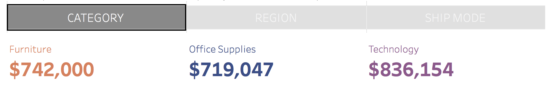
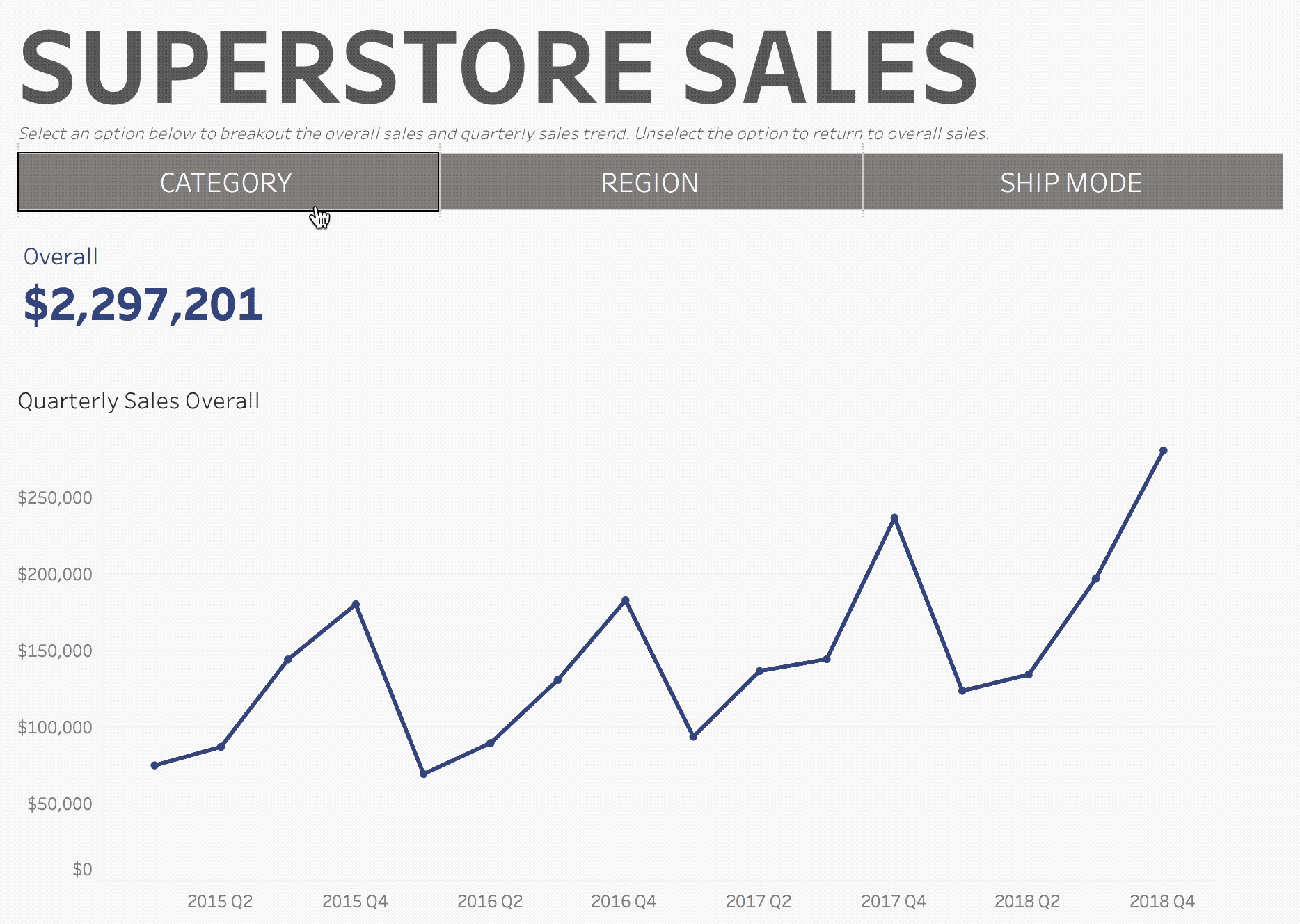
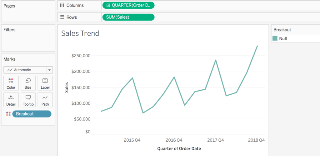
Set actions can be used to choose which dimension to use in corresponding visualizations. In this example, clicking on either “Category”, “Region”, or “Ship Mode” will break down the trend line and overall sales number. This approach allows for more flexibility in how a user chooses a dimension (this method can be applied to any type of worksheet or icon). Previously, the most common way for a user to select a dimension was through a parameter, however this offers little control over the look and feel (other than choosing between a dropdown, slider, or radio button list).![]()
The Inspiration
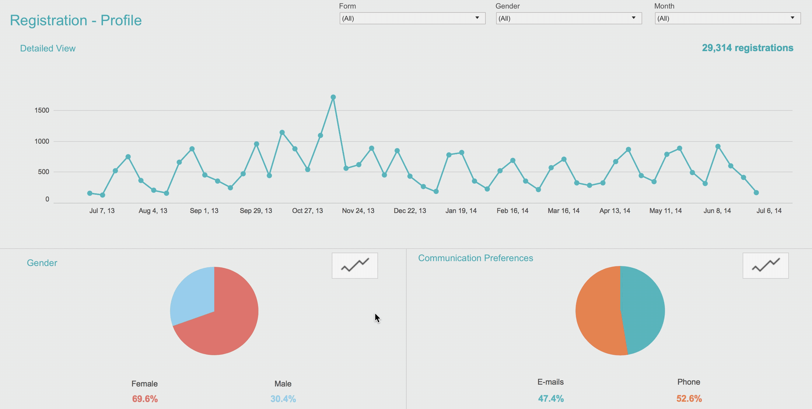
In my blog post about my data visualization journey, I shared the following dashboard. To get the desired effect, I had to create three trend worksheets (one for overall, one for by gender, and one for by communication preferences) and two trend icon worksheets. I then used dashboard filter actions to show and hide the trend worksheets. However, because the trend worksheets were in a container and “collapsing”, it led to some inconsistencies in the display of the dashboard. For example, watch how the X axis shifts between the two views. This inspired me to think there had to a better way using set actions (and the same methodology detailed in the next section can be used to recreate this dashboard!)
The How
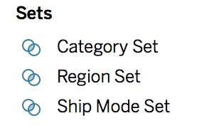
- Decide which dimensions you want the user to choose between. In my example, I am choosing: Category, Region, and Ship Mode.
- Create a new set for each dimension selected in step 1. This can be done by right clicking on the desired dimension (ex: category) and selecting create > set. Name the set [Name of Dimension] Set (ex: Category Set) and leave it on select from list with no values selected.
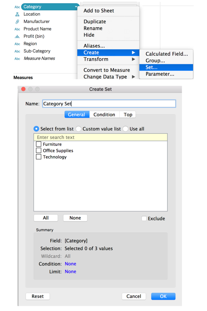
You should now have three (or however many desired dimension) sets.
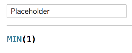
- Create a new calculation called “Placeholder” with the calculation MIN(1)
- Add the new “Placeholder” calculation to the columns shelf. Keep adding the “Placeholder” calculation to the columns shelf until the number is equivalent to the number of dimensions selected in step 1. In my example, I have three dimensions, so I will add “Placeholder” to the columns shelf three times. This will serve as the buttons the user clicks on to change the dimension.
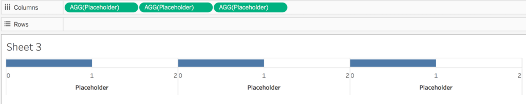
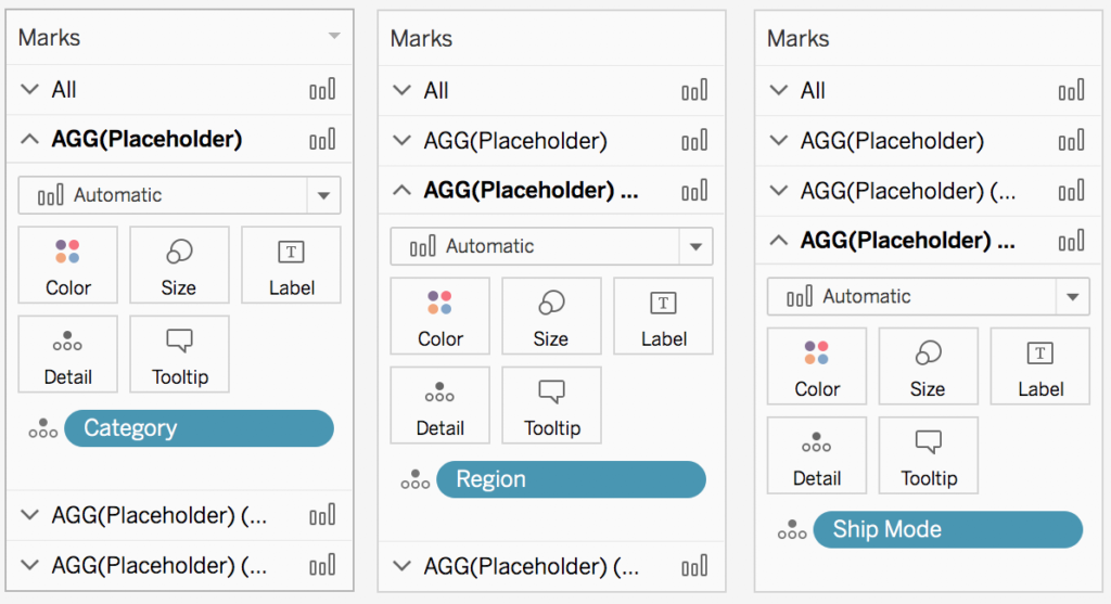
- Select the first “Placeholder” green pill in the columns shelf so that the corresponding marks shelf appears. Drag your first dimension to detail (in my example, category). Then, select the second “Placeholder” green pill and add your second dimension to detail (in my example, region). Repeat until every “Placeholder” marks card has a different dimension on detail. The “automatic” mark type should default to a bar, but if it does not, manually change it to bar (otherwise, keeping it on “automatic” works fine).
- You will notice that each bar is now a stacked bar chart, corresponding to the number of values within each dimension. We do not want the user to be able to see all these different pieces. Right click on the axis and select “edit axis”. Change the range from automatic to fixed from 0 to 1.
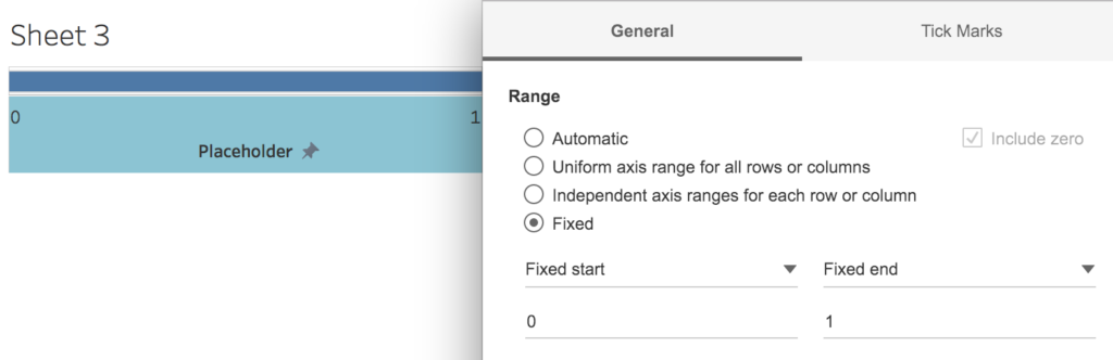
Repeat for each axis. - Right click on each axis and uncheck “show header”
- Click on the first “Placeholder” green pill on the columns shelf to bring up the corresponding marks card. Drag “Placeholder” from the measures shelf onto “Label”. Then click the label mark to bring up the label options. Select the “…” next to the text field to bring up the text editor. Type in the name of the dimension, or what you want the user to see (in my example, I typed category)
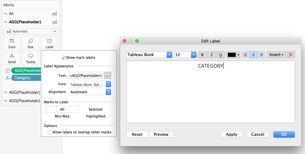
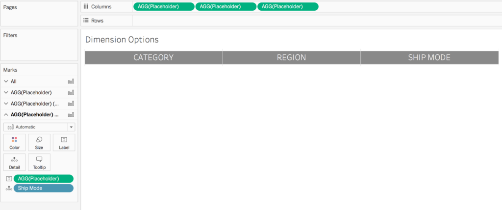
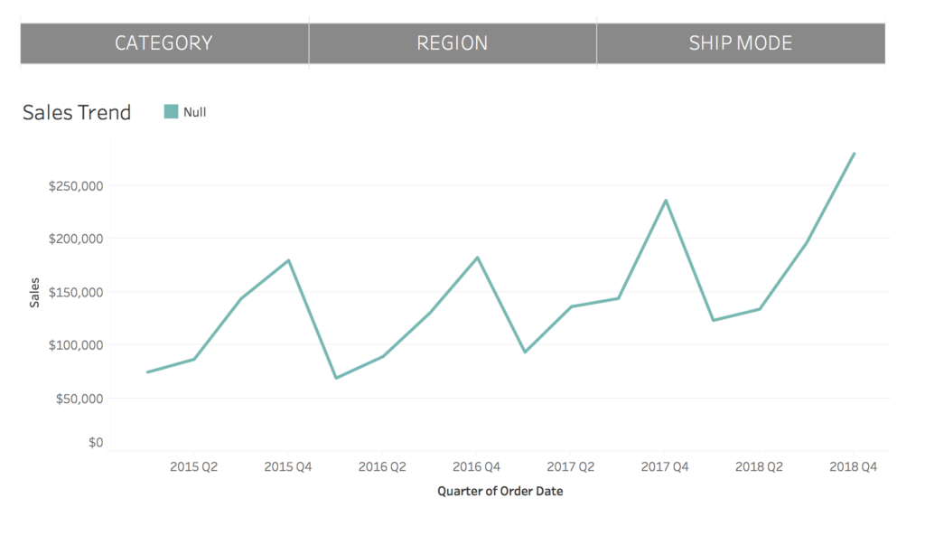
Repeat for each dimension / placeholder. Remove dividers and change the color and fonts to match your desired look. Name the worksheet “Dimension Options”. In the end, your worksheet should look something like this:
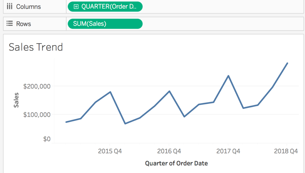
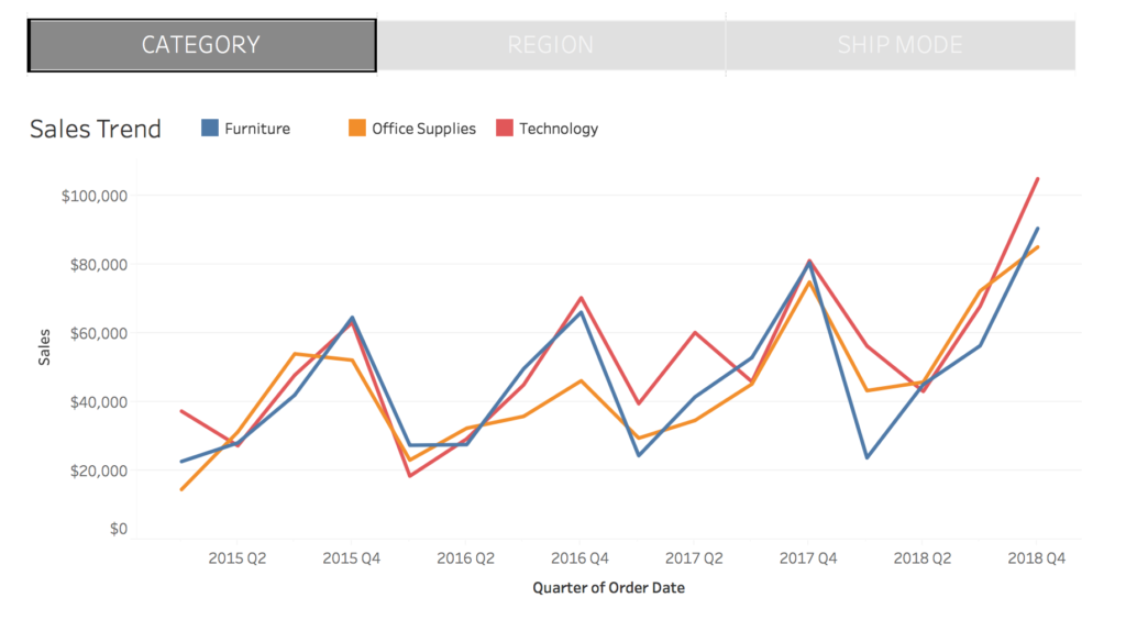
- Create a new worksheet. This will serve as the chart that will be updated when one of the dimensions is selected. In my example, I called the worksheet “Sales Trend” and added Order Date (with a granularity of quarter) to the columns shelf and sales to the rows shelf
- Create a new calculated field called [Dimension Name] Selection (in my example, Category Selection). This is where the magic (starts to) happen! Replace [Dimension Set] with the name of one of the sets created in step 2. Then repeat until each created set has its own selection calculation.
{MAX(if [Dimension Set]=false then 0 else 1 END)}In my example, I have three new calculations:
Category Selection
{MAX(if [Category Set]=false then 0 else 1 END)}Region Selection
{MAX(if [Region Set]=false then 0 else 1 END)}Ship Mode Selection
{MAX(if [Category Set]=false then 0 else 1 END)}What is this calculation actually doing?! It is allowing us to see if any values are included in a set. If even ONE value is included in the set then return X for the entire dataset but if NOTHING is checked in the set return Y for the entire data set.
If I removed the {} around my “Category Selection” calculation and added “Category” to the rows shelf and “Category Selection” to text, I would see the following:
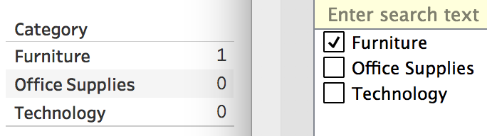
This is simply telling us which items in the set are selected (Furniture).
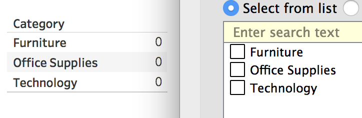
However, I don’t care about how many items are selected or which items are selected, I just want to know if anything is selected at all (yes or no). Thus, if I add {} back to my “Category Selection” calculation, I can use the power of level of detail expressions to return one value for the entire dataset.
In this example, nothing is selected, so a 0 is returned.
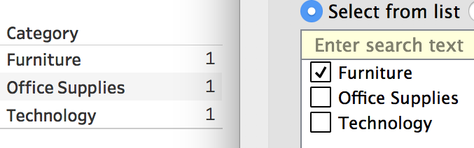
However, as soon as I select a value in the set, a value of 1 is returned for every row (and there is not just a 1 by furniture!).
Why does this need to be done?! Well, remember back to step 6 where we fixed the axis from 0-1? When the user clicks on a bar, they are technically only clicking on one “stack” of the bar. For category, the user is selecting the “Furniture” value. Clicking it will break out our visualizations by furniture, but will not include the other two categories, office supplies and technology. So, this calculation helps tell Tableau that if any value in the category dimension is selected (such as furniture), show all values in that dimension (furniture, office supplies, and technology).
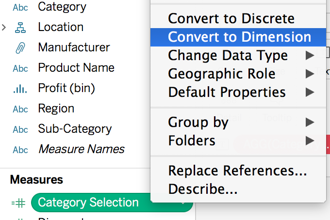
- Convert all the selection calculations created in the previous step to discrete dimensions. This can be done by right clicking on the metric in the measure shelf and selecting “convert to dimension”
- Write one last calculation called “Breakout” to bring it all together! This is the calculation that will then be placed on the “colors” mark and power the set action. When a value is selected/added to the set (and returns a value of 1 in the selection calculation), we have to tell Tableau what dimension to return and display.
if [Dimension 1 Selection]=1 then [Dimension 1]
ELSEIF [Dimension 2 Selection]=1 then [Dimension 2]
ELSEIF [Dimension 3 Selection]=1 then [Dimension 3]
END
In my example, the calculation would look like this:
if [Category Selection]=1 then [Category]
ELSEIF [Region Selection]=1 then [Region]
ELSEIF [Ship Mode Selection]=1 then [Ship Mode]
END
- Add the previously created “Breakout” calculation to the color mark. Right now it displays “null” because all three sets created are empty. Tip: change the alias from null to overall.
- Create a new dashboard. Add the sales trend worksheet plus the dimension options worksheet.
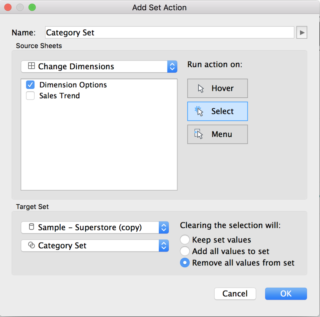
- The last step involves setting up the set actions. There will need to be one set action created to target each set created in step 2. Each set action should look identical to the screenshot, with the only changing item being swapping out which set is being targeted.This can be done by going to Dashboard > Actions > Add Action > Change Set Values. For the source sheet, select the dimensions options worksheets. We want users to click this worksheet to update the set values. Run the action on select. For the target set, select the name of the datasource, followed by which set to target. Then change “clearing the selection will” to remove all values from set. This is critical in order to be able to toggle between “overall” and a dimension, but also to allow to switch between different dimensions (due to the “Breakdown” calculation being an IF statement and the way it evaluates).
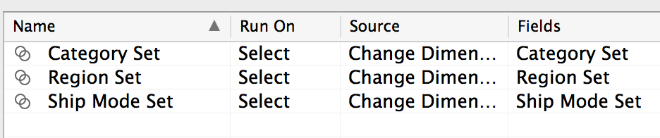
 You should now have three set actions:
- Test it out! Clicking on “category” should update the trend line to be broken out by category. Unselecting “category” will then return the graph back to showing the overall numbers. Note: you HAVE to unselect the selected item (category) before choosing a different one (region or ship mode) in order for it to work.
To view my working example on Tableau Public or to download my workbook, click here. Also, check out the other dashboards in the workbook detailing different ways to drill down into data using set actions.