The What
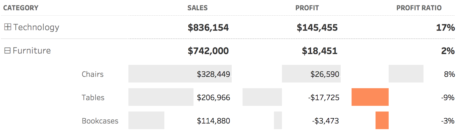
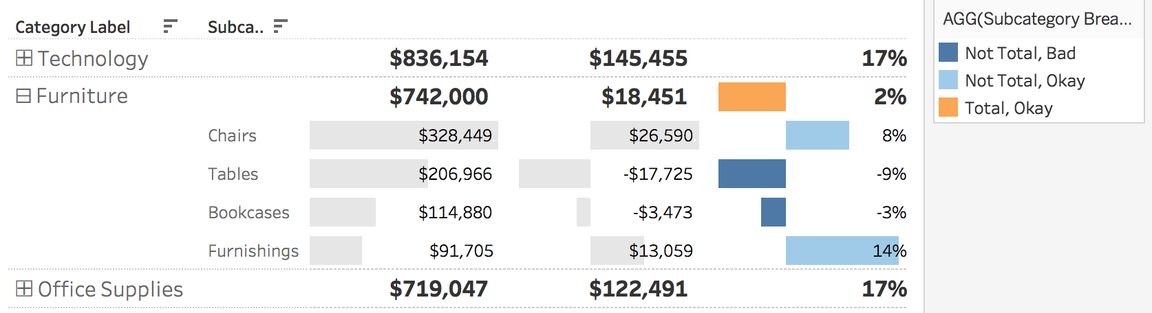
“We want our data in a table” is a sure way to make any data visualization practitioner cringe. Yet it is a common request by stakeholders in the business world. The main argument against displaying data in a table is the inability to quickly and accurately tell the difference between values, especially when there are lots of different numbers. One way to present data in a table like manner yet still incorporate visual cues is to show light grey bar charts behind each number when a dimension is expanded. This can be accomplished in Tableau through utilizing set actions and formatting of subtotals. In this example, I even highlighted the bars with a negative profit ratio orange.
The Inspiration
In the latest Power BI update, a new feature was introduced to allow for the ability to drill in and out of different items. I wanted to see if something similar could be created in Tableau.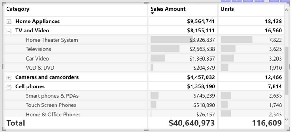
The How
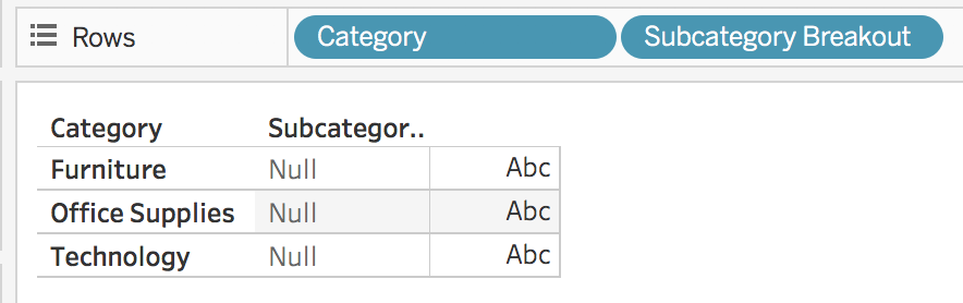
- Determine the main dimension to display as well as the secondary dimensions to breakout the main dimension by. I am going to use category as the main dimension and sub-category as the secondary dimension.
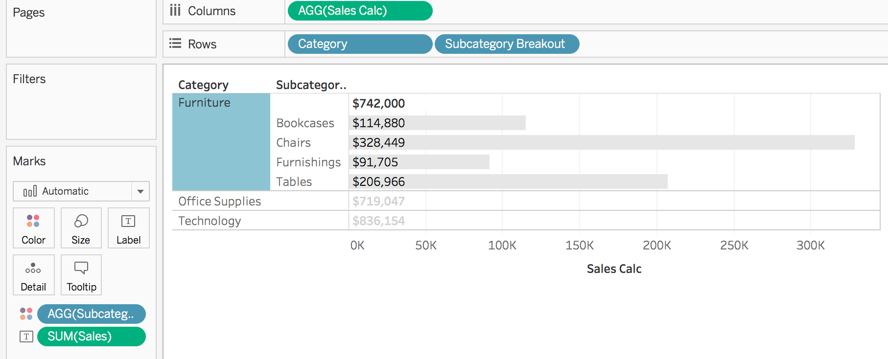
- Create a new worksheet and add the main dimension, category, to the columns shelf
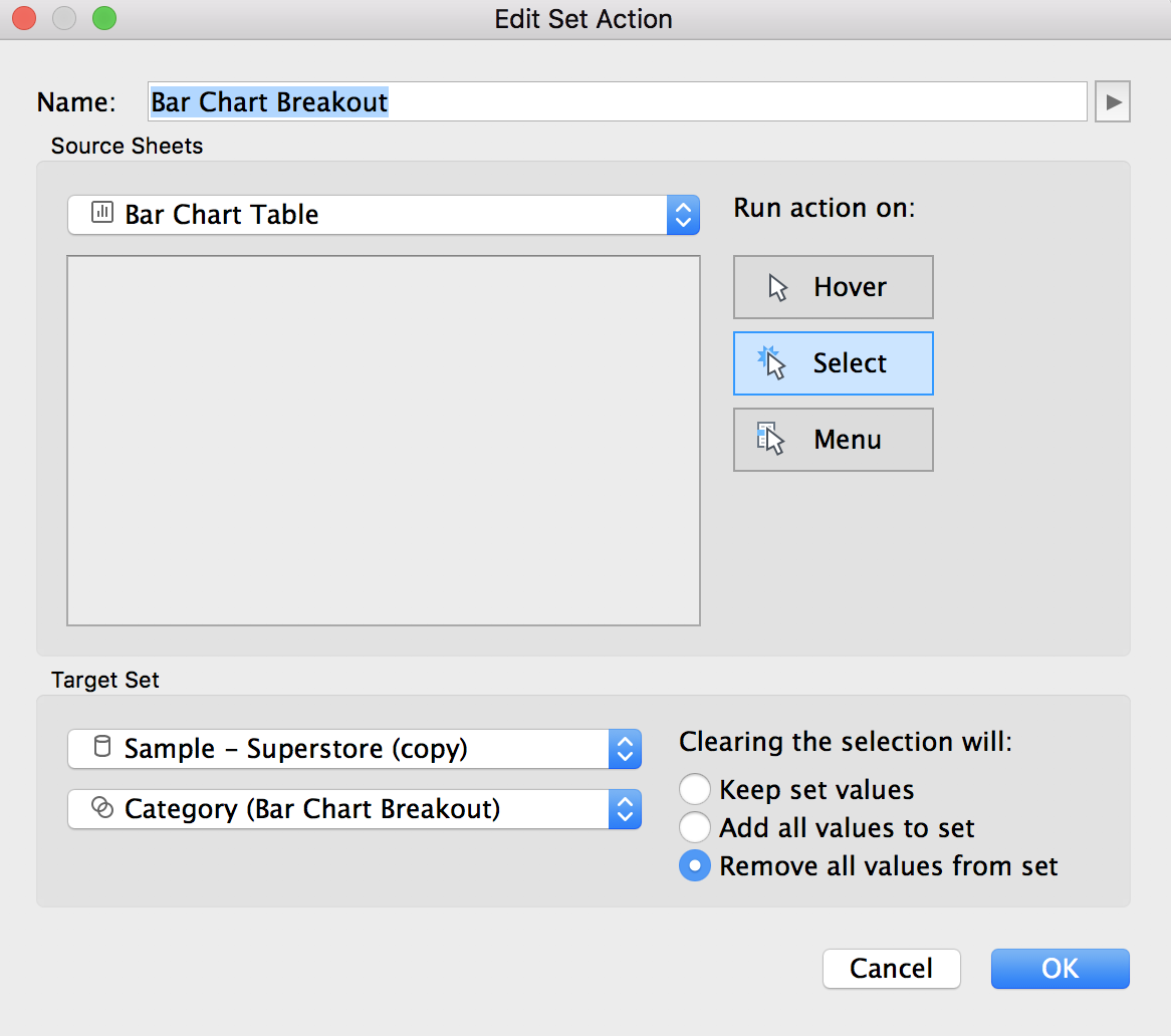
- Create a new set based upon the main dimension. To do this, right click on the dimension (category) in the dimension shelf and select create > set. Name the set “Category (Bar Chart Breakout)” and don’t change any of the settings
- Create a new calculated field called “Subcategory Breakout”. This calculation will tell Tableau what to do when a value from the main dimension is clicked on (and thus added to the set). This will serve as the drill down, where clicking on any category will then show the corresponding sub-categories.
IF [Category (Bar Chart Breakout)] THEN [Sub-Category] END
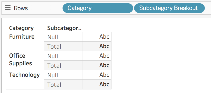
- Add “Subcategory Breakout” to the rows shelf
- Add a new worksheet set action. This can be done by going to worksheet > actions > add action > change set values. Run the action on select, with clearing the selection removing the set values.
- Add subtotals to the view by going to analysis > totals > add all subtotals
- Determine which metric to use. In this example, I am going to use sales. Create a new calculated field called “Sales Calc”.
SUM(if [Category (Bar Chart Breakout)] then [Sales] else 0 END)
- Add “Sales Calc” to the columns shelf and change the mark to bar. As shown below, the calculation created in the previous step will only show a bar for each sub-category (where as the totals of non-selected categories just show 0).
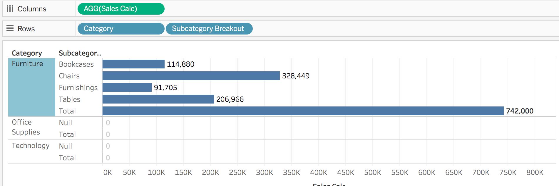
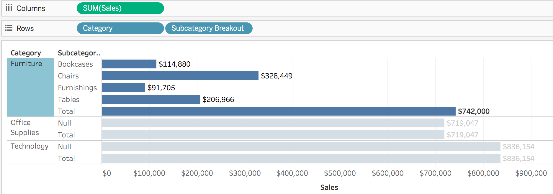
If we had just added “Sales” to the columns shelf, instead of the created calculation, our axis would get skewed by the “total” values from the non-selected categories.
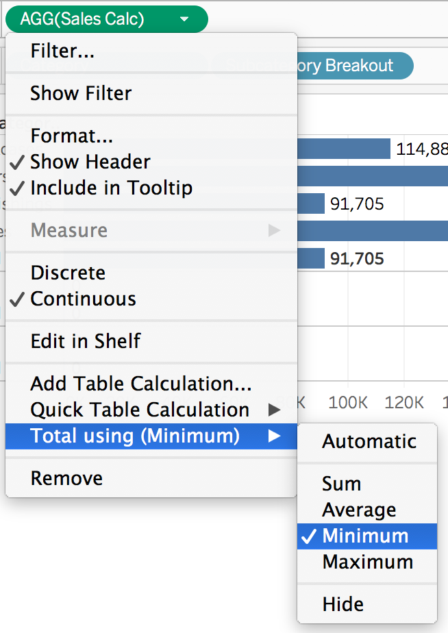
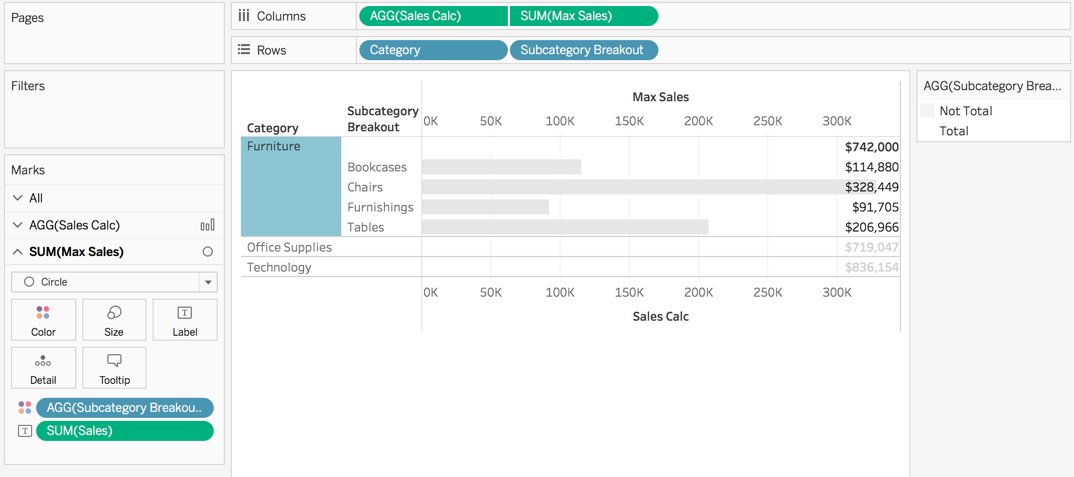
- Right click on the “Sales Calc” field and select total using minimum. When furniture is selected, the total row will show $91,705 (the subcategory with the least amount of sales) instead of the overall sales of $742,000.
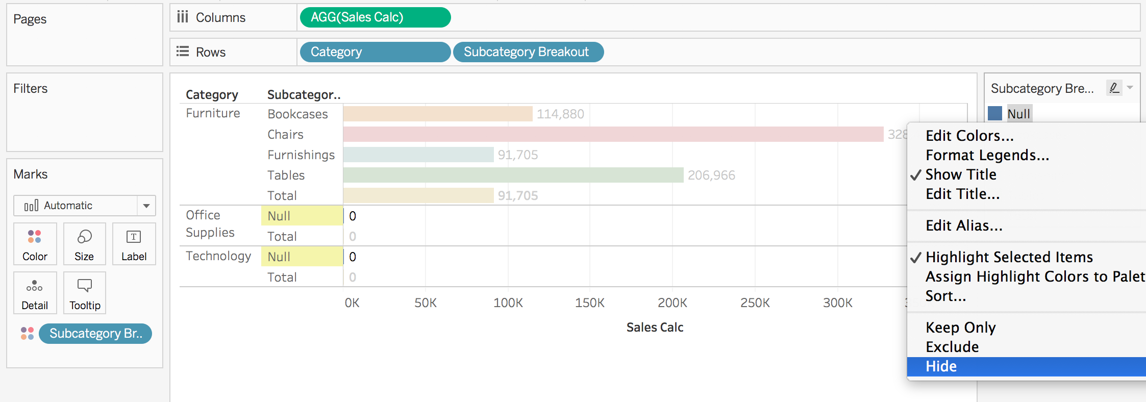
- Add “Subcategory Breakout” to the colors mark. Then, on the color legend, right click on “Null” and select “hide”. This will hide the “null” rows that appear due to the category not being in the set and will leave only the total rows for non-selected categories.
- Remove “Subcategory Breakout” from the colors mark
- Create a new calculated field called “Subcategory Breakout Color”. This will be used to color the total rows one color (white) and the rest of the rows a different color.
IF ATTR([Category (Bar Chart Breakout)]) THEN
IF MIN([Subcategory Breakout]) != MAX([Subcategory Breakout]) THEN "Total" else "Not Total" END
ELSE "Total"
END
- Add “Subcategory Breakout Color” to the color mark. Change “Total” to white and “Not Total” to any desired color, such as light grey
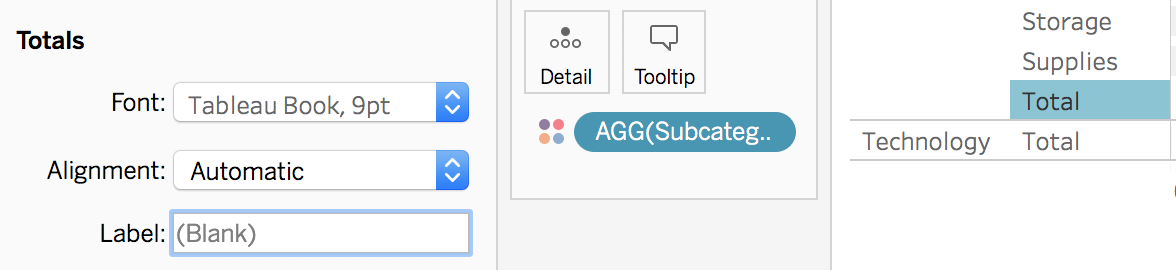
- Right click on “total” and select format. Delete the word “Total” so that nothing shows up, so that it shows (Blank)
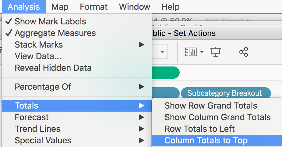
- Select analysis > totals > column totals to top
- At this point there are two options:
Option 1: Add “Sales” to the label mark to show the correct total values. Change the horizontal alignment of the label to left. Leave the graph like this (and sort the bars, cleanup the lines, and make the font size of totals bigger!)
Option 2: Keep going to setup the labels to appear on the right - Create a new calculated field called “Max Sales”
IFNULL({MAX({fixed [Category (Bar Chart Breakout)]:
MAX({fixed [Sub-Category]:
SUM(if [Category (Bar Chart Breakout)] then [Sales] END)})})}, 0)
An important note: because this calculation uses LODs, it may need to be adjusted depending on how your table is setup and the desired look. For example, if you have “region” on the columns shelf, the calculation would need to be updated to
IFNULL({MAX({fixed [Category]: MAX({fixed [Sub-Category], [Region]: SUM(if [Category Set] then [Sales] END)})})}, 0) - Add “Max Sales” to the columns shelf. This calculation will return the max sales value of only the shown subcategories.

- Click on the “max sales” pill on the columns shelf and select “dual axis”. Right click on the axis and select “synchronize axis”. Remove measure names from the marks cards. Change the “Sales Calc” mark back to bar and the “Max Sales” mark to circle
- On the “Sales Calc” marks card, click on label and unselect “show mark labels”
- On the “Max Sales” marks card, add “Sales” to the label to bring in the correct value for the total. Change the horizontal alignment of the label to right. Reduce the size of the mark all the way down to smallest size possible. Change the opacity of the mark down to 0%
- At this point, all that is left is formatting! If you desire to add additional metrics into the table, repeat steps 8-22.
- My formatting tips:
- Right click on the axis and unselect “show header” to remove the axis
- Right click anywhere in the graph and select format.
- Format Borders: Change column dividers to none. Change row dividers to dashed.
- Format Lines: Remove column gridlines. Remove zero lines.
- Format Font: Change the “total” font size to be larger, such as Tableau Bold, size 12
- Sort Category and Subcategory by sales, descending
- Determine what your preferred drill up/down option is:
Option 1: Leave as is. Upon clicking on a category, the section turns blue and the other category values grey out. To drill back up, click on the selected category (what is blue) once.

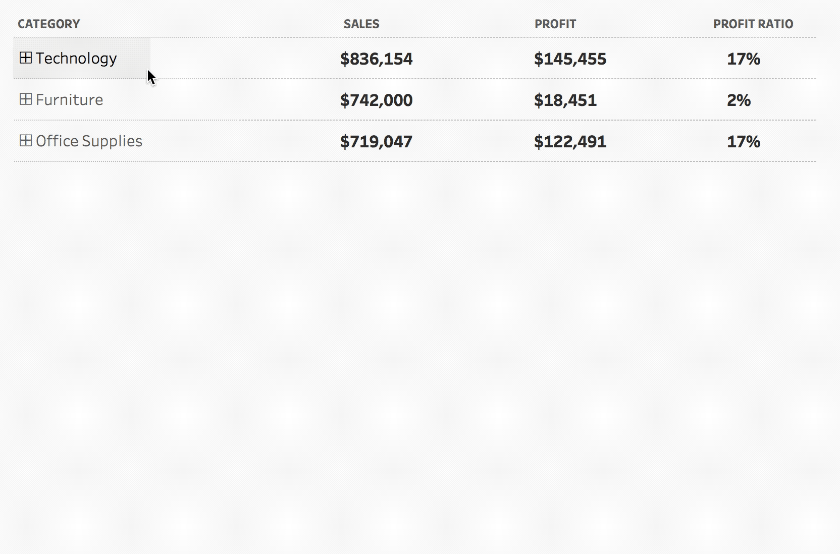
Option 2: If a category is expanded it will have a – where as if it is not it will have a + (this will help indicate to the user the ability to drill up/down). Upon clicking on a category, the category will not highlight/turn blue as above. However, to drill back up, the user has to double click on the category (once to select the category so it turns blue and then again to unselect).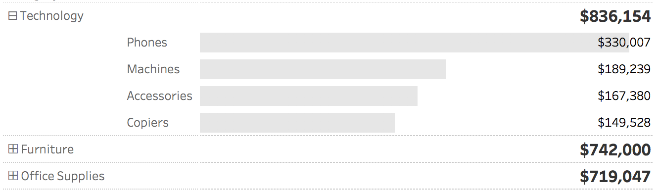 To do this, create a new calculated field called “Category Label”
if [Category (Bar Chart Breakout)] then "⊟ " + [Category]
ELSE "⊞ " + [Category]
END
Add it to the rows shelf, in front of category. Right click on the category pill and unselect show header. Sort “Category Label” by sales, descending.
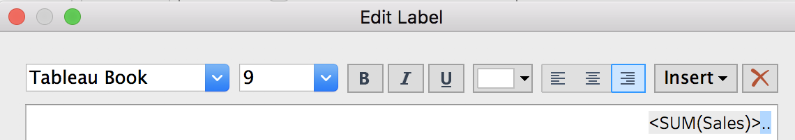
- If you add multiple measures, there will not be much space in-between the different columns. To easily add additional space, edit the label. Add two periods to the end of the label and change the color to white
- If you want to color the bars of any of the measures, such as if there was a threshold for a good, bad, and okay profit ratio, a calculation can be created and added to the detail mark. Then, clicking on the icon next to the pill, change it to color.
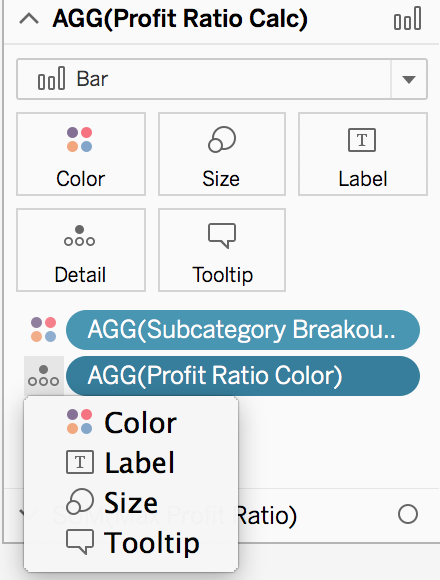
This will bring up a combined legend, where the total values can be changed to white while the others can be updated accordingly
To view my working example on Tableau Public or to download my workbook, click here. Also, check out the other dashboards in the workbook detailing different ways use set actions