The What
Tableau Desktop includes a feature called drop lines that can be added to a graph (by right clicking on a mark and selecting drop lines > show drop lines). They then appear after clicking on any mark. There are some formatting options available, similar to reference lines. However, the biggest drawback to the built in drop lines is that they don’t work on Tableau Public or Tableau Server.
This is where set actions + transparent worksheets come to the rescue. The combination can be used to create custom drop lines (that appear on either hover or click). Here is the example I created for Week 47 of Makeover Monday using this method:
This example uses 5 (!!) worksheets overlaid on top of each other to create the desired effect. The different layers include:
Layer 1: What the User Interacts (and Changes the Set) With
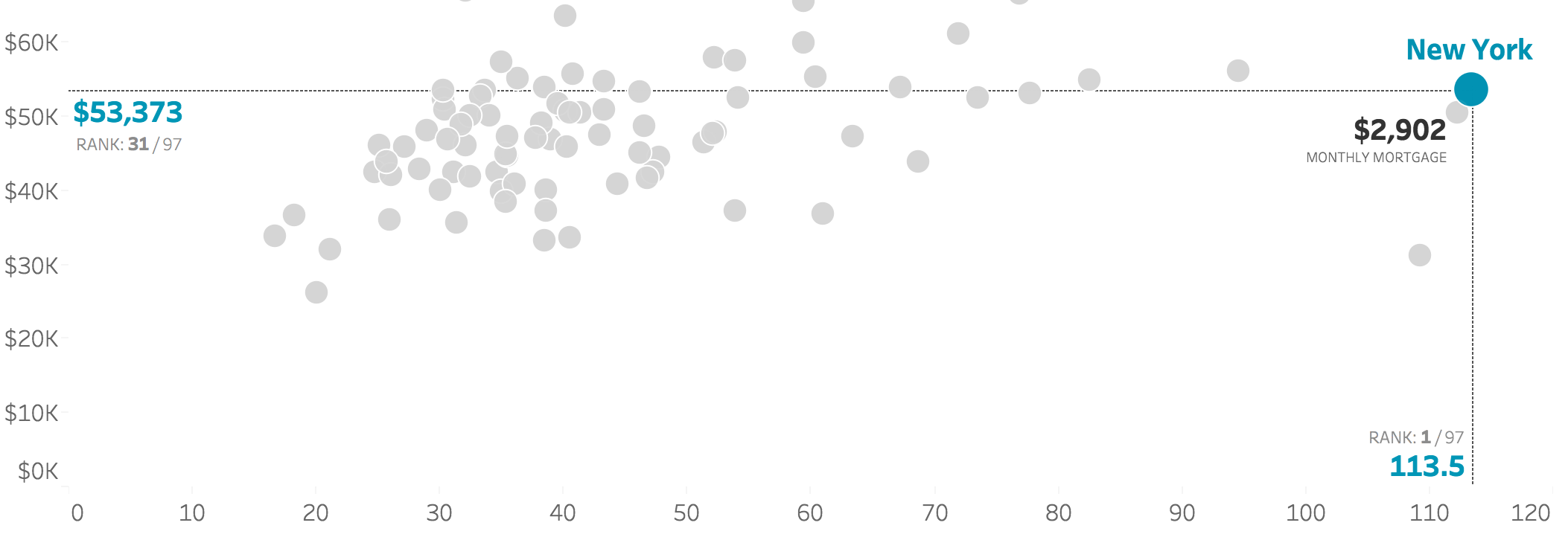
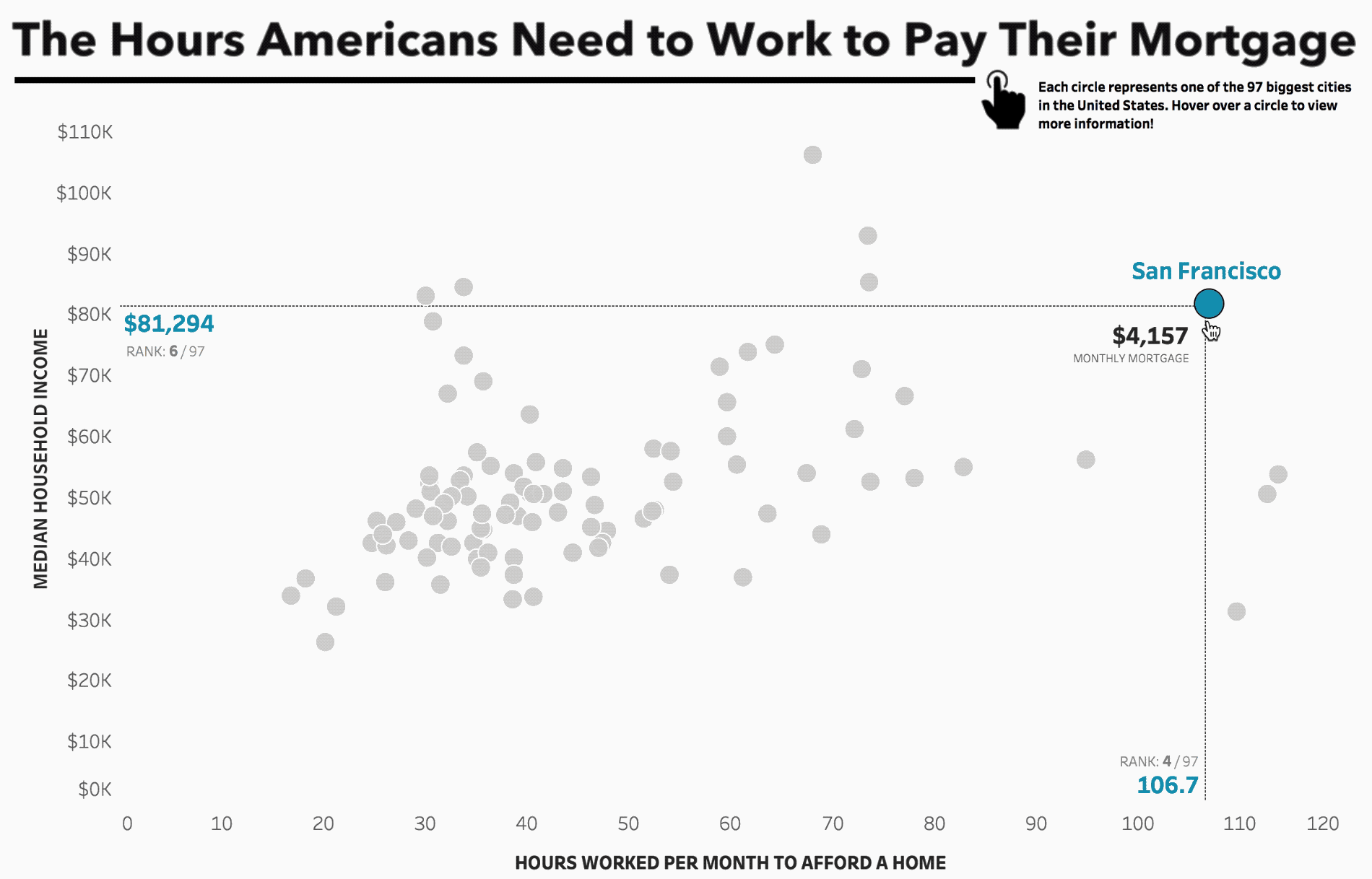
This worksheet is the scatterplot, with a point for each city. A set was created based on city and the corresponding set was added to the color and size mark. I wanted my labeling to be set up so that the name of the city appeared above the circle while the monthly mortgage price appeared in the upper corner of the drop lines. To add two different labels, I needed to create a dual axis chart. To only label the selected city, I create two new calculations, one to isolate the name of the selected city and one to isolate the selected monthly mortgage. Everything else is hidden behind this worksheet and thus the user can’t touch it. Placing the drop (reference) lines on a worksheet underneath this layer solves for two things: a) the selected city mark will appear above the reference line and b) the no-way-to-turn-off reference line tooltips won’t be accessible to the user.
Layer 2: The Reference Lines + Axis
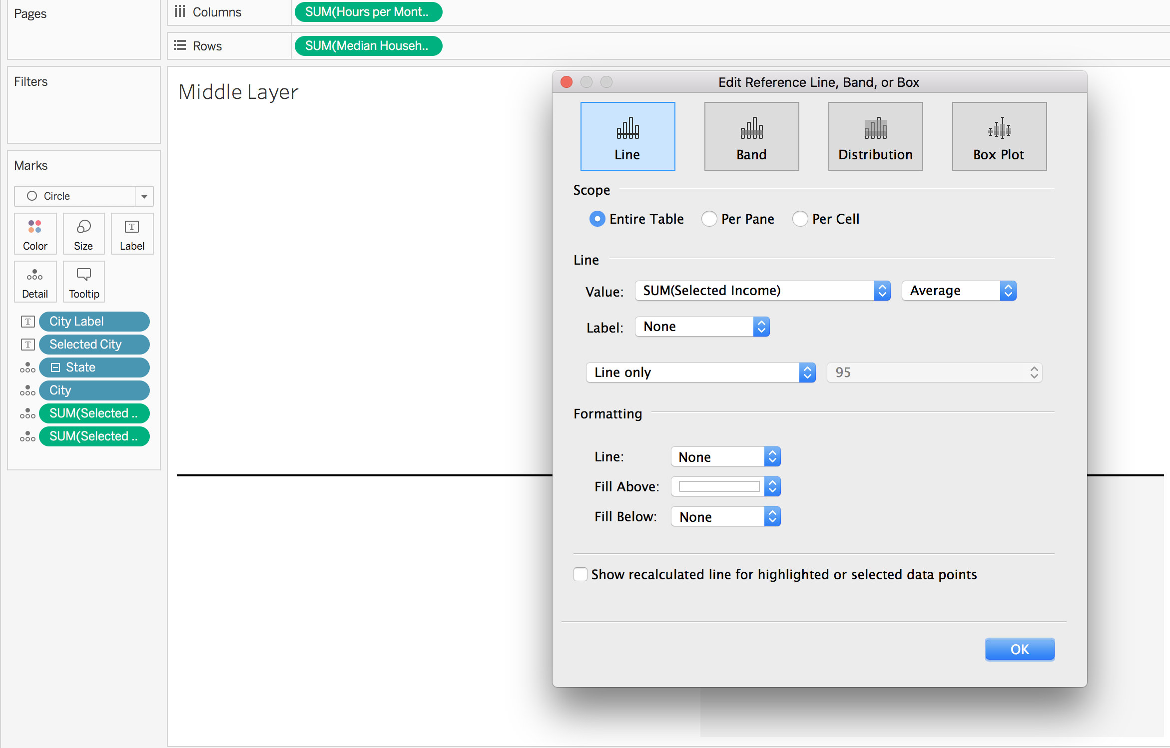
I duplicated the scatterplot created for layer 1, removed the labels and sizing, and changed the color of each circle to white. I then created two new calculations, one to isolate the hours per month to afford a home for the selected city and one for the median household income of the selected city. I added those calulcations to the detail mark, added them as reference lines, and formatted the reference lines to my liking. I moved the labels to be underneath the median household income line and to the left of the hours worked line in order to not be cut off by the following layer. I also used this as the layer which contained the axis.
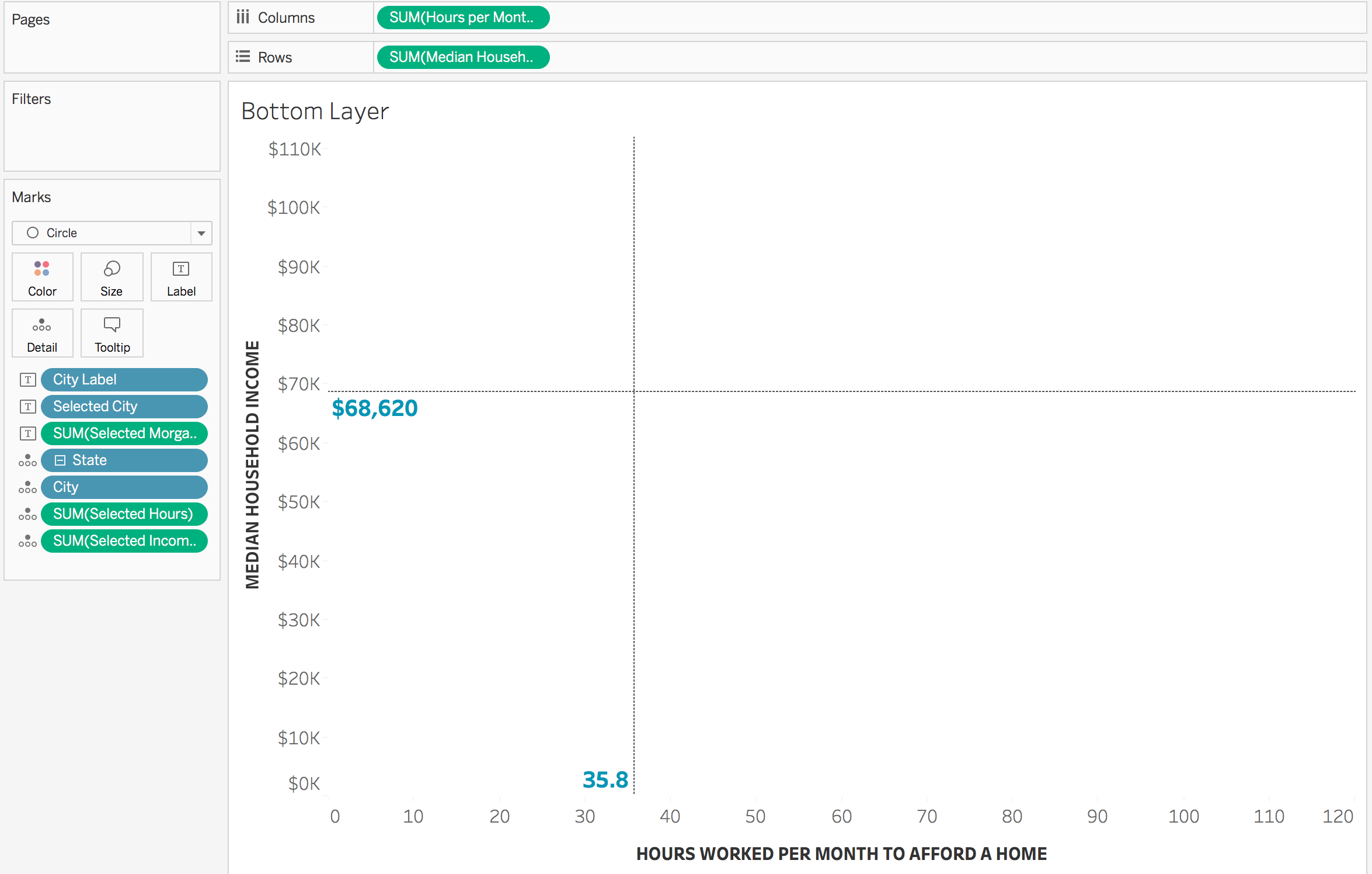
Layer 3: Removing the Lines Above and to the Right of the Selected City
I could have left the reference lines as is and created a ‘quadrant’ style view. However, I wanted to mimic drop lines and thus wanted to remove part of the lines that extended above and to the right of the selected city. To do this, I duplicated layer 2. Then I edited the reference lines to have no label, show no line, and to have the fill above be white. This layer was placed on TOP of layer 2.
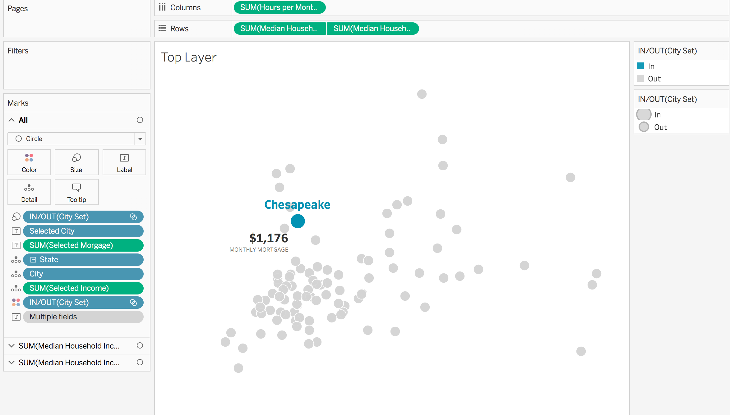
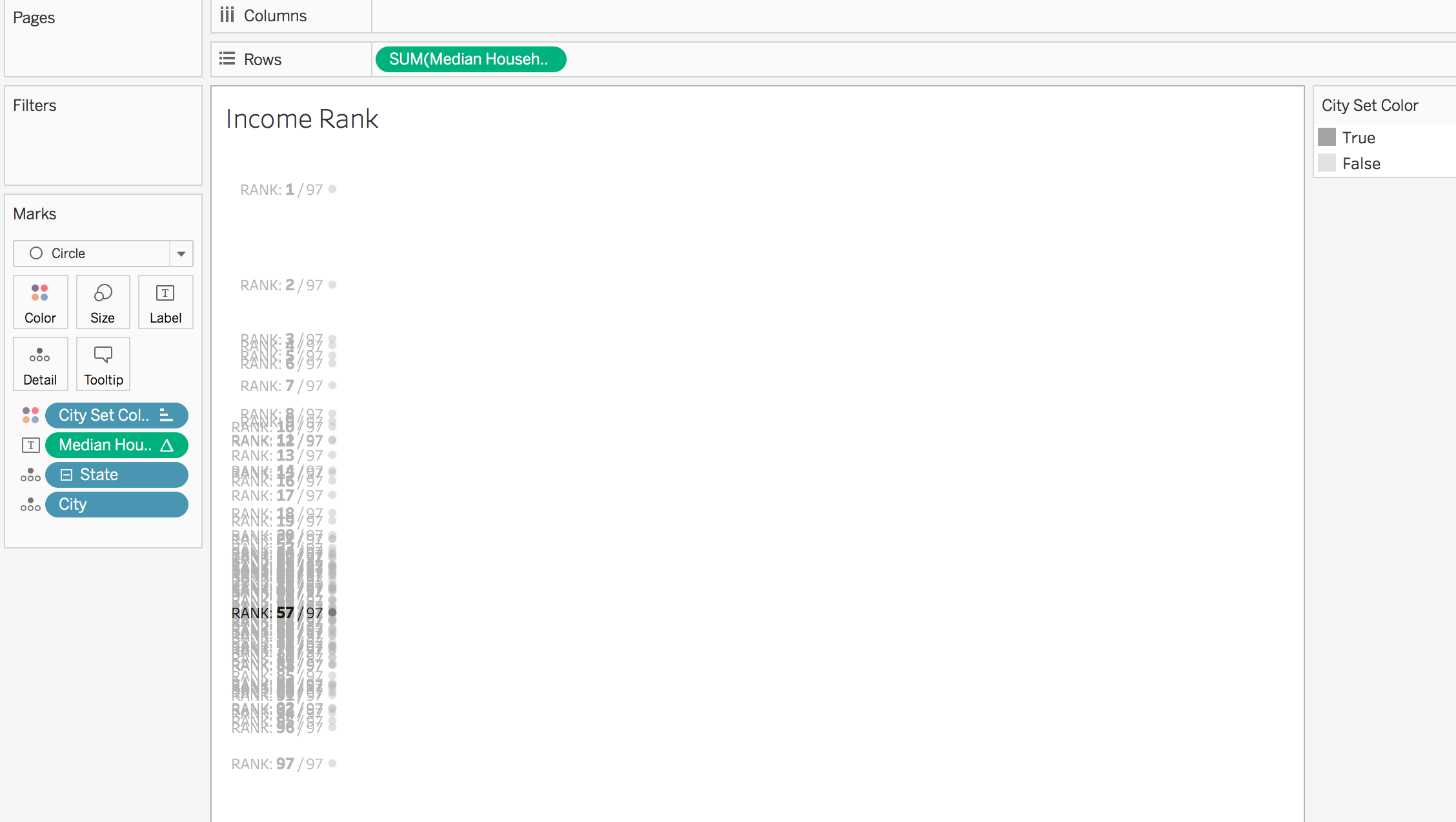
Layer 4 & 5: Show Where the Selected City Ranked
Below the selected city’s median income and hours of work required, I wanted to show where the selected city ranked. For example, selecting Miami shows that it ranks 96 / 97 cities in terms of median income – only Cleveland has a lower median income. However, Miami has the 3rd (3 / 97 cities) highest hours worked required to pay the mortgage – with only New York and Los Angeles above it. To do this, I added my desired measure to the rows shelf with a mark of circle. I created a rank calculation using my desired measure and added that to the label. Because I had already used the city set on color, I created a new calculation to allow me to use a different color set (note: “false” is set to white in the workbook, but light grey here to better see what it is doing). I then changed the label to match the color of the mark. These layers were placed behind layers 1-3 on the dashboard.
I then made sure each worksheet was set to have a background color of none and placed the worksheets on top of each other on my dashboard.
The How
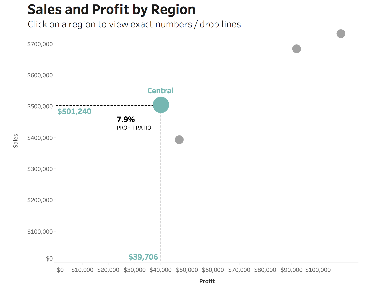
Let’s walk through how to build layers 1-3 using Sample SuperStore data.
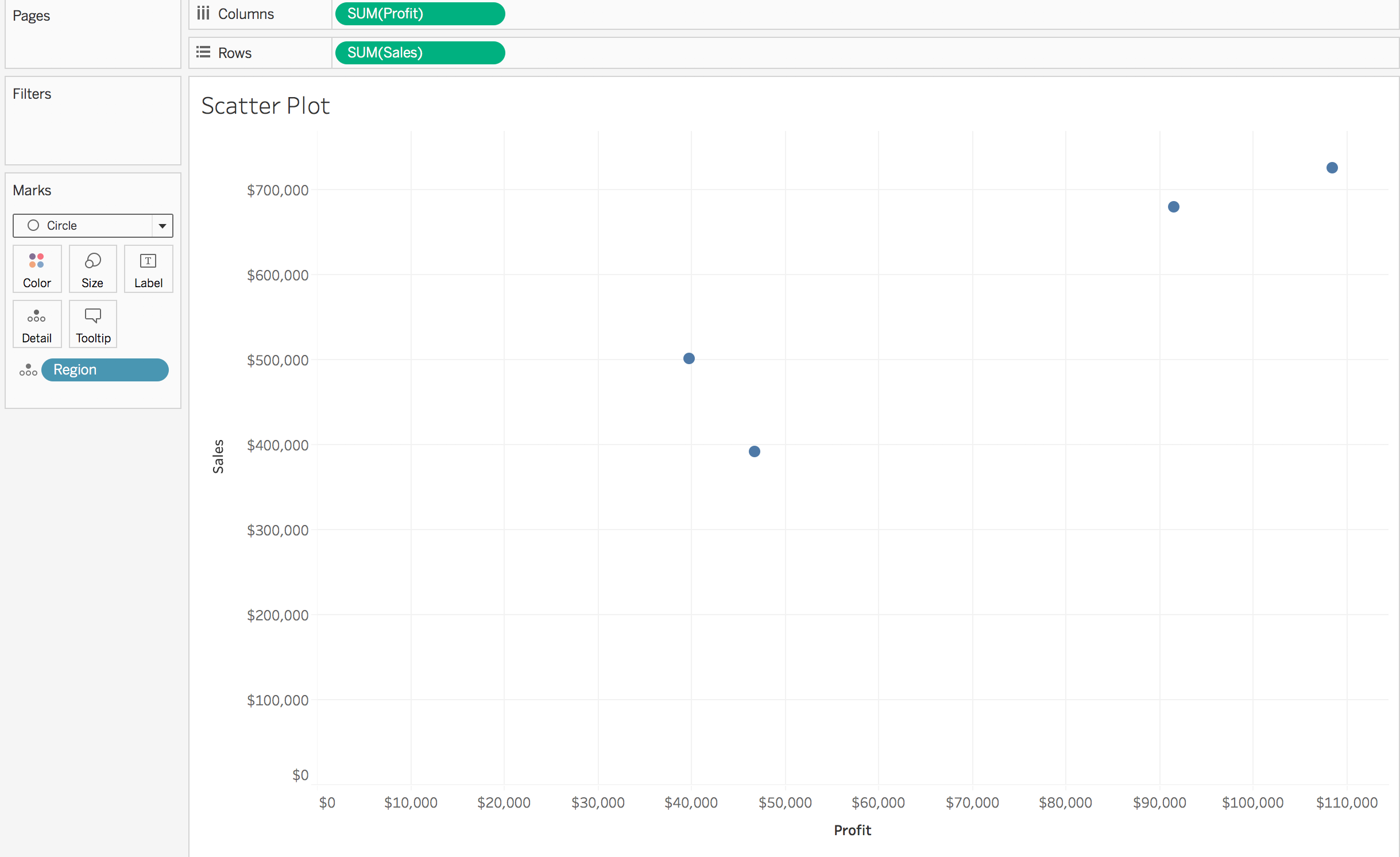
- Build a scatterplot. I put “Profit” on columns, “Sales” on rows, and “Region” on detail (with a mark of circle).
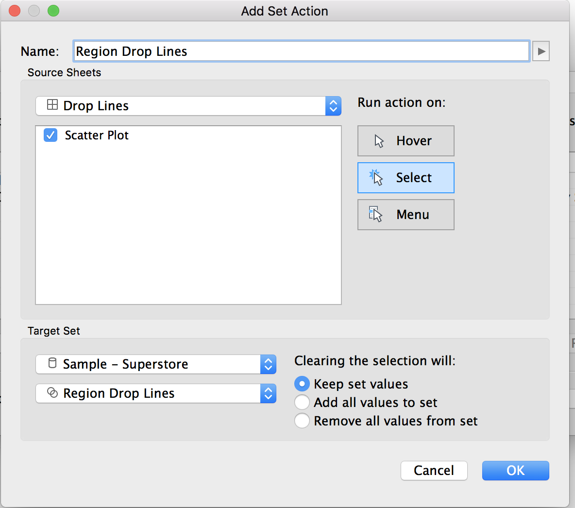
- Create a set based off the dimension on detail, region in my case. This can be done by right clicking on the dimension in the dimensions shelf and selecting create > set. Name the set “Region Drop Lines Set” and don’t change any of the settings.
- Create a new dashboard. Add the scatterplot worksheet to it.
- Add a new dashboard set action. This can be done by going to dashboard > actions > add action > change set values. Run the action on select, with clearing the selection keeping the set values.
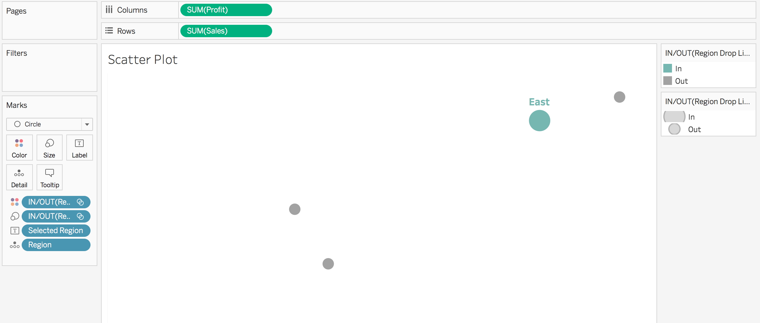
- Return to the scatterplot worksheet. Add the created set to the color shelf and, if desired, the size shelf (edit the size and reverse it, so the selected one is biggest).
- Right click on the sales and profit axis and unselect “show header”. Remove gridlines.
- Create a new calculated field called “Selected Region”
if [Region Drop Lines] then [Region] END
- Add “Selected Region” to the label mark. Change the alignment to center top and the color to match mark color.
- Add another instance of “Sales” to the rows shelf. Right click on the second (new) “Sales” pill and select dual axis. Synchronize the axis, uncheck show header, and remove the column and row dividers.
- Create a new calculation called “Selected Profit Ratio”
SUM(if [Region Drop Lines] then [Profit] END)
/
SUM(if [Region Drop Lines] then [Sales] END)
- Click on the second “Sales” pill to bring up the corresponding marks card. Remove the “Selected Region” from the label. Add “Selected Profit Ratio” to the label. Change the alignment to bottom left. Format to a percentage and change the font color/size to desired look. (I wanted mine to say “Profit Ratio” underneath only the selected city, so I created a calculation to do so: if [Region Drop Lines] then “PROFIT RATIO” END). Check “allow labels to overlap other marks”.

- Create two new calculations, one to isolate the selected region sales and one to isolate the selected region profit
Selected Region Salesif [Region Drop Lines] then [Sales] END
Selected Region Profit
if [Region Drop Lines] then [Profit] END
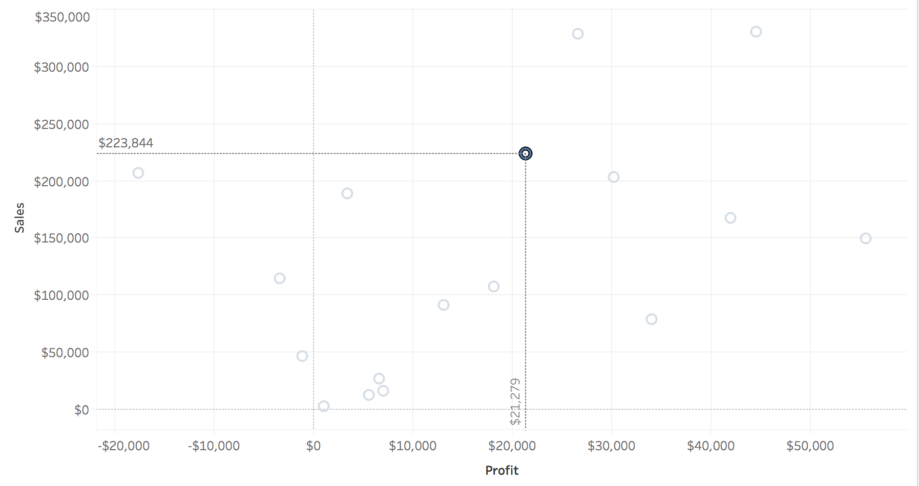
- Duplicate the current scatterplot worksheet and call it “Reference Lines”
- Remove the second sales pill from the rows shelf and the in/out of the created set from the color and size mark. Uncheck “show mark labels”
- Add “Selected Region Sales” and “Selected Region Profit” to the detail mark
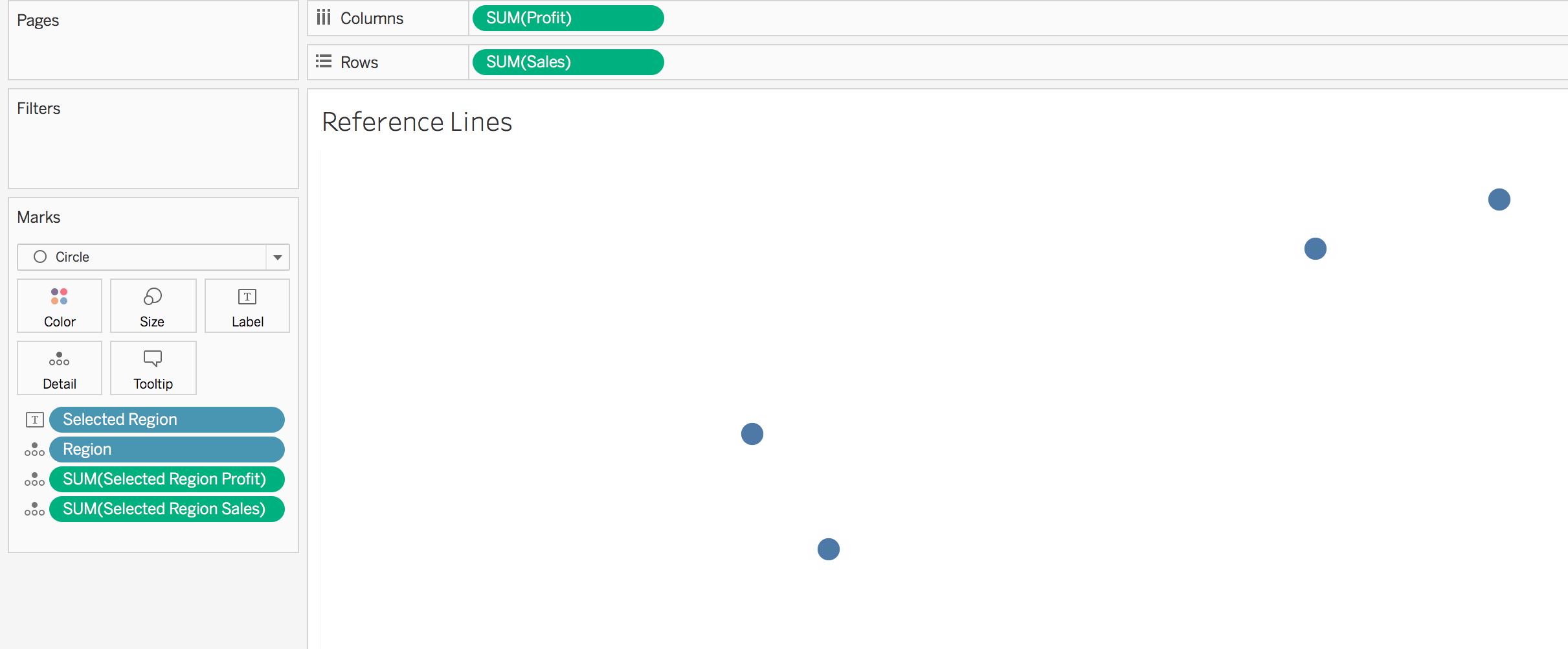
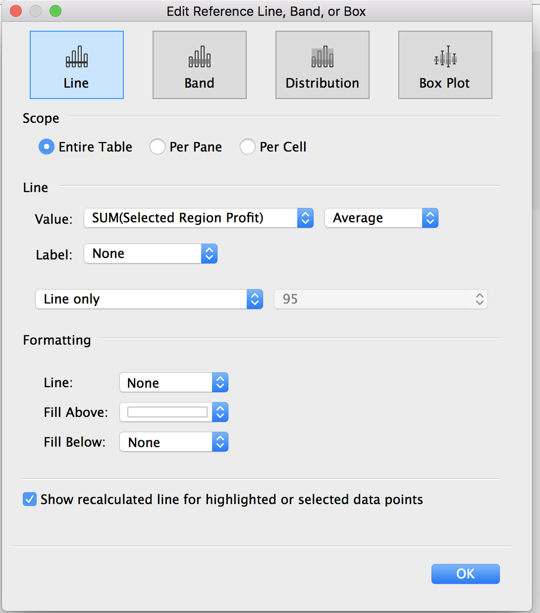
- On the analytics pane, add a reference line at the intersection of “Table” and “SUM(Profit)”. Change the value to SUM(Selected Region Profit) and format to desired look. Duplicate for sales.
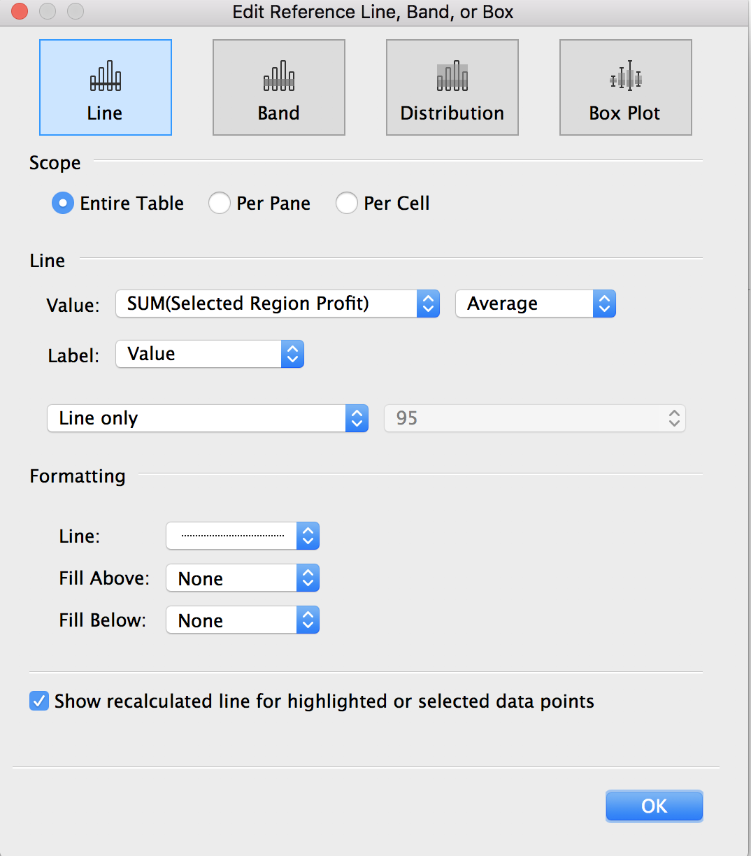
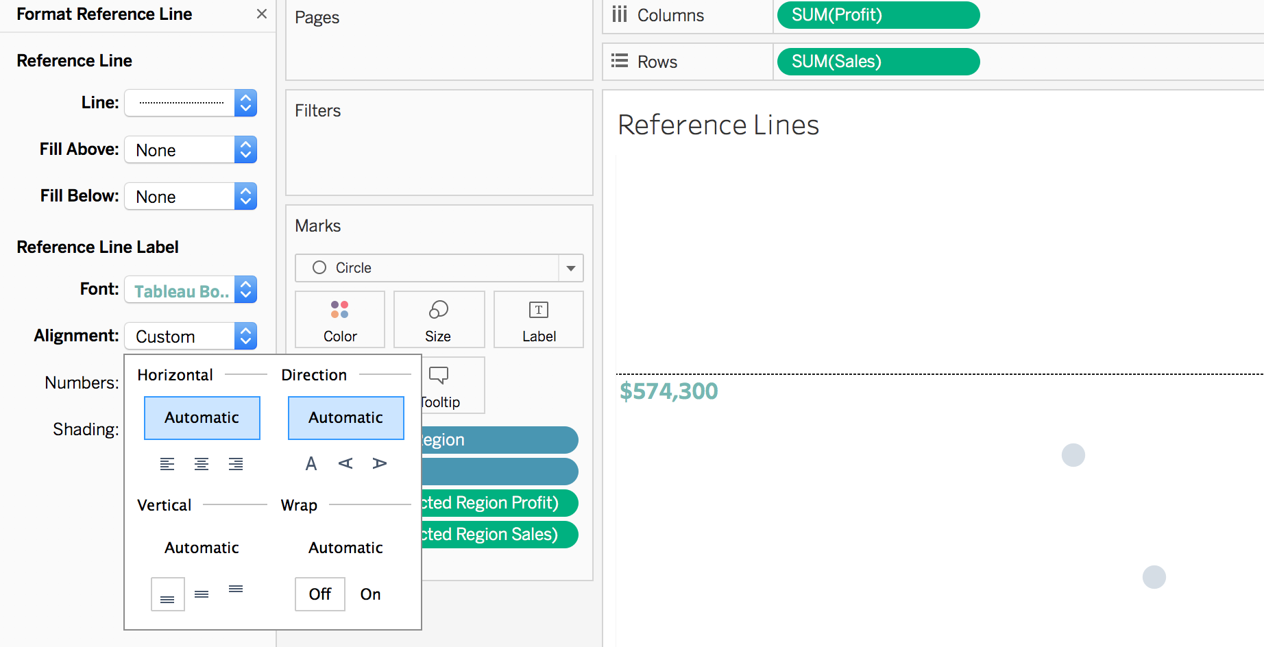
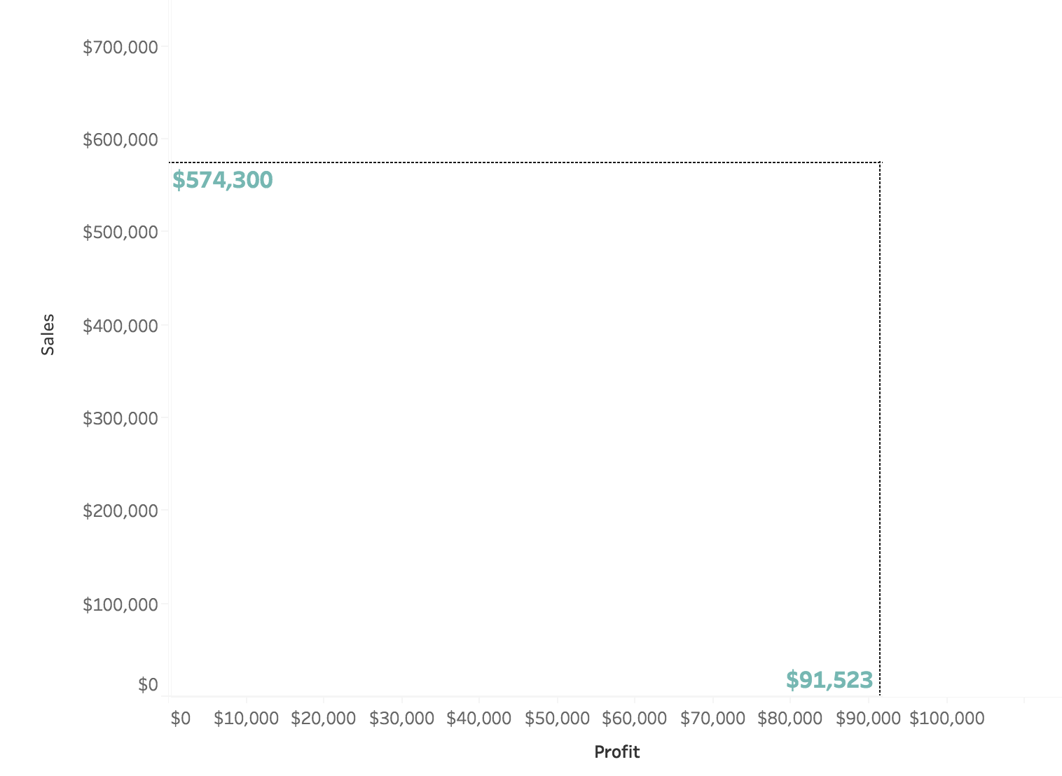
- Format the reference lines (right click on the reference line and select format). For the sales reference line, we want the label to have a vertical alignment of bottom (shown below). For the profit reference line, we want the label to have a horizontal alignment of left. This will prevent the labels from being cut off by our final layer.
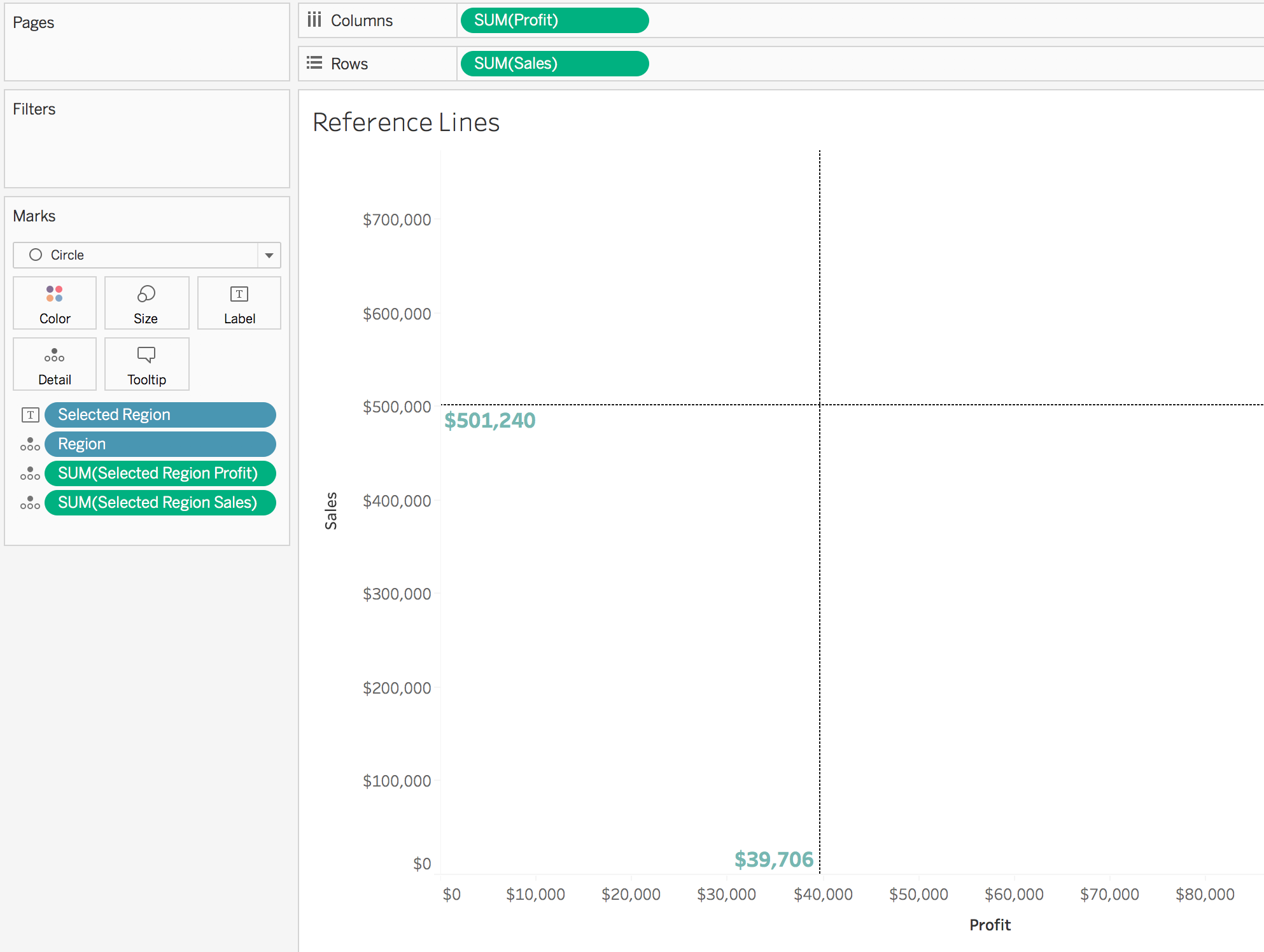
- Change the mark color to white. Click on the profit and sales pills and check shower header. This worksheet should now look like the following:
- Duplicate the “reference lines” worksheet as “middle layer”
- Edit both of the reference lines to have no line, no label and a fill above of white. Click on the profit and sales pills and uncheck show header. This should leave you with a worksheet that looks completely blank!
- Go back to the dashboard created in step 3. Add the “middle layer” and “reference lines” worksheets to it
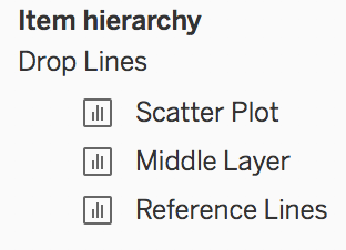
- Arrange the items so that the item hierarchy in the layout pane looks like the following:
- Change the background color of each of the three worksheets to none (right click on the worksheet > format > paint can)
- The easiest way to align the three worksheets is to begin by placing the reference lines worksheet in the desired position. Then, overlay the middle layer until it looks like this:
- Lastly, add the scatter plot worksheet on top, aligning the center of the selected circle with the intersection of the reference/drop lines
To view my working example on Tableau Public or to download my workbook, click here. Also, check out the other dashboards in the workbook detailing different ways use set actions. To view this method applied to Makeover Monday data, click here.