Viz in tooltips allow you to place entire worksheets inside the tooltip of another worksheet. This type of interactivity allows for additional information to be presented without taking up space on a dashboard (but be careful about placing important information in the tooltip, since you can’t be positive it will be seen). In the current viz in tooltip setup, you can choose which filters to apply to the viz in tooltip worksheet. Now, with set actions, there are additional ways to modify the viz in tooltip worksheet. Below are three ways to use set actions along with viz in tooltips. I am presenting all these options as viz in tooltips, however they could just as easily be added side-by-side on a dashboard instead of in the tooltip. Continue reading to find out how to build each of these visualizations.
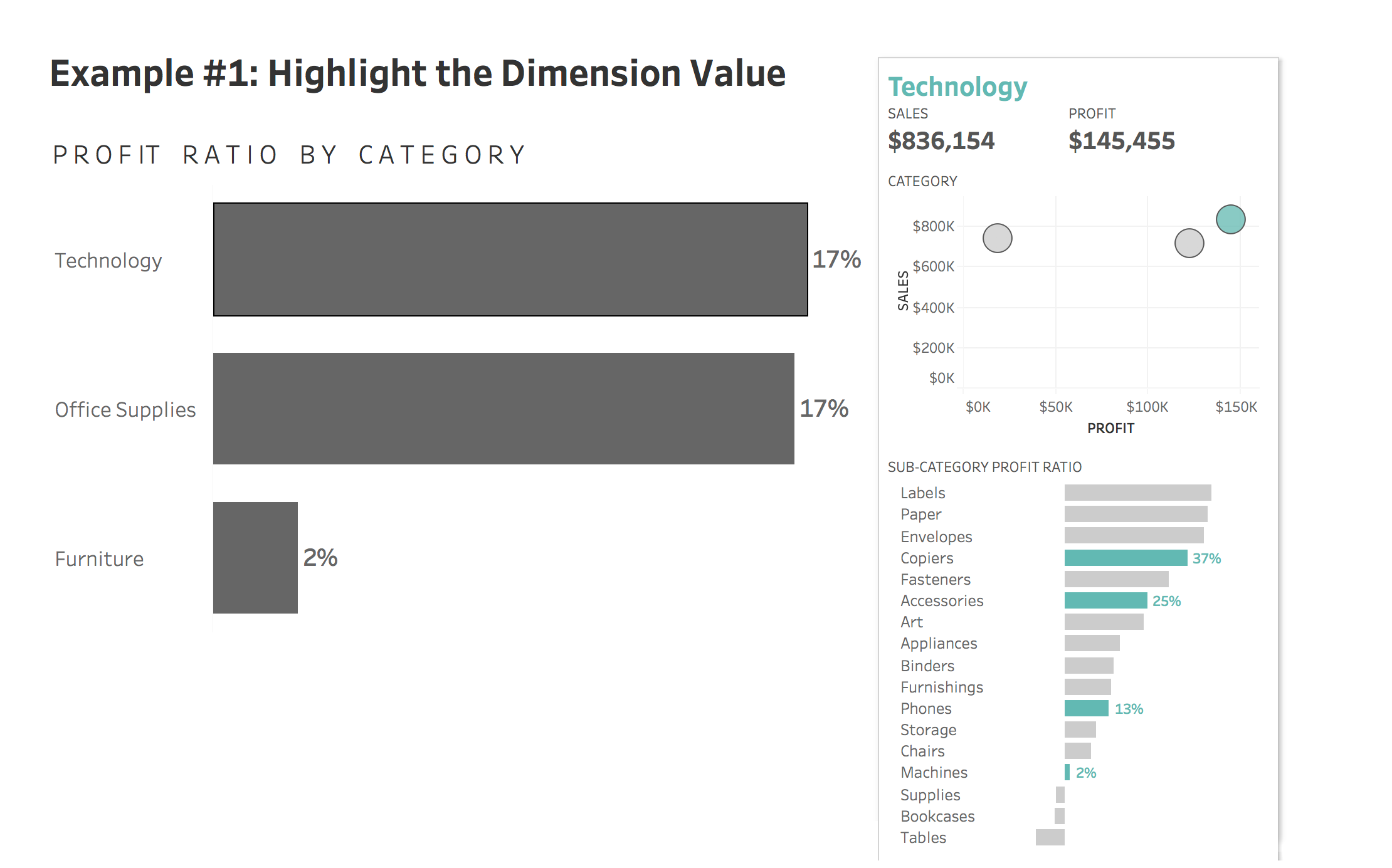

#1: Highlight the Dimension Value
How To
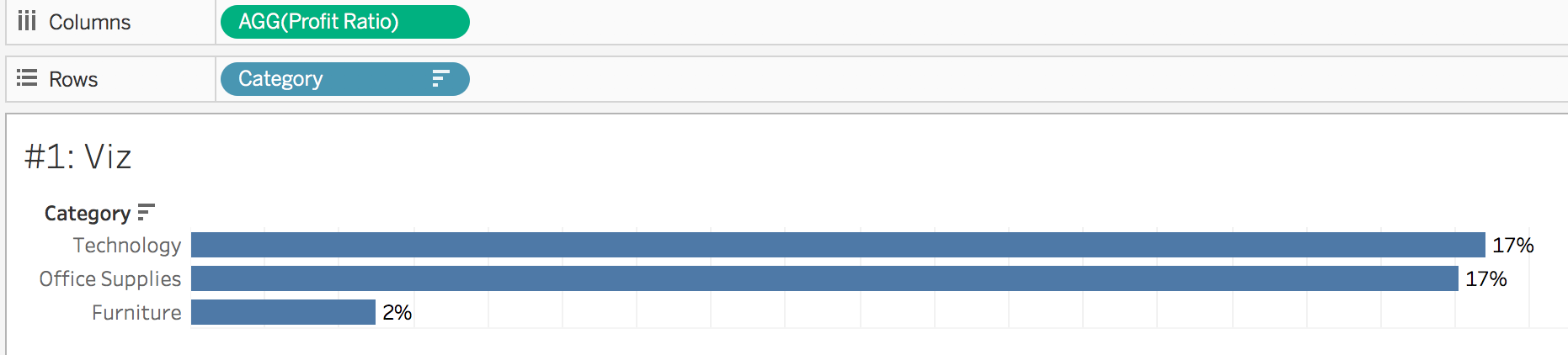
- Create a bar chart in a new worksheet with category on rows and profit ratio on columns. Sort category descending by profit ratio. Show mark labels and uncheck show header.
- Create a new worksheet to act as the viz in tooltip. Add profit to the columns shelf and sales to the rows shelf. Add category to the detail shelf.
- Create a new set based off category. To do this, right click on category in the dimension shelf and select create > set. Name the set Category Tooltip Set. Select a value of “Furniture” to allow us to have something in the set.
- Add the category tooltip set to the color shelf of the scatterplot tooltip worksheet

- Go to the profit ratio bar chart worksheet and edit the tooltip. Select insert > sheets and find the tooltip worksheet created in step 2.

- Delete the <All Fields> piece of the filter section. If we did not remove this section, the scatterplot would filter out the other categories.. but we want to keep them! The code in the tooltip should look like the following:
<Sheet name="#1: Tooltip" maxwidth="300" maxheight="300" filter="">
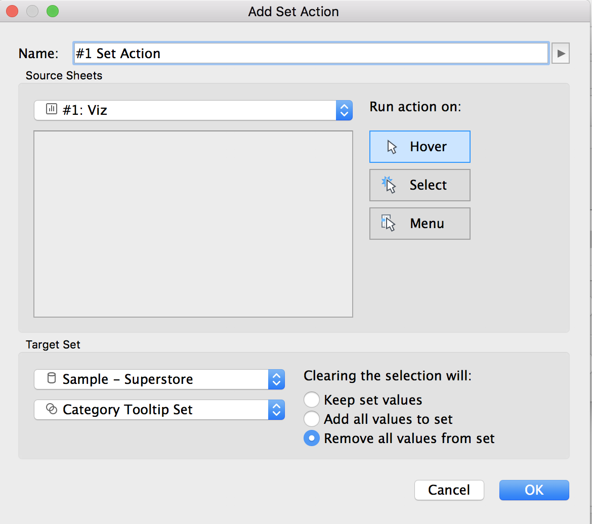
- On the bar chart worksheet, add a new set action. This can be done by going to worksheet > actions > add action > change set values. Run the action on hover, with clearing the selection removing set values. Note: ideally we would have the run action on hover, however at the time of writing, hover actions with tooltips can be laggy. The best user experience may involve changing the run action to select. Try both out and see what you prefer!
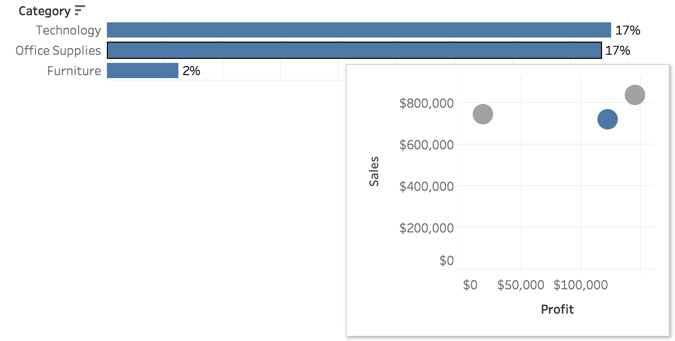
- Test it out! Hovering over a bar (such as office supplies) will then bring up a scatter plot with office supplies in blue.
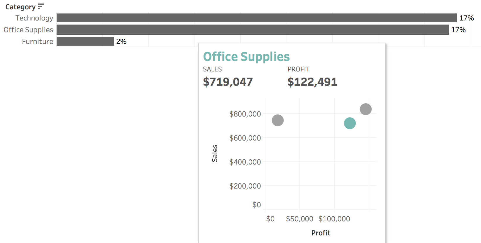
- On the bar chart worksheet, add sales and profit to the tooltip mark. Then, edit the tooltip to display those numbers so the user can see what makes up the profit ratio. Coloring the title of the category the same color as the highlighted (in the set) value can also help the user draw the connection.
To view my working example on Tableau Public or to download my workbook, click here. Also, check out the other dashboards in the workbook detailing different ways to use set actions.
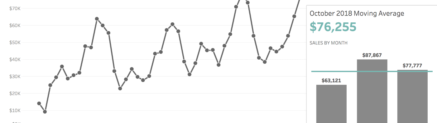
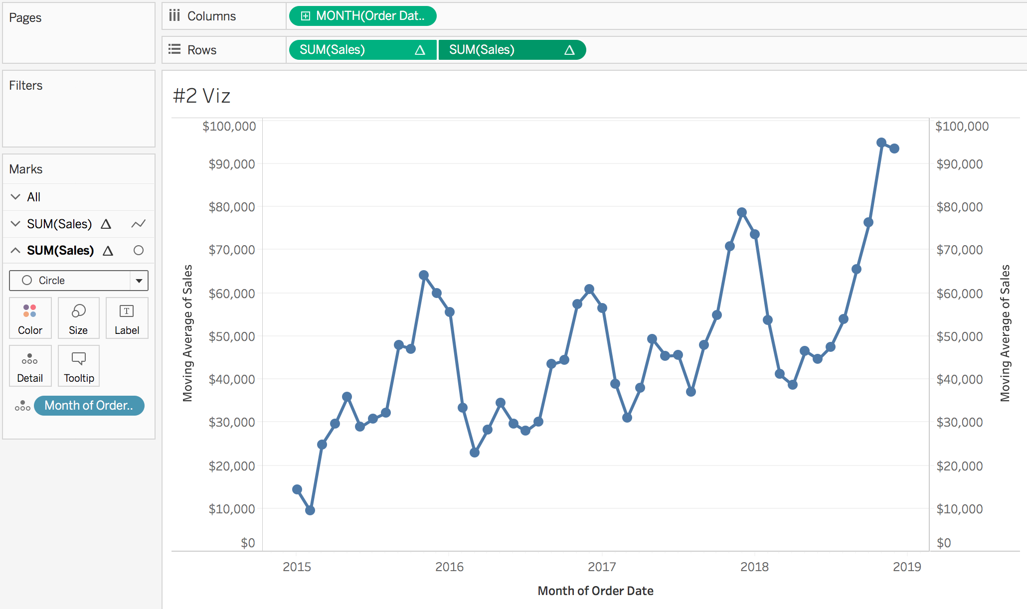
#2: Show the Values that Make Up a Moving Average
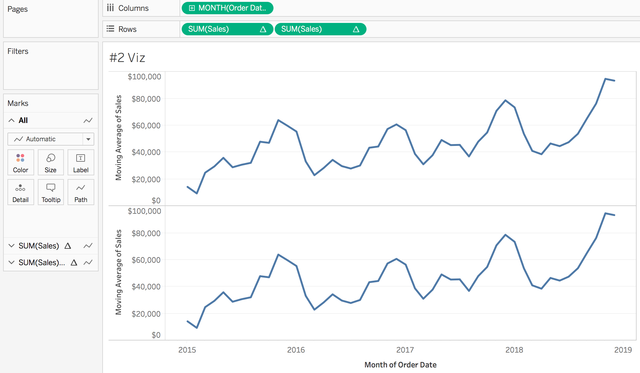
- Create a worksheet using sales on rows and month of order date on columns
- Click on the green sales pill on the rows shelf and select quick table calculation > moving average. The default is to use use the two previous months as well as the current month when computing the average. To change how many months are included, click on the green sales pill again and select edit table calculation. Then change the previous value. For this example, I am keeping it as it and not changing anything.
- Duplicate the sales pill on the columns shelf. This can be done by holding command on a Mac (control on a PC) and then clicking and dragging the sales pill. Or, add another instance of sales to the rows shelf and change it to moving average, as done in step 2.
- Create a new calculation called Month of Order Date. This has to be done in order to create a set off of the date.
-
STR(DATETRUNC('month', [Order Date])) - Click on the second sales pill on the rows shelf to bring up the corresponding marks card. Add the month of order date calculation created in step 4 to the detail mark.
- Click on the second sales pill on the rows shelf again and select dual axis. Then right click on the axis and select synchronize axis. At this point the dots won’t line up with the line!
- To ensure the dots are on top of the line, the table calculation needs to be updated. Click on the second sales pill on the rows shelf and select edit table calculation. Select compute using specific dimensions then check the second month of order date box (which is the calculation created in step 4).

- Click on the second sales pill on the rows shelf to bring up the corresponding marks card. Change the mark type from automatic to circle.
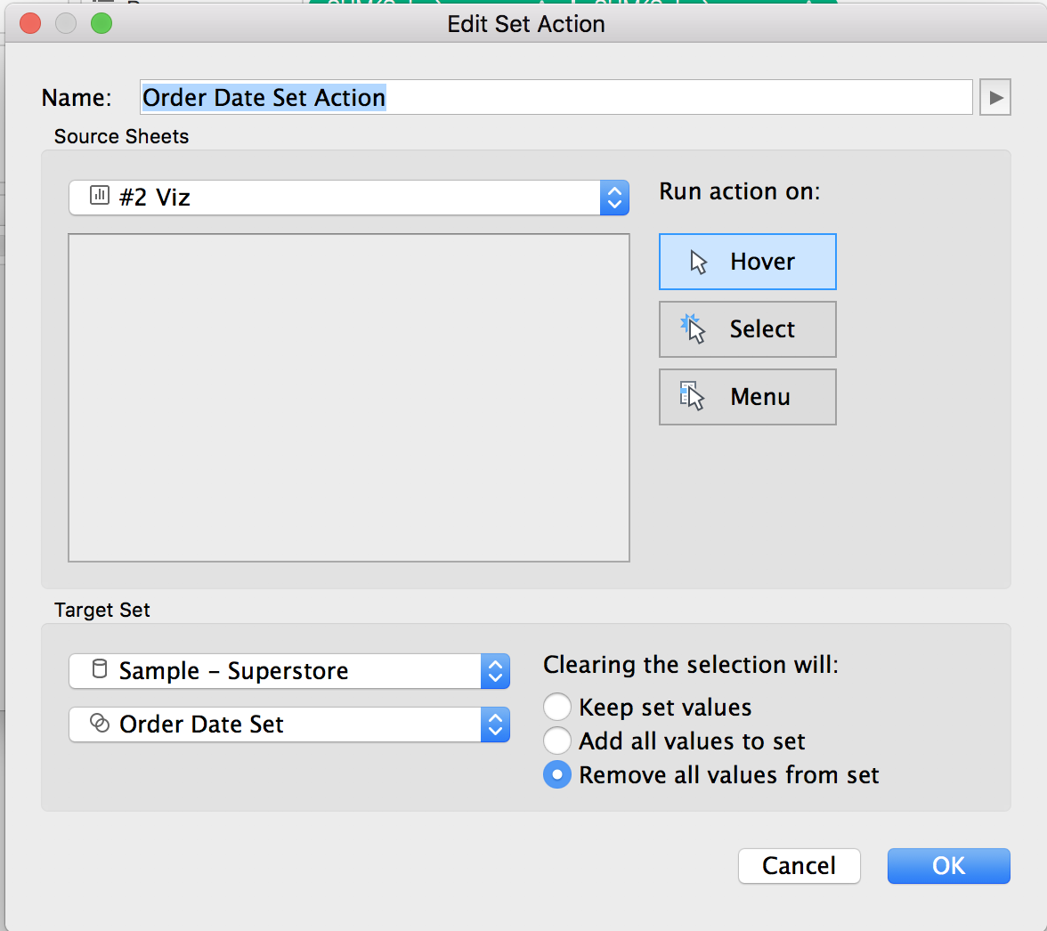
- Create a new set based off the month of order date calculation created in step 4.To do this, right click on month of order date in the dimension shelf and select create > set. Name the set Order Date Set. Select a value of “2015-06-01 00:00:00” to allow us to have something in the set.
- Create a new calculation called Months in Moving Average.
IF
DATETRUNC('month', [Order Date]) <= {MIN(DATETRUNC('month', if [Order Date Set] then [Order Date] END))}
AND
DATETRUNC('month', [Order Date]) >= DATEADD('month', -2, {MIN(DATETRUNC('month', if [Order Date Set] then [Order Date] END))})
THEN "In Moving Average"
ELSE
"Out of Moving Average"
END
What is this calculation doing? First, it is isolating which order date is selected in the set. Adding the LOD around it allows for every row in the dataset to be compared to the selected order date. Then, it’s saying if the order date of an individual row is less than (i.e. before) or equal to the order date in the set AND the order date of an individual row is greater than (i.e. after) or equal to two months (or how many months are in the moving average) before the date in the set… then assign a value of “In Moving Average”
- Create a new worksheet to act as the viz in tooltip. Add months in moving average to the filters shelf and select “In Moving Average”
- Add order date to the columns shelf and change it to month and discrete. Add sales to the rows shelf and change the mark type to bar (or vice versa)
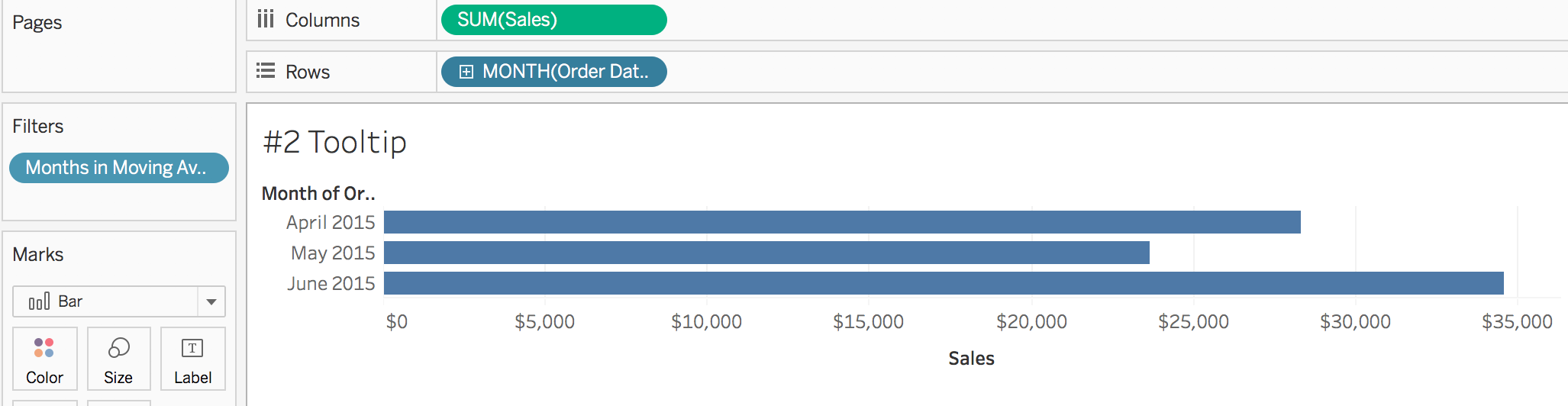
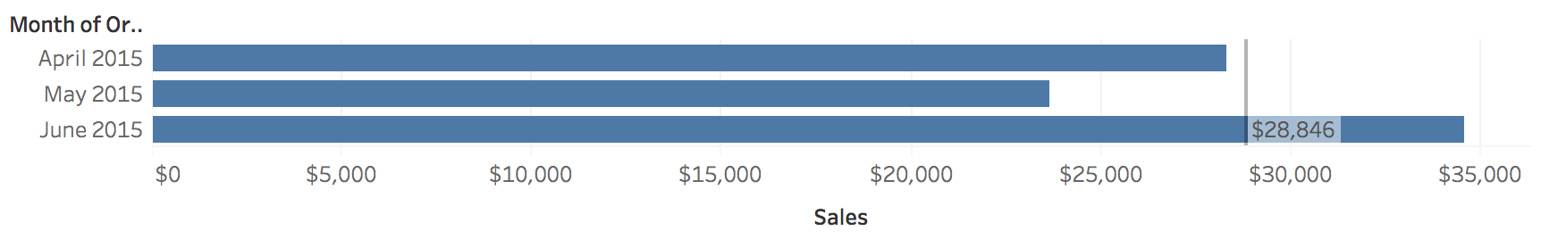
- In the analytics pane, add an average line to the table. Edit the reference line so the label is the value
- Change the view from standard to entire view (a dropdown in the menu).
- Go back to the main visualization with the line chart. Select the second sales pill on the rows shelf to bring up the corresponding marks card. Edit the tooltip and select insert > sheets and find the tooltip worksheet created in step 12.
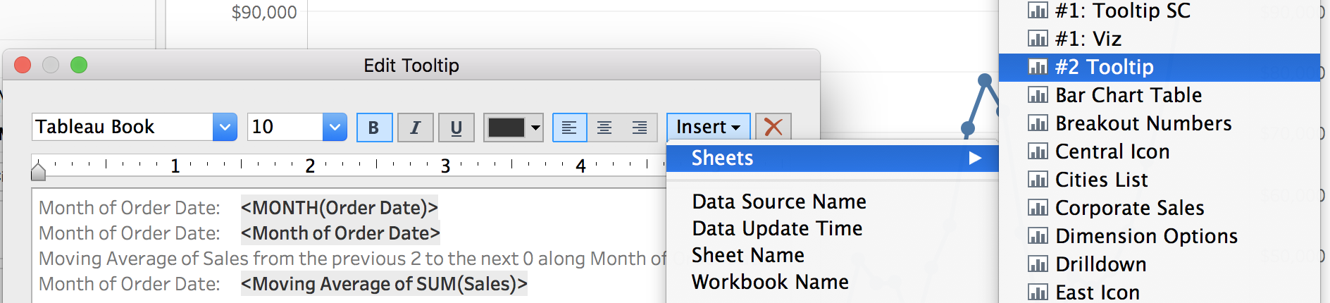
- Delete the <All Fields> piece of the filter section. If we did not remove this section, the the previous months would be excluded from the bar graph.. but we want to keep them! The code in the tooltip should look like the following:
<Sheet name="#2 Tooltip" maxwidth="300" maxheight="300" filter="">
- Select the first sales pill on the rows shelf to bring up the corresponding marks card. Edit the tooltip and delete out the text
- On the line chart worksheet, add a new set action. This can be done by going to worksheet > actions > add action > change set values. Run the action on hover, with clearing the selection removing set values. Note: ideally we would have the run action on hover, however at the time of writing, hover actions with tooltips can be laggy. The best user experience may involve changing the run action to select. Try both out and see what you prefer!
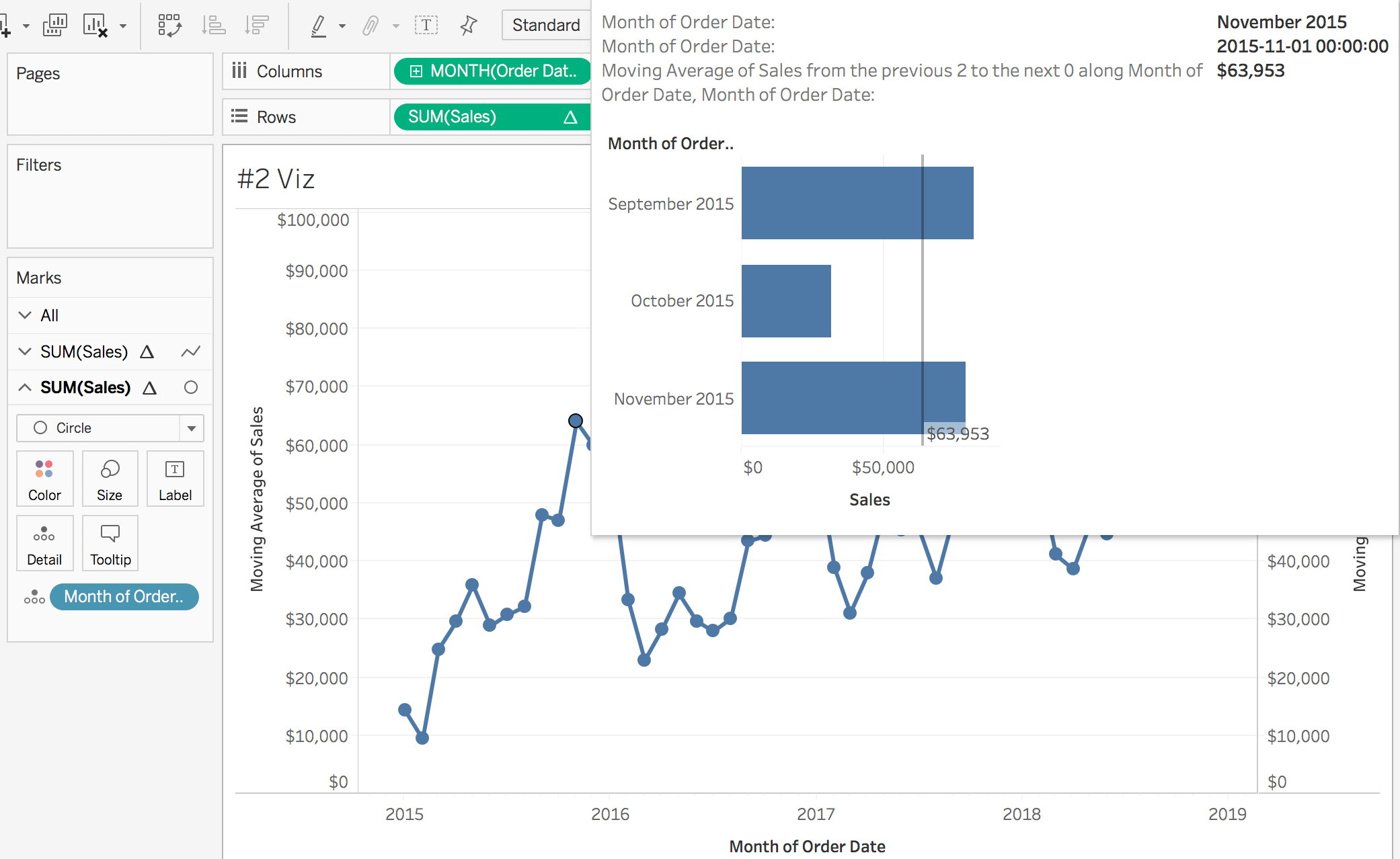
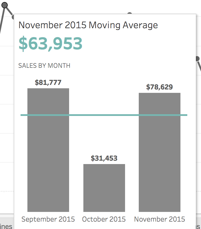
- Test it out! Hovering over a point, such as November 2015, will show the sales value that make up the moving average of $63,953 (September 2015, October 2015, November 2015).
- Clean it up!
To view my working example on Tableau Public or to download my workbook, click here. Also, check out the other dashboards in the workbook detailing different ways to use set actions.
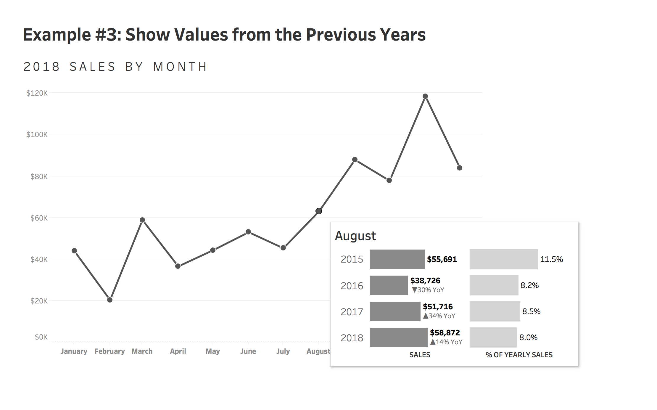
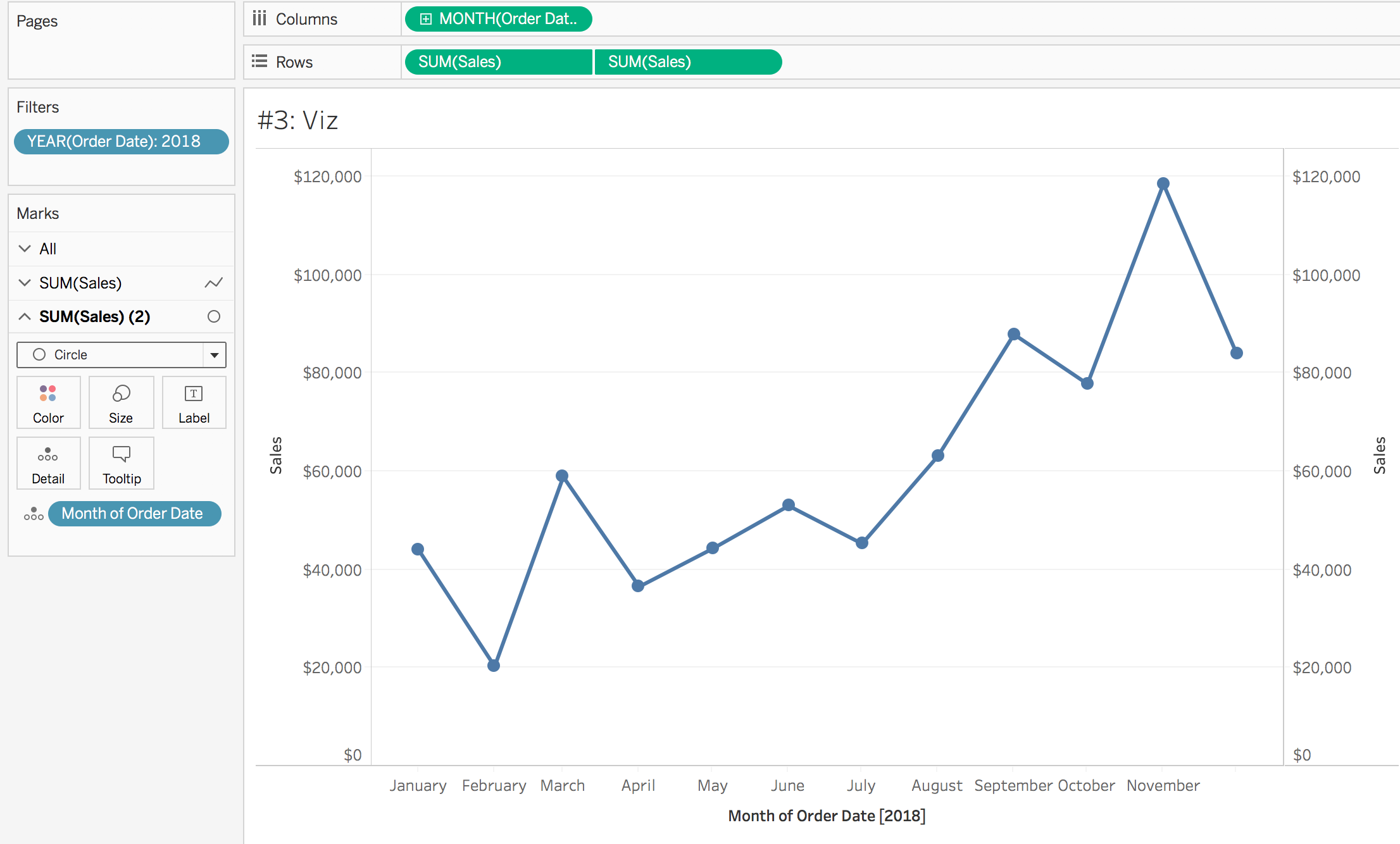
#3: Show Values from the Previous Years
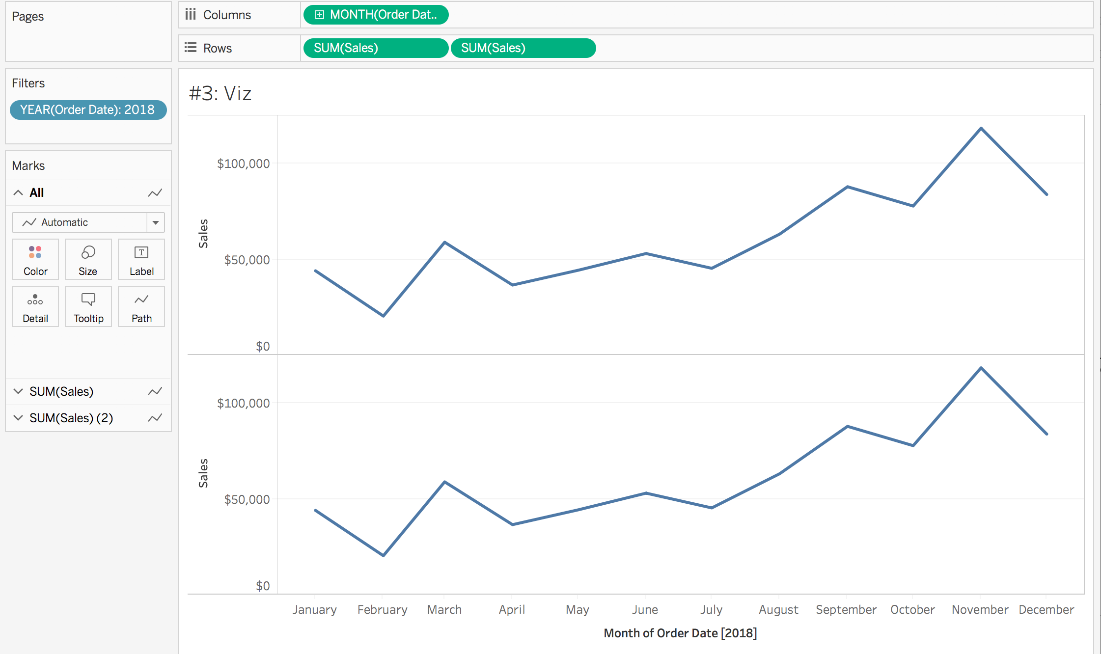
- Create a worksheet using sales on rows and month of order date on columns
- Duplicate the sales pill on the columns shelf. This can be done by holding command on a Mac (control on a PC) and then clicking and dragging the sales pill. Or, drag a new instance of sales to the rows shelf.
- Add a filter to the filters shelf to only show values for the year 2018.
- Create a new calculation called Month of Order Date. This has to be done in order to create a set off of the date.
STR(DATETRUNC('month', [Order Date])) - Click on the second sales pill on the rows shelf to bring up the corresponding marks card. Add the month of order date calculation created in step 4 to the detail mark.
- Click on the second sales pill on the rows shelf again and select dual axis. Then right click on the axis and select synchronize axis. Change the mark type from automatic to circle
- Create a new set based off the month of order date calculation created in step 4.To do this, right click on month of order date in the dimension shelf and select create > set. Name the set Order Date Set. Select a value of “2015-06-01 00:00:00” to allow us to have something in the set.
- Create a new worksheet to act as the viz in tooltip. Add year of order date to the rows shelf
- Create a new calculation called months to show
{MIN(DATEPART('month', if [Order Date Set] then [Order Date] END))} = DATEPART('month', [Order Date])What is this calculation doing? First, it is isolating which month is in the set. Then, through the date part function, it is pulling back only the month (no day, no year). By wrapping that piece in a LOD, we can add that value into every single row in the dataset. Lastly, we are taking the month of the order date of the selected row and saying is it the same or different as the month of the date in the set.
- Create a new calculation called selected months sales. This will only return the sales when the month of the row is equivalent to the month of the date in the set.
if [Months to Show] then [Sales] END
- Add selected months sales to the columns shelf and change the mark type to bar
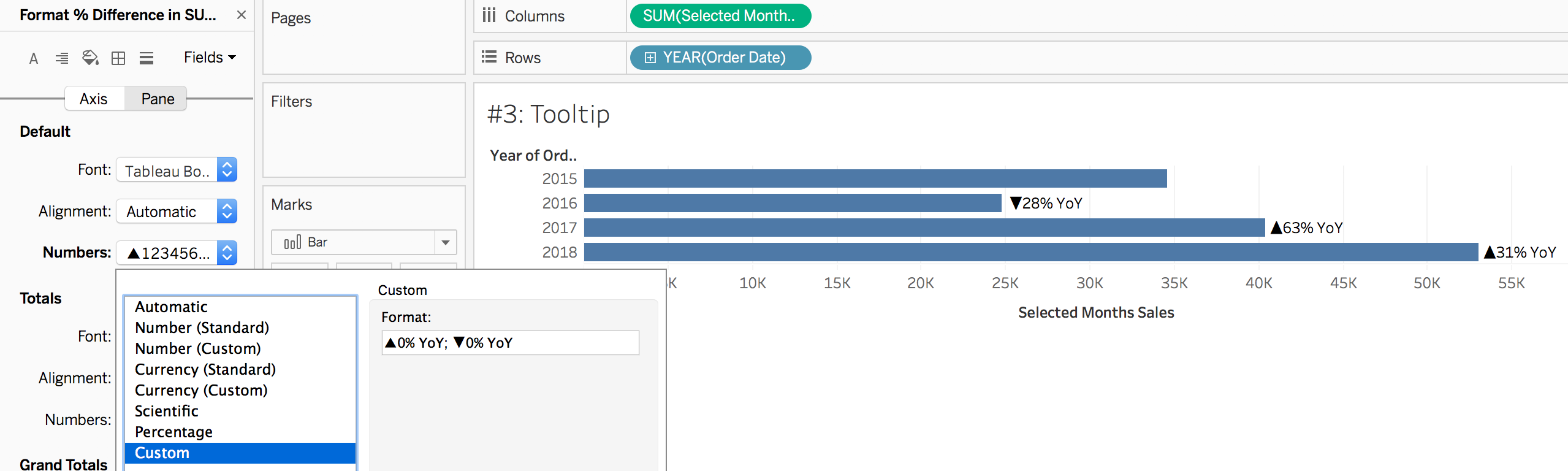
- Add selected month sales to the tooltip mark. Click on the pill and select quick table calculation > percent difference. Click on the pill again and select format. Change the number formatting to custom and type in the following:
▲0% YoY; ▼0% YoY
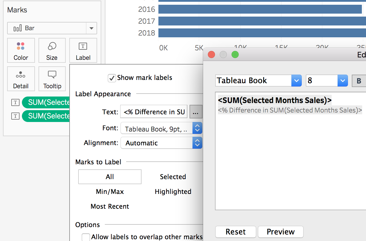
- Add selected months sales to the label mark again. Edit the formatting of the label so that the sales value appears with the YoY change below it. Update the formatting of the selected months sales to be currency.
- Change the fit of the view from standard to entire view using the dropdown in the top menu.
- Add sales to the columns shelf. Click on the sales pill on the columns shelf to bring up the corresponding marks card. Remove the two selected month sales pills. Add months to show to color.
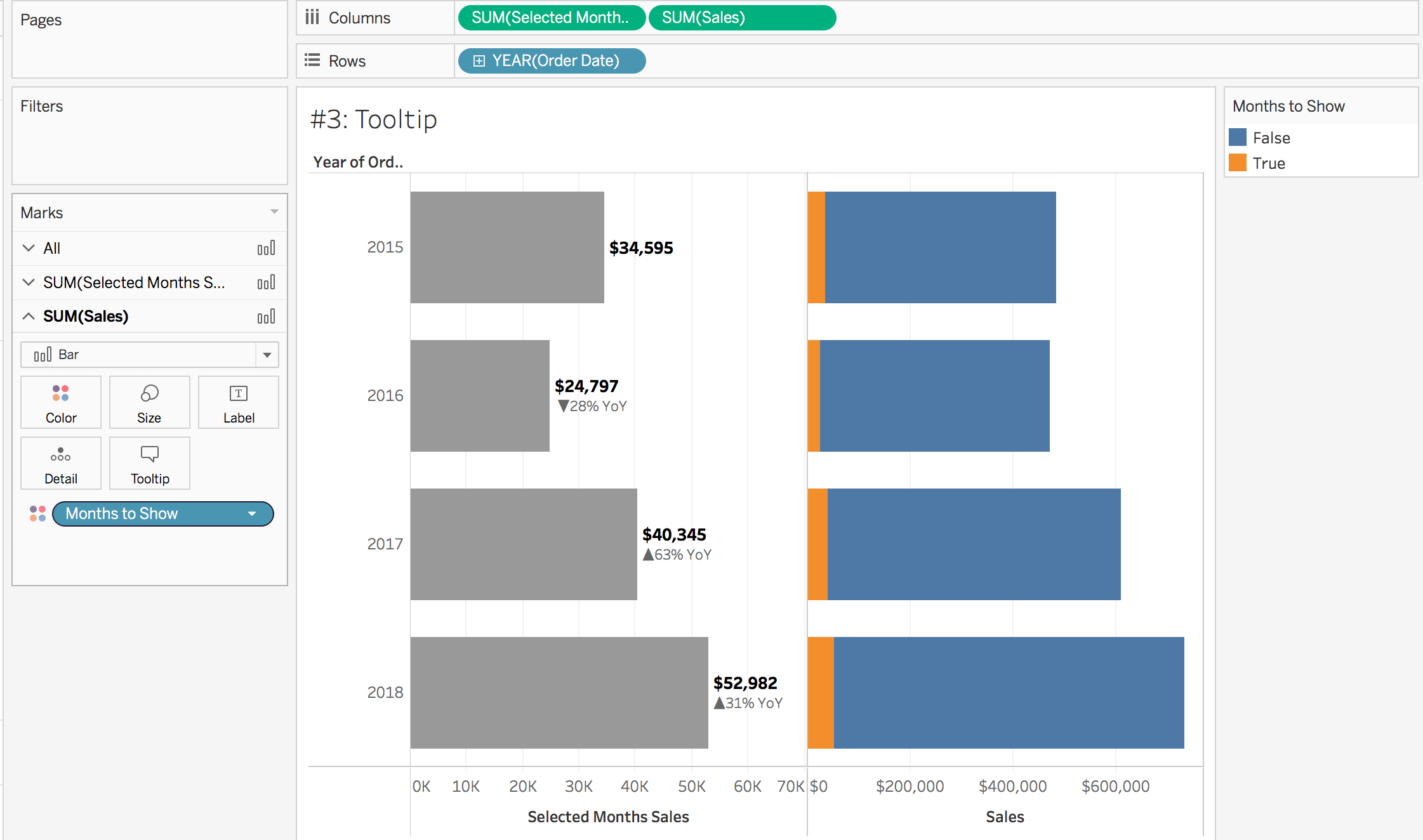
- Click on the sales pill on the columns shelf and select quick table calculation > percent of total. Then, click on the sales pill again and select compute using > table across. This tells us for the entire year of sales, what percentage does the selected month make up?
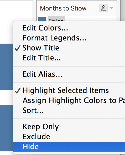
- Right click on the value of “false” in the months to show legend and select hide.
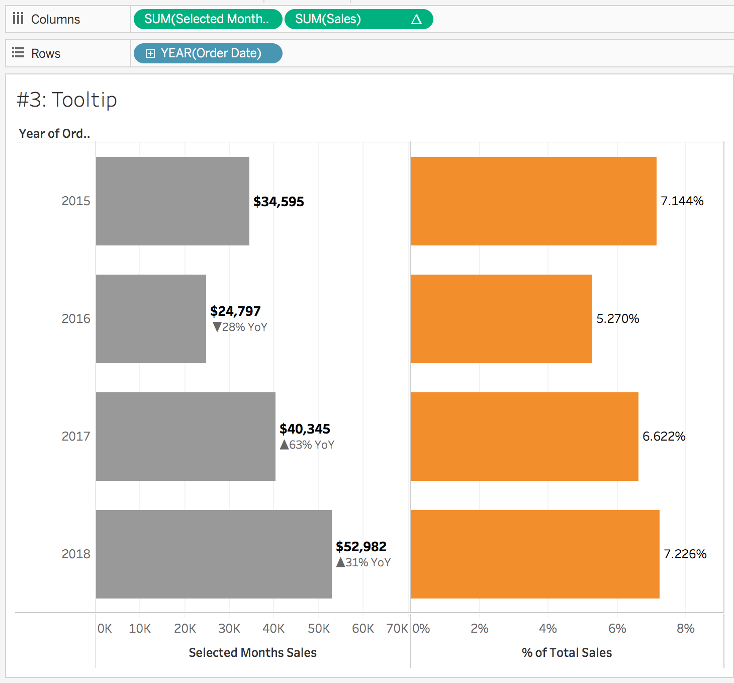
- Click on the sales pill to bring up the corresponding marks card. Click on label and select show mark labels. In our set is the value June 1, 2015. So, this view is saying June 2015 was 7.144% of 2015 sales while June 2016 only contributed 5.27% to overall 2016 sales.
- Right click on the selected months sales axis and select edit axis. Change the tick marks to none. Repeat for % of total sales. This will allow the axis to serve as the description of what metric is being displayed.
- Go back to the main visualization with the line chart. Select the second sales pill on the rows shelf to bring up the corresponding marks card. Edit the tooltip and select insert > sheets and find the tooltip worksheet
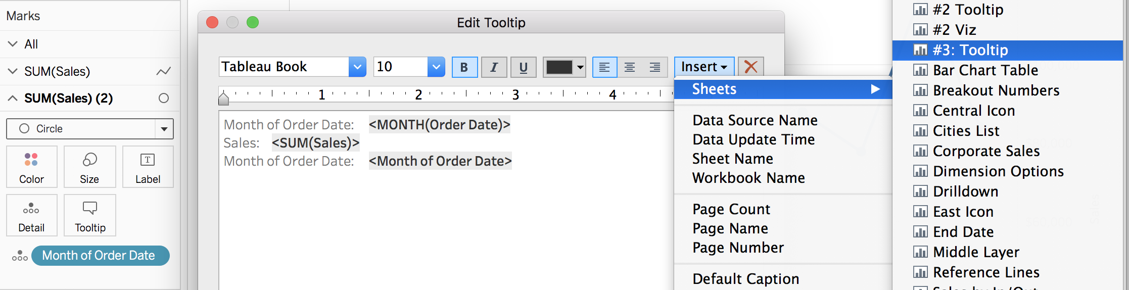
- Delete the <All Fields> piece of the filter section. If we did not remove this section, the the previous years would be excluded from the bar graph… but we want to keep them! The code in the tooltip should look like the following:
<Sheet name="#3: Tooltip" maxwidth="300" maxheight="300" filter="">
- Select the first sales pill on the rows shelf to bring up the corresponding marks card. Edit the tooltip and delete out the text
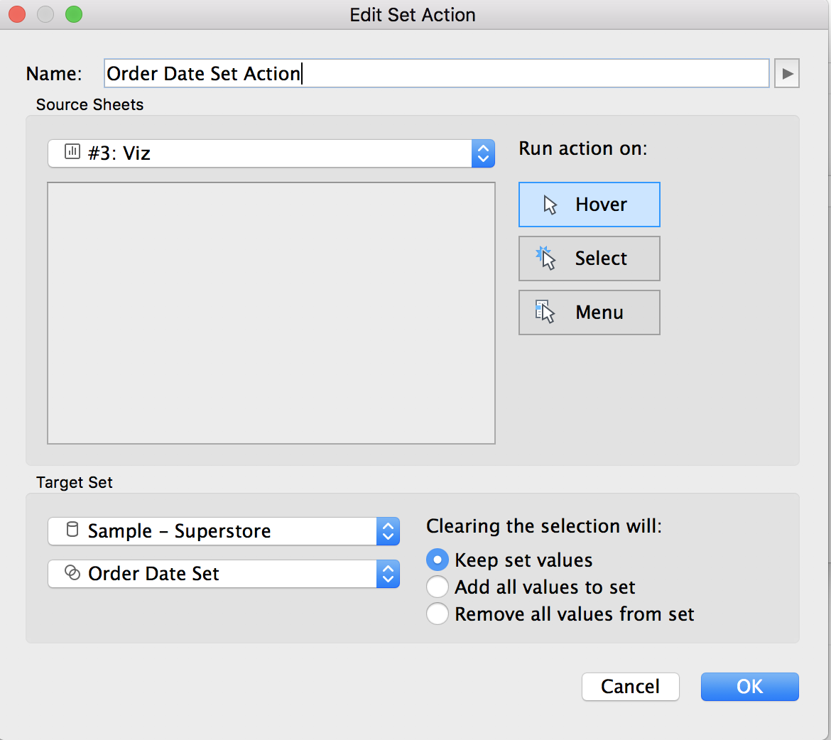
- On the line chart worksheet, add a new set action. This can be done by going to worksheet > actions > add action > change set values. Run the action on hover, with clearing the selection keeping set values. Note: ideally we would have the run action on hover, however at the time of writing, hover actions with tooltips can be laggy. The best user experience may involve changing the run action to select. Try both out and see what you prefer!
- Test it out! Hovering over a point should bring up the previous years values
- Clean it up!
To view my working example on Tableau Public or to download my workbook, click here. Also, check out the other dashboards in the workbook detailing different ways to use set actions.