
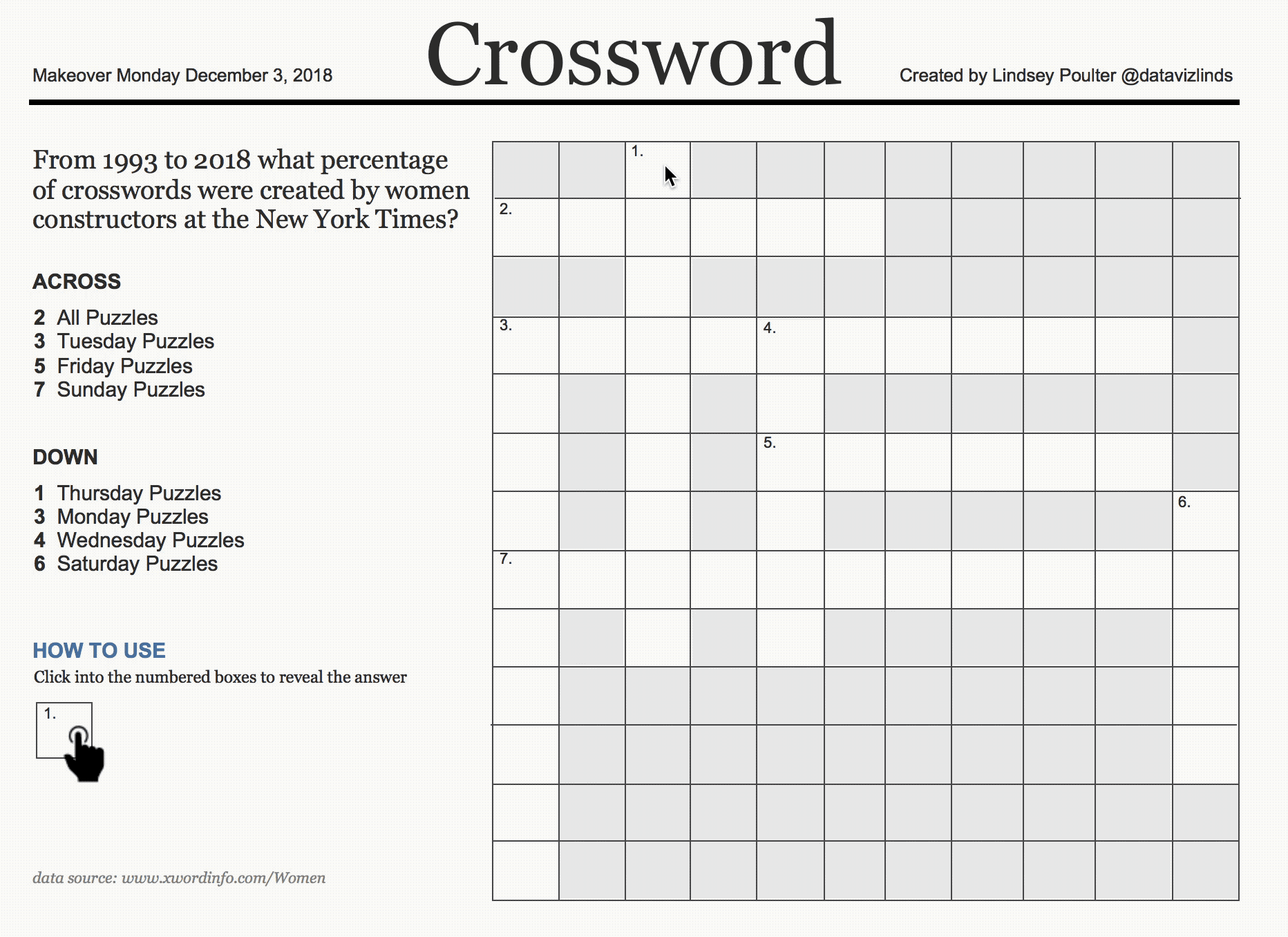
This week’s Makeover Monday looks at all the crossword puzzles created in the New York Times from 1993-2018 and breaks down how many of them were by women (with the caveat that 1993/2018 are partial years and puzzles where women collaborated are counted as by women). I almost passed on doing Makeover Monday this week, until I saw Charlie Hutcheson tweet about leaving it to someone to create a crossword style grid. That’s when I had a lightbulb moment of what if I try to create an actual crossword…. using SET ACTIONS (which are my obsession as of late). Here is my end result, but read on for my process of how I created it.
Getting Started
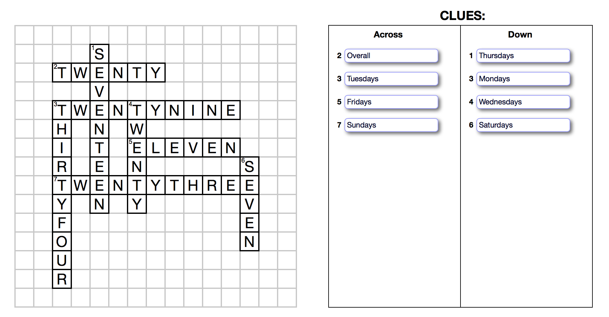
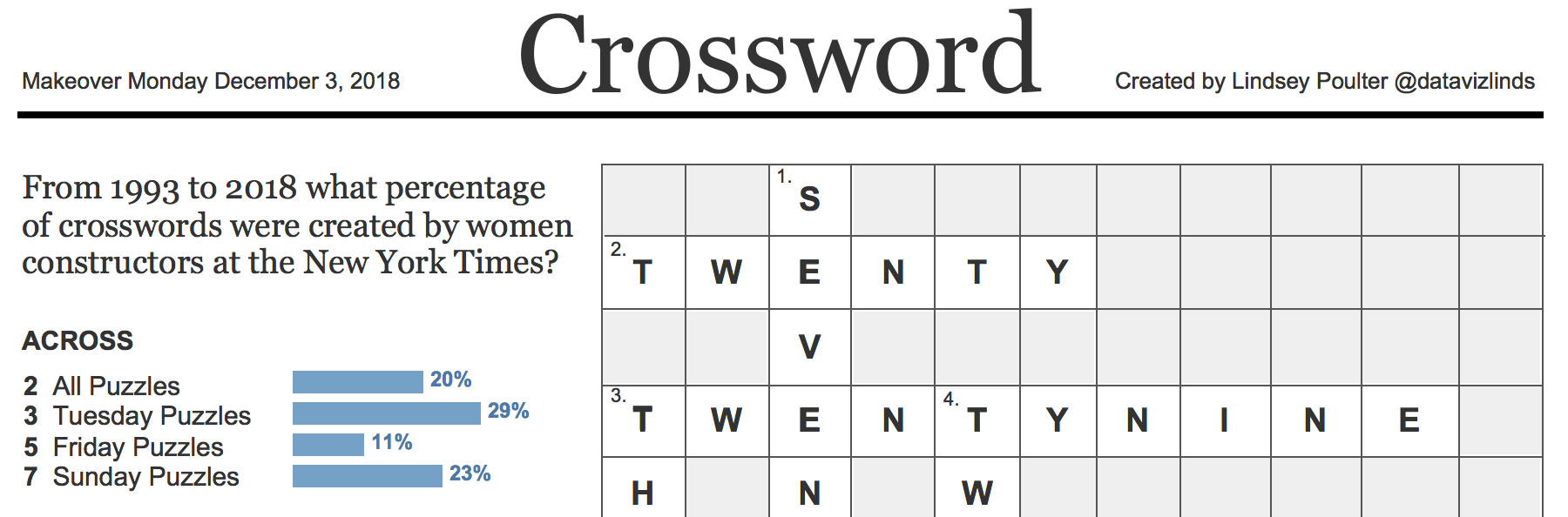
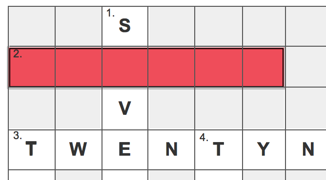
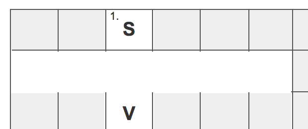
The first thing I needed to do was create an actual crossword. What values would be in it and what would the clues be? The easiest thing I decided was to just use the total percentages for women constructors for each day of the week (and the overall total). I then put the answers/clues into Crossword Hobbyist, which spit out the following:
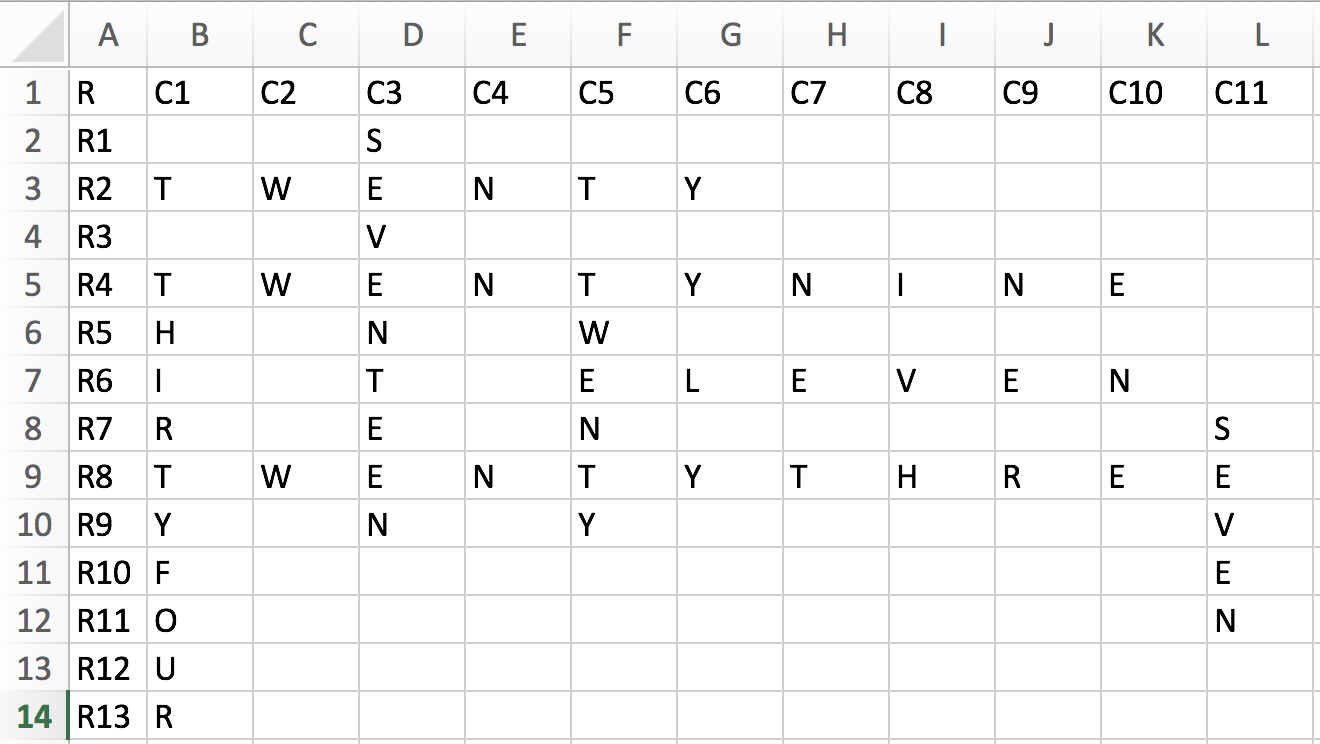
The next step was to figure out how to translate this into something Tableau could read. I went with replicating the exact grid above in an Excel spreadsheet:
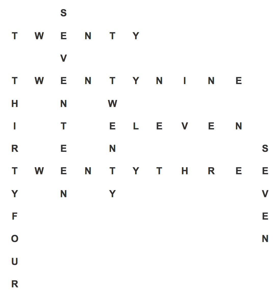
I then uploaded the data into Tableau. I had to use advanced table layout settings to allow me to show 11 columns and change null values to a space to prevent from showing the word null.
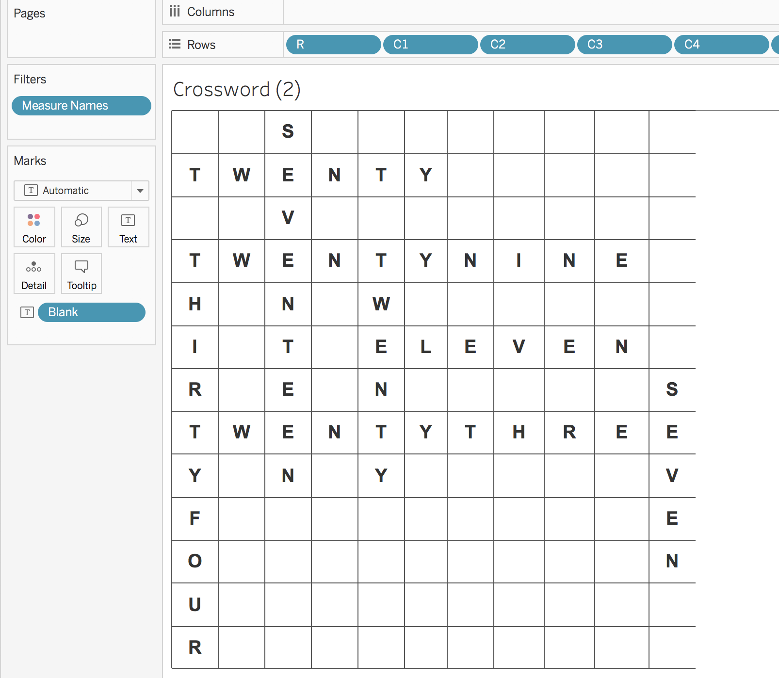
Because the way I set the data up, everything was treating as dimension headers, so I didn’t have many formatting options for what to show as a white square (where a letter would go) and what to show as a grey square (no letter). I decide to just create multiple text boxes with a light grey background and transparency. I then placed those on top of every box that did not hold a letter.
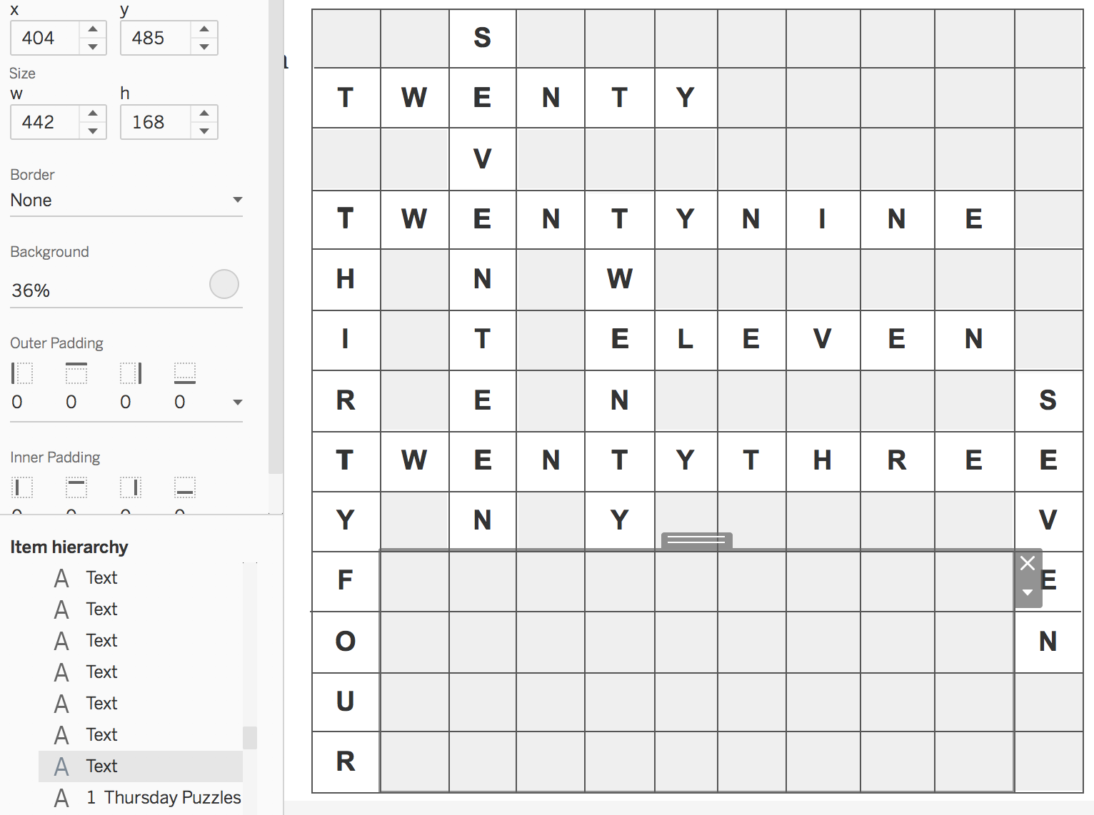
I wanted my header and styling to mimic that of the New York Times, so I googled what the crossword section looks like. This is one of the first things that came up.
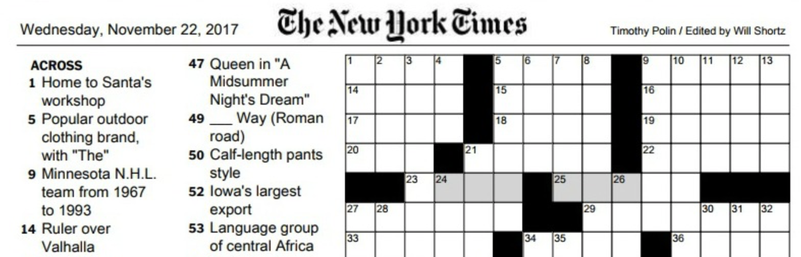
I decided to mimic my header and clues off of their formatting, One of the examples of the crossword in the actual newspaper had the title has “Crossword”, so I decided to use that as well.
Set Actions
The most challenging part of getting this example setup was the set actions. I knew I would have to do something similar to the methodology I described in my blog post about using icons to add and remove values from a set. I adapted this methodology for this viz by:
- Adding a worksheet to the dashboard that had all the text values in it.
- Creating a set for each word (8 total). All sets were based off of the “row” dimension. It doesn’t really matter in this scenario which row value is selected. I just needed some value to say either “in” or “out” that I could use in a calculation and would be updated when the user clicks on the area where a word is suppose to go.

- Creating a calculation for each word (8 total) that would make use of the set value.
if [1 down] then 0 else 1 END
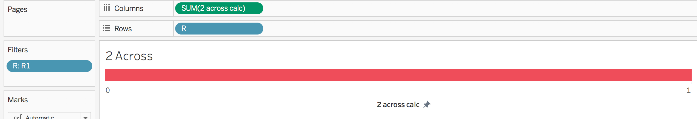
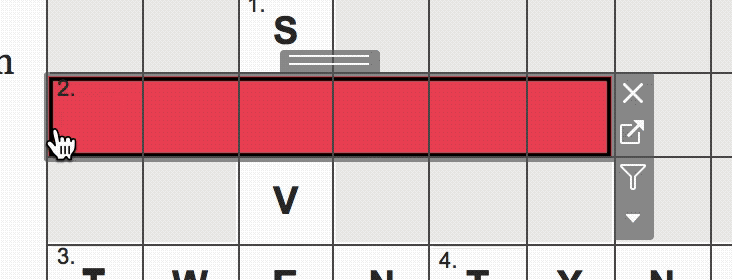
- Creating a worksheet for each (8 total) that utilized the calculated fields created in step 2. When a value is OUT of the set (or no value is in the set at all), such as it is below, the calculation returns a 1, which in turn creates a bar chart.
When a value is IN the set, a 0 is returned, such as below. You can tell the bar is still kind of there with the tiny pink slice on the very left.
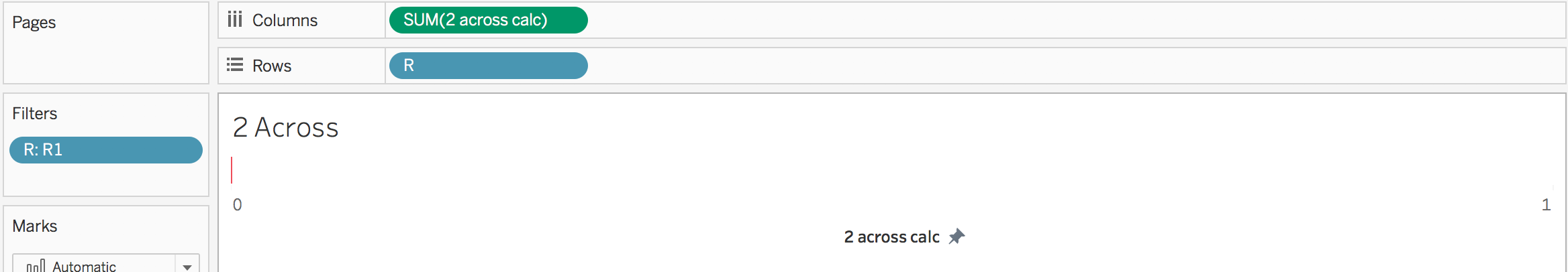 I fixed the axis from 0 to 1 in order for when something is out the set, for it to take up the entire view. I also set the background to be transparent.
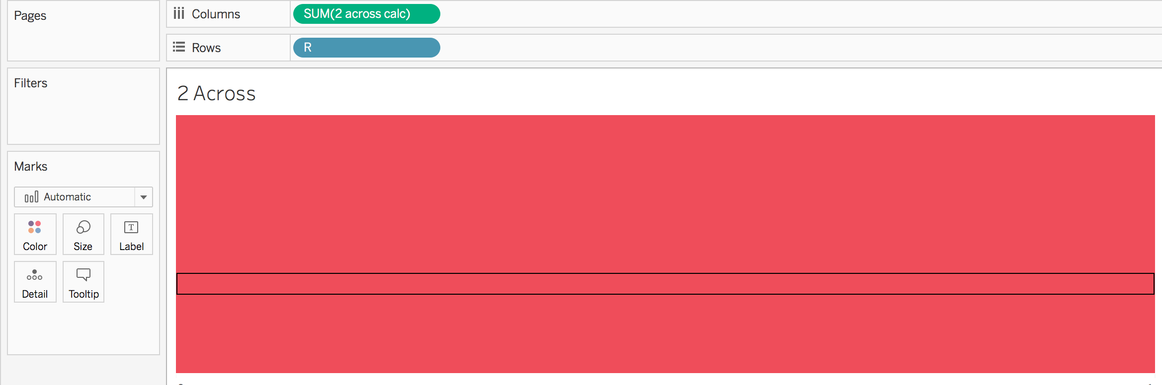
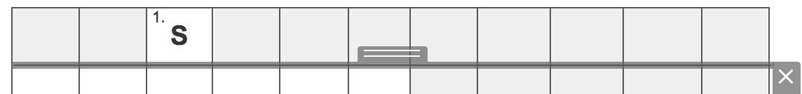
One last thing, I put a filter of “row 1” on the filters shelf (even though row 1 doesn’t actually correspond to 2 across… it doesn’t matter!). Then on the next word, I put the filter to “row 2”. However, since each set is separate, all words could have a filter of “row 1” on them. The point of the filter is to prevent the viz from doing something like below, where there are multiples things that can be selected on the view
- I then placed the created worksheet for each word on top of the viz added to the dashboard in step 1
- I then added a set action for each word (8 total) to update the associated set. I set the action to run on select and remove all values when cleared. That then allowed the word to operate like this:
- Seems easy enough right? There are a few little things I glossed over (and the areas I spent the most time trying to figure out!)
- I originally had the grid lines on the same worksheet as the text. However, when I added the worksheets on top to show/hide the word…. it went on top of the gridlines!
Since I couldn’t make the bar itself transparent (and I didn’t want to mess with trying to align reference lines or something)…….. I created a BUNCH of text boxes and placed them above all the worksheets (very manual I know)
- I needed to figure out what to do when 1 down was selected but 2 across wasn’t! Because the 2 across worksheet was above the 1 down worksheet…. it made the intersection not show up!
So what did I do? I created a worksheet for each intersection that said… if either of the sets is selected show the E (or whatever letter). I then placed this worksheet above the 1 down and 2 across worksheets.if [1 down] OR [2 Across] then "E" END
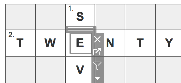
- What I just described previously created one more problem for me…. people would expect to click on the first box of a word and have it appear. However, because there was a special intersection worksheet there…. it didn’t work!
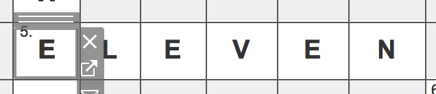
So, I duplicated the 5 across worksheet (what I created in step 4), changed the opacity of the bar down to 0 and then overlaid that on above the original 5 across and the intersection worksheet - The last caveat I had to ensure was to think about the order of how the worksheets were placed so that one word’s worksheet didn’t overlap another word’s worksheet in a way that made it not work
- I originally had the grid lines on the same worksheet as the text. However, when I added the worksheets on top to show/hide the word…. it went on top of the gridlines!
- The last thing I wanted to do was to show next to the clues, a bar chart representation of the numbers after they have been unveiled. Because I never used the actual dataset, I created a calculation for each of the eight numbers. I only wanted the number to show when a value was in the corresponding set
if [2 Across] then .2 END
I then added all of the created calculations as measure values.
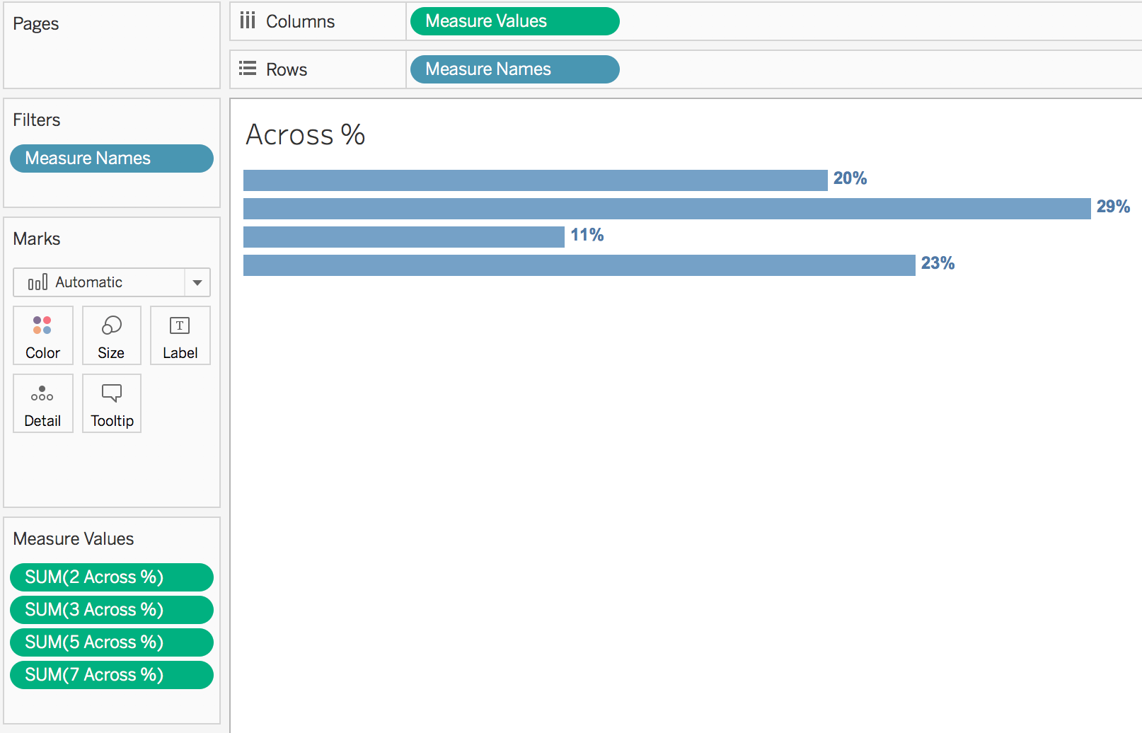
After I had created bars for the across values, I also wanted to create bars for the down values, so I used the same methodology. However, I fixed the axis on the two graphs so they would be the exact same!
Download my workbook and take a closer look (at your own risk).