The What
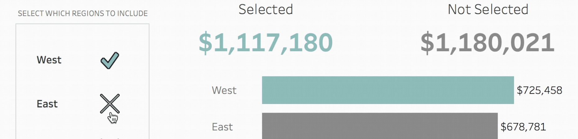
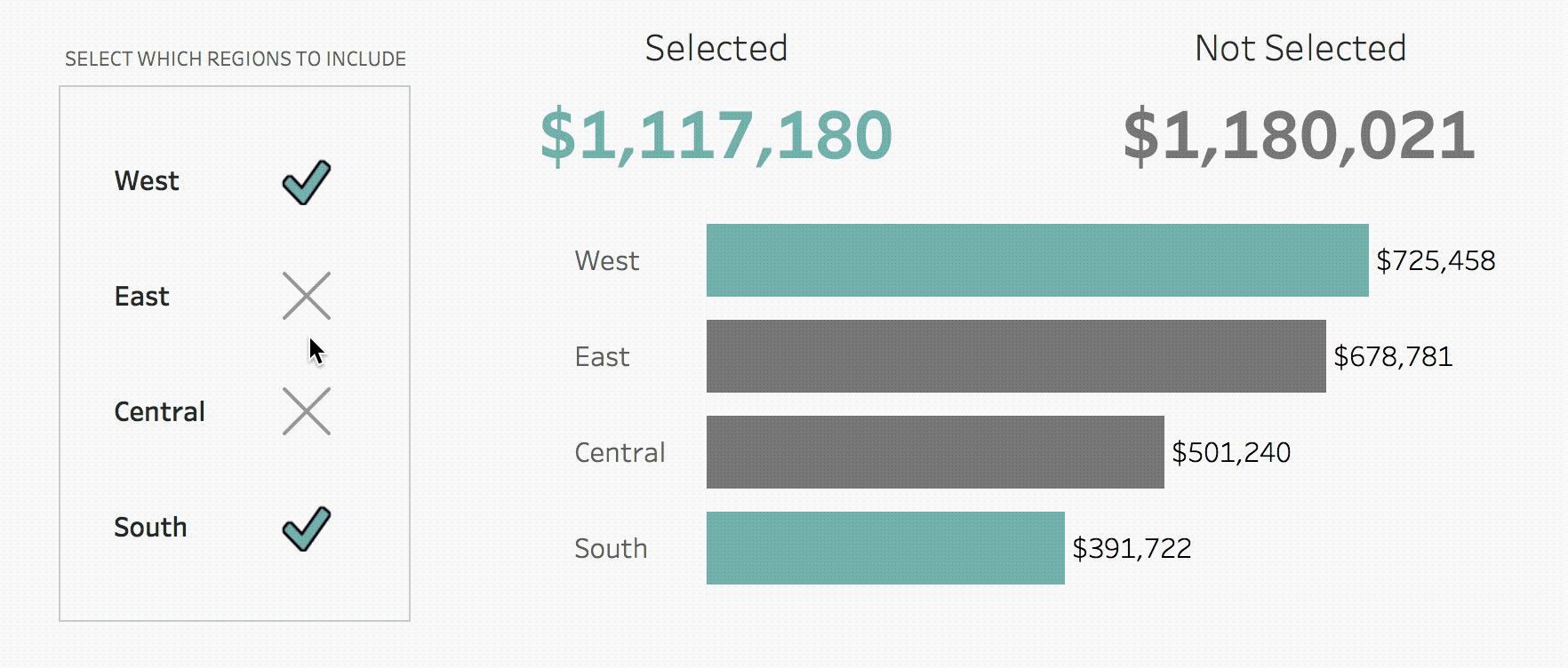
Set actions allow the user to choose what is included and excluded from a set. Through the use of icons/shapes, the user can select what values they want to see as part of the set. Note: this method requires a worksheet (for the icon), a set, and a set action for every value (east, west, central, & south in this example), so it will work best when there are a limited amount of never changing values.
The Inspiration
This exchange on twitter from Ken Flerlage made me curious if I could figure out a way to make selecting multiple items easier than having to hold down a button.
…To do that now, I’d have to ctrl-click (or command click on Mac) or multi select by drawing a box. I think the ability to click and add individually could be very useful and would make user interactions cleaner.
— Ken Flerlage (@flerlagekr) November 12, 2018
The How
- Determine which dimension to use. In this example I am going to choose region. Therefore, I will allow the user to toggle between choosing if the region values of east, west, south, and central should be included or excluded from the set.
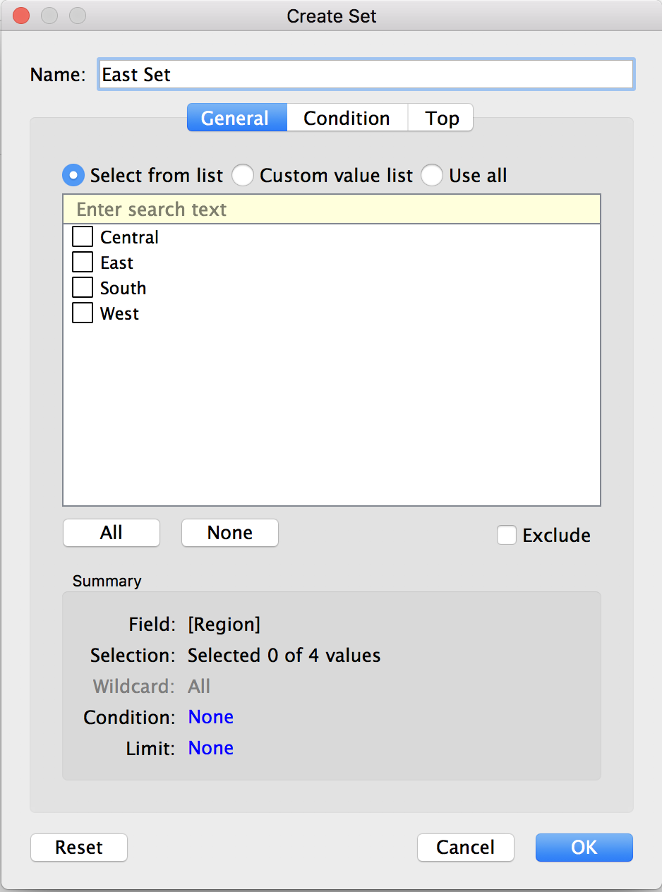
- Create a new set, one for every value of the selected dimension. In this example, I will create four new sets (one for east, west, south, and central).To do this, right click on region from the dimensions pane and select create > set. Name the set [Value Name] Set and do not change any of the other settings.
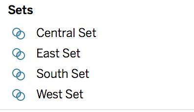
Upon completion, you should have four new sets:
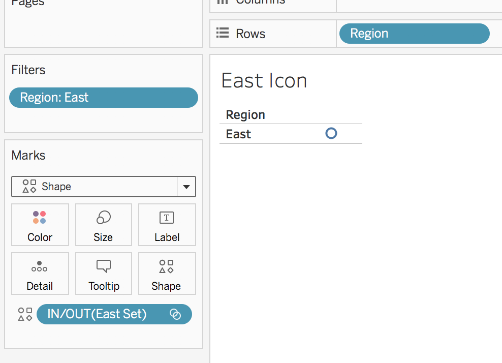
- Create a new worksheet, one for every value of the selected dimension. This will serve as the icon used by the end user to add/remove values from the set. The easiest route is to setup the worksheet for one value and then duplicate it (and swap out the correct values) for the others. To create the needed worksheet for the east region:
- Create a new worksheet called “East Icon”
- Add “Region” to the filters shelf. Select “East”
- Add “Region” to the rows shelf
- Change the mark from automatic to shape
- Add the “East Set” created in the previous step to the shape mark
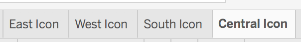
- Duplicate the “East Icon” worksheet three times, once for south, central, and west. Then update the filter to the correct region and place the correct set on the shapes mark.
- Create a new dashboard. Add the four icon worksheets into a vertical container (if desired). Remove the title, hide field labels for rows (the word “region”), and fit to the entire view. Keep the legends for now (but will delete later!).
- Add four new set actions, one for every value.This can be done by going to dashboard > actions > add action > change set values. Name the set [Value] Set Action. Run action on select of the corresponding icon worksheet. Change the target set to the datasource, as well as the corresponding set. Clearing the selection will remove all values from the set.
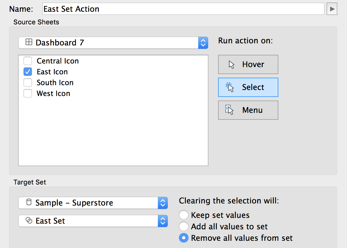
You should end up with four new set actions:

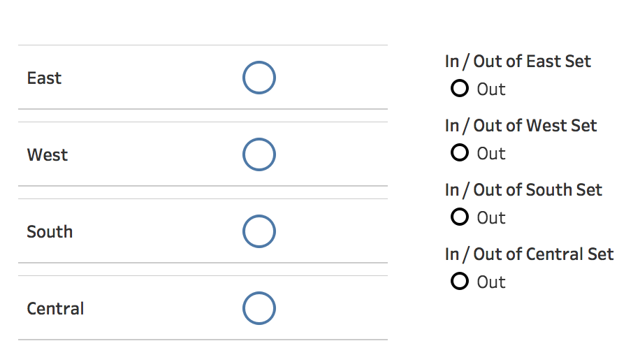
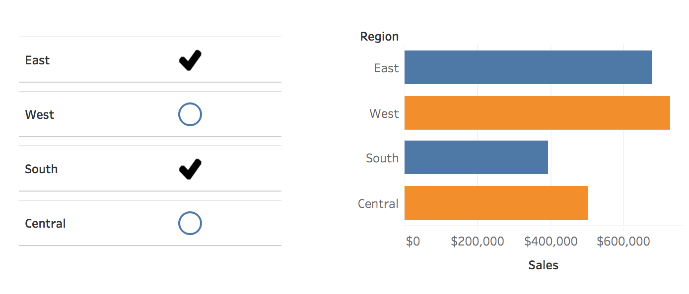
- Test it out! Click on any of the icons on the dashboard. The icon shape should update, as well as the legend.
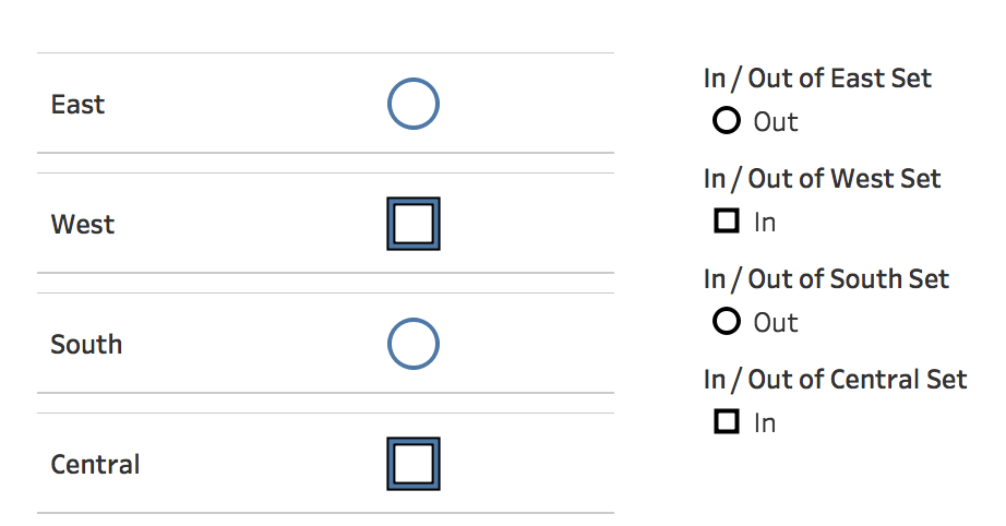
- Update the “In” shape of each set to be something more meaningful, such as a checkmark. Leave the “out” shape as a circle or update to your preference. Then delete the legends from the dashboard.
- Now it’s time to write a calculation that will allow us to know what is “In” and what is “Out”. This calculation can then be used as a filter, on the colors shelf, rows shelf or anywhere else! Create a new calculated field called “In/Out”. This field will return “True” when a value is selected and “False” when it is not selected.
[East Set] OR [West Set] OR [South Set] OR [Central Set]
- Create a new worksheet. Add “Region” to the rows shelf, “Sales” to the columns shelf, and “In/Out” to the color mark.
- Add this worksheet to the dashboard and test it out!
- That’s it! Clean up the formatting, add labels/instructions, and any additional worksheets that make use of the “In/Out” calculation
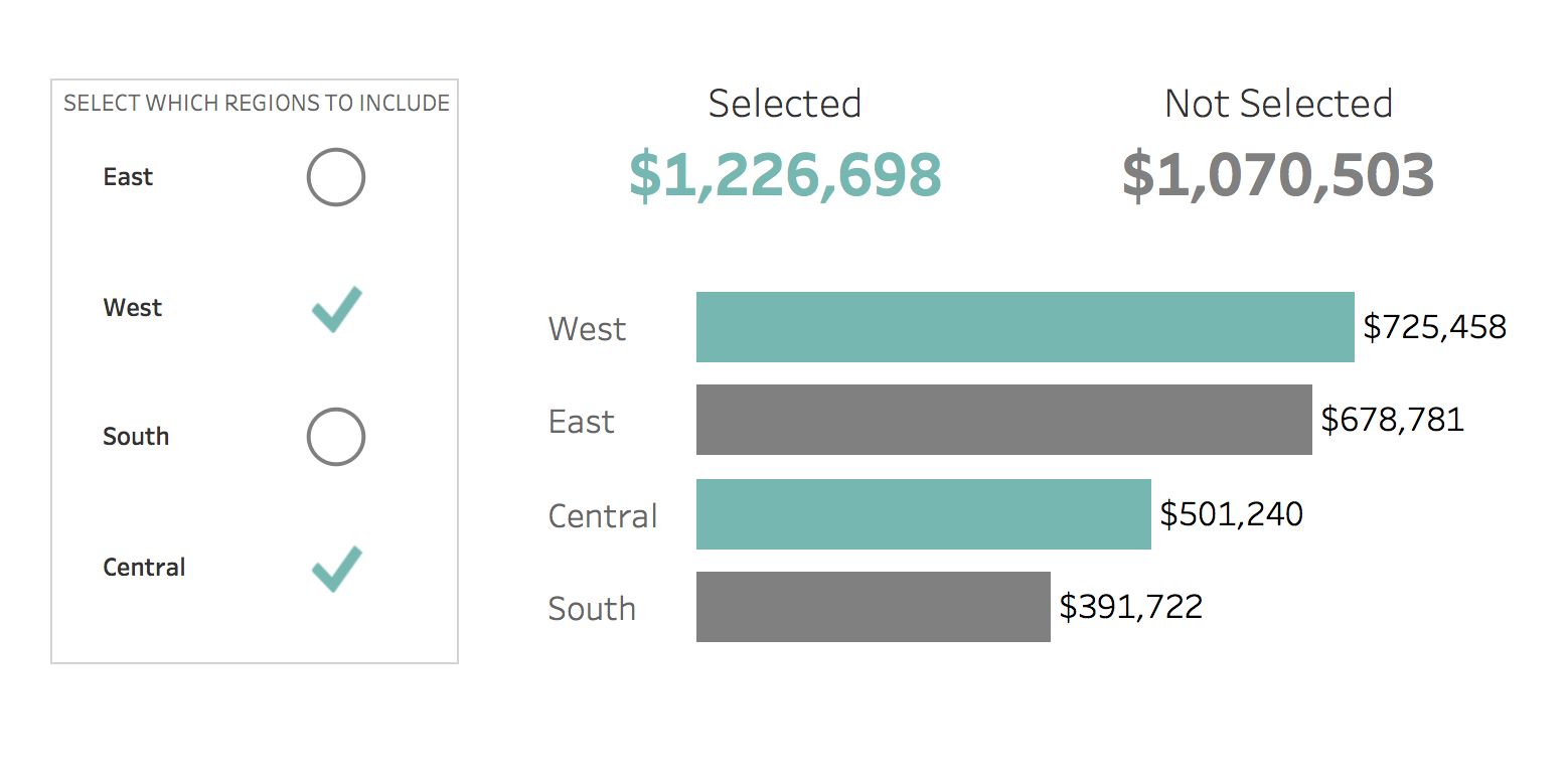
To view my working example on Tableau Public or to download my workbook, click here. Also, check out the other dashboards in the workbook detailing different ways use set actions. To view this method applied to NBA data, click here.