The What
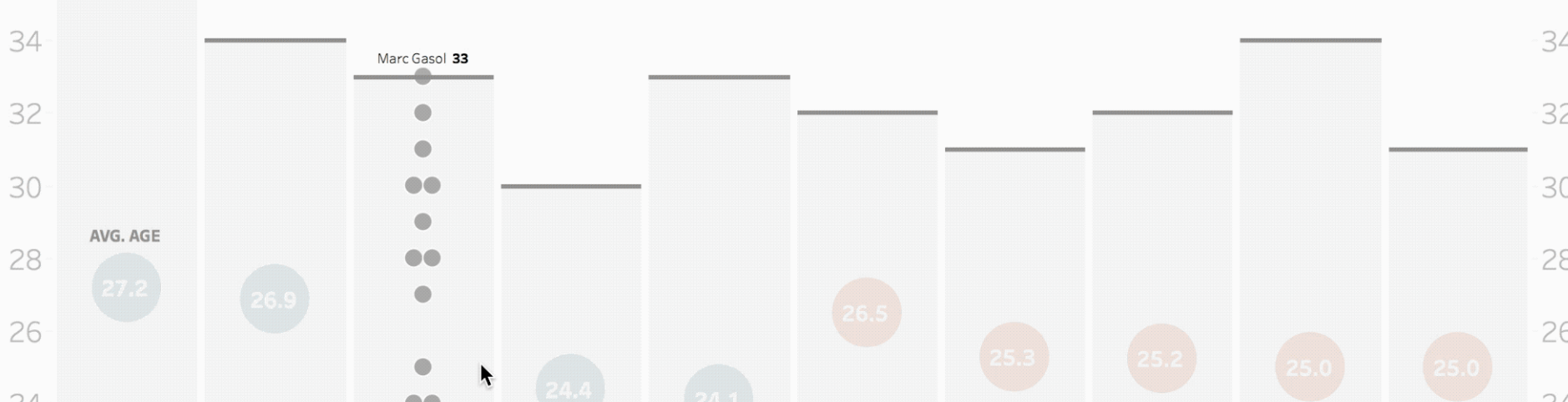
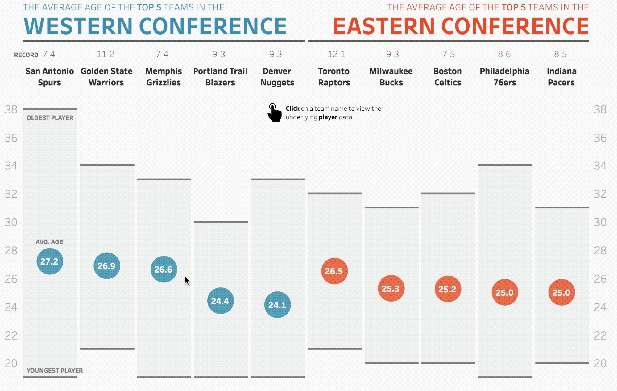
Set Actions can be used to allow for the ability to toggle between showing and hiding underlying data. Often times when showing a distribution or box plot, it makes the visual less cluttered to not be able to see the underlying points. However, it can be helpful to view the underlying data to better understand the shape of the data and if there are any outliers. Set actions allow for the ability to default to an overall summary view but have the option to view the underlying data. In the following example, I look at the age of every player on the top 10 NBA teams. I start with showing the average age as well as the minimum (youngest) and maximum (oldest). Clicking on the average circle or a team name will then show the underlying points.
The How
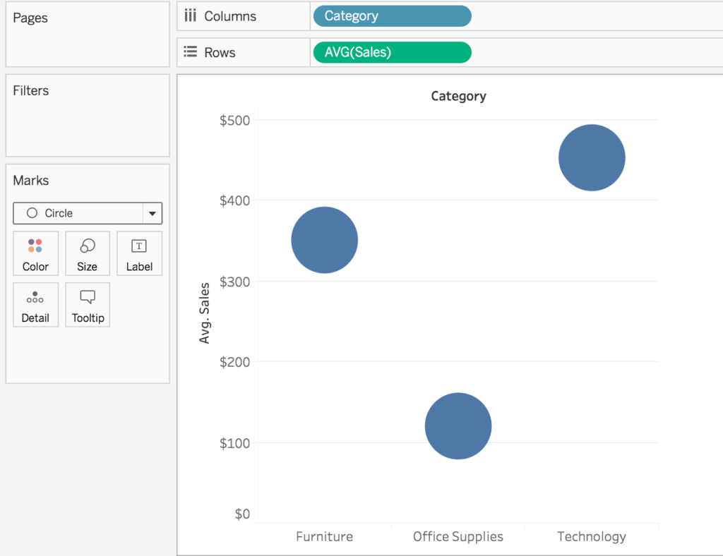
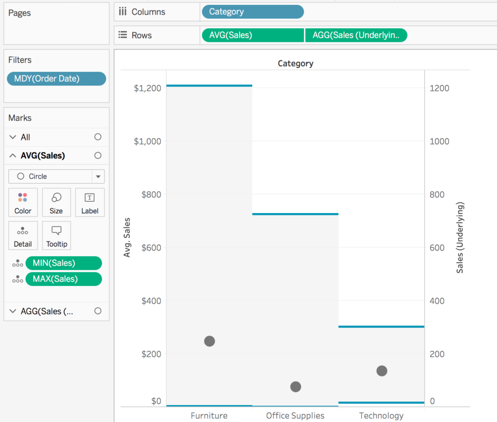
- Create a worksheet that includes one dimension and one measure (with an aggregation of average or median) with a mark type of circle. For this example, I am choosing category and AVG(sales) using Sample Superstore data.
- Create a set using the dimension added to the columns shelf. This can be done by right clicking on the dimension on the dimension shelf and clicking create > set. Name the set something meaningful (“Category Set (for underlying data)”). Click OK and leave the rest of the settings as is.
- Create a new calculation called “Sales (Underlying)” using the set created in step 2 and the measure selected in step 1.
//AVG(if [Set] then [Measure] END)

AVG(if [Category Set (for underlying data)] then [Sales] END)
- Add the calculation created in step 3 to the rows shelf
- Open up the set created in step 3 and select any value (find the set in the sets shelf and right click > edit set). This will help us see what we are doing!
- Click on the “Sales (Underlying)” pill on the rows shelf to bring up the corresponding marks card. Add the desired level of detail to the detail mark. In this example, I am adding “Order ID” and “Product” to the detail shelf. This will allow me to go have a mark on the view for every single row of the data set.
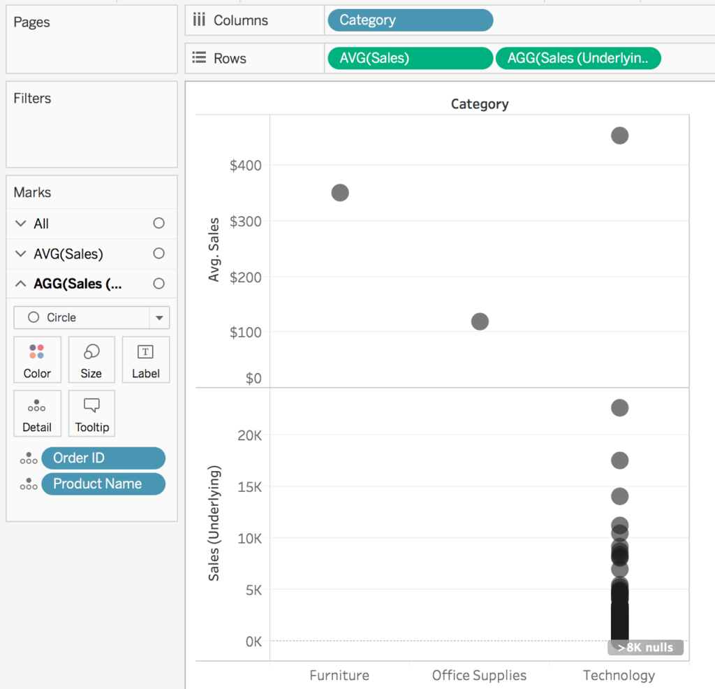
- Right click on the “Sales (Underlying)” pill on the rows shelf and select “Dual Axis”. Synchronize the axis. Right click on the null indicator (>8K nulls) and select “hide indicator”. Remove “Measure Names” from the color shelf and choose a color for overall sales and the underlying sales.
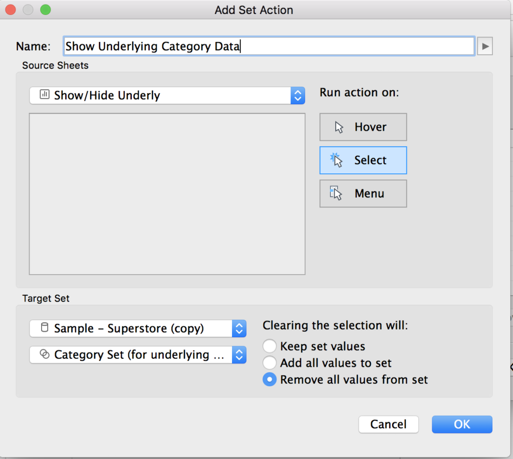
- Go to worksheet (or dashboard) > actions > add action > change set values. Create a new set action for the set created in step 2.
- In order to simplify the view, I added a filter on “Order Date” and only included the last 3 days of 2018.
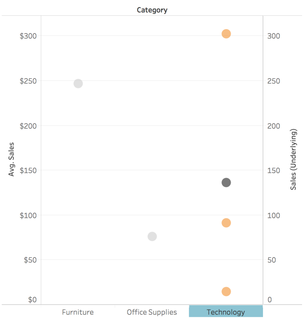
- Test it out! Click on a category circle or the category title on the axis to see the data show/hide.
- Add MIN(Sales) and MAX(Sales) to the detail shelf of the AVG(Sales) pill. Then from the analytics pane, drag “reference band” to the intersection of AVG(Sales) and Cell
- Select the band from and band to values to be the MIN(Sales) and MAX(Sales) and change the formatting to your desired look
- Add thick white column dividers on the formatting pane in order to create separation between the different columns
Further Tips
- Write a calculation to make the AVG(Sales) mark disappear when clicking on it and viewing the underlying data. This can be done by a calculation that replaces AVG(Sales) on the rows shelf:
AVG(if [Category Set (for underlying data)] then null else [Sales] END)
- Right click on the average sales circle on the dimension on the far left and select annotate > mark. Add three new annotations (all on the average sales mark) to serve as labels for the MIN, MAX, AVG
- If you have a lot of overlapping circles, try jittering your plot.
To view my working example on Tableau Public or to download my workbook, click here. Also, check out the other dashboards in the workbook detailing different ways use set actions. To view this method applied to player age in the NBA, click here.