In my 2019 Tableau Iron Viz entry, I wanted the end user to be able to select a brand to understand its particular location strategy.
I also wanted the ability to compare the selected brand to its rivals. The best way to achieve this was through using a parameter. However, the dataset included 922 unique brand names. If I set the parameter to list and then added all the brand names, they would have appeared in alphabetical order. It would have taken a lot of work to go from Starbucks to Dunkin’ Donuts. Additionally, how would the end user know where to start, other than looking for values they were familiar with? My second option was to limit the dataset to a select 10-20 brands I wanted to include and type them in manually to the parameter. However, I was striving for creating a real world dashboard or application that could be utilized by any brand, not just the biggest or more well known brands.
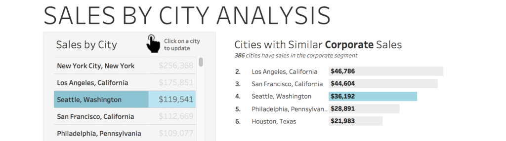
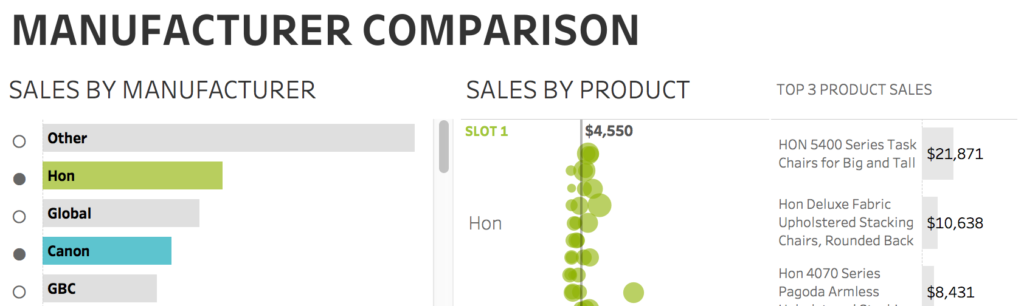
I decided that I would create a visualization that showed brand name sorted by the # of locations. I would then have the user select the brand they wanted to highlight and an action would pass that value to the parameter. I had done something similar (including choosing similar values based upon what was selected) in a visualization I created previously.
I had also built a dashboard that utilized a closed and open circle (using unicode characters) to demonstrate what was selected, so I knew I wanted to use that again to mimic radio buttons, and add a sense of familiarity to the audience.
I couldn’t find a way that I thought provided enough value to keep the bar chart selection visible at all times (and was worth the real estate since I was working in the confines of not having a scroll bar on the big screen). Thankfully, Tableau now allows you to show and hide containers when a user clicks on a button (that doesn’t require any hacks or calculations!). I decided this was the best route to go. I then realized this also allowed me to fully customize and design how the dropdown would operate, which made me really excited (because, if you are new to my blog, I love finding ways to create new user experiences in Tableau).
So, without further ado, here is how to make a custom dropdown in Tableau:
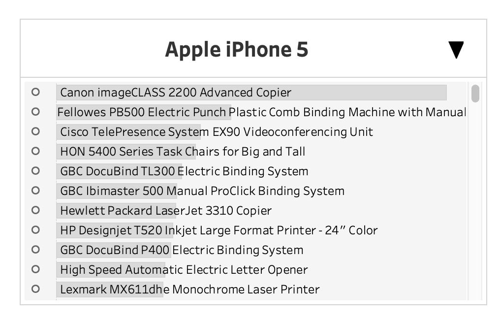
1. Create the visualization that will serve as what the user clicks on. Using sample superstore data, I am going to put sales on the columns shelf and product on the rows shelf to create a bar chart.
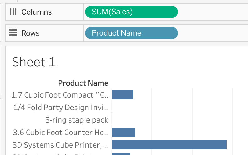
2. Sort product name by SUM(SALES) by clicking on the product name pill on the rows shelf and selecting sort. Change the sort to a field, descending, with the field set to sales
3. Format the worksheet to desired preference. I am going to add product name to the label mark and left align it. Then, uncheck show header on both the sales and product pills. Change the background to light grey with a slightly darker grey as the bar and remove the column grid lines.
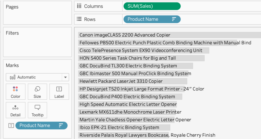
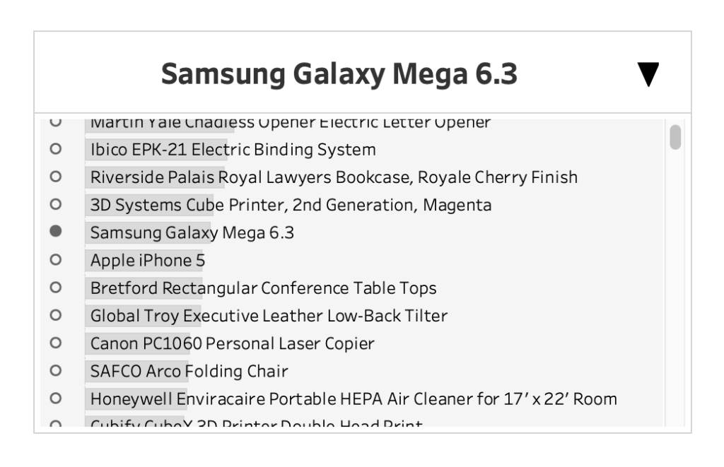
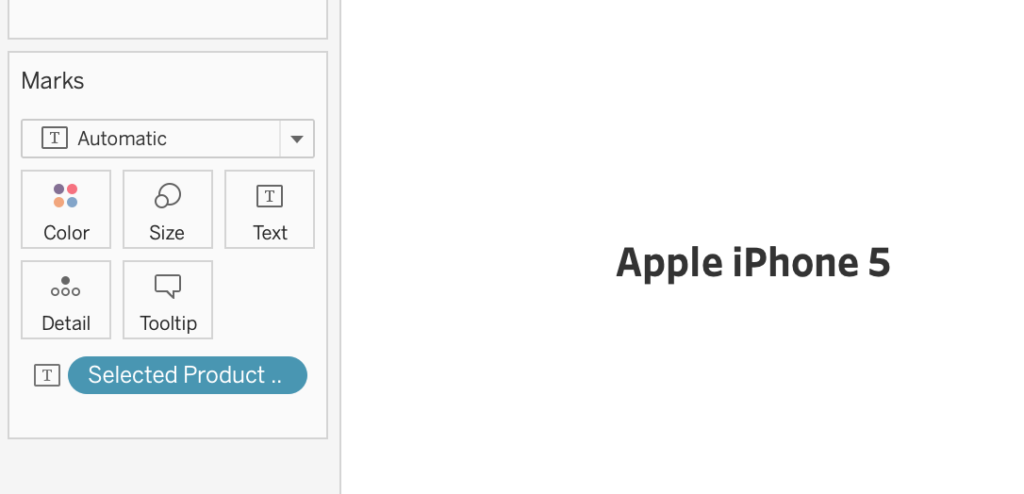
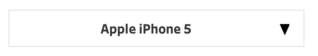
4. Create a parameter called Selected Product. Set the data type to string. Change the current type to any value in the data – I am choosing Apple iPhone 5. Keep the allowable values at all
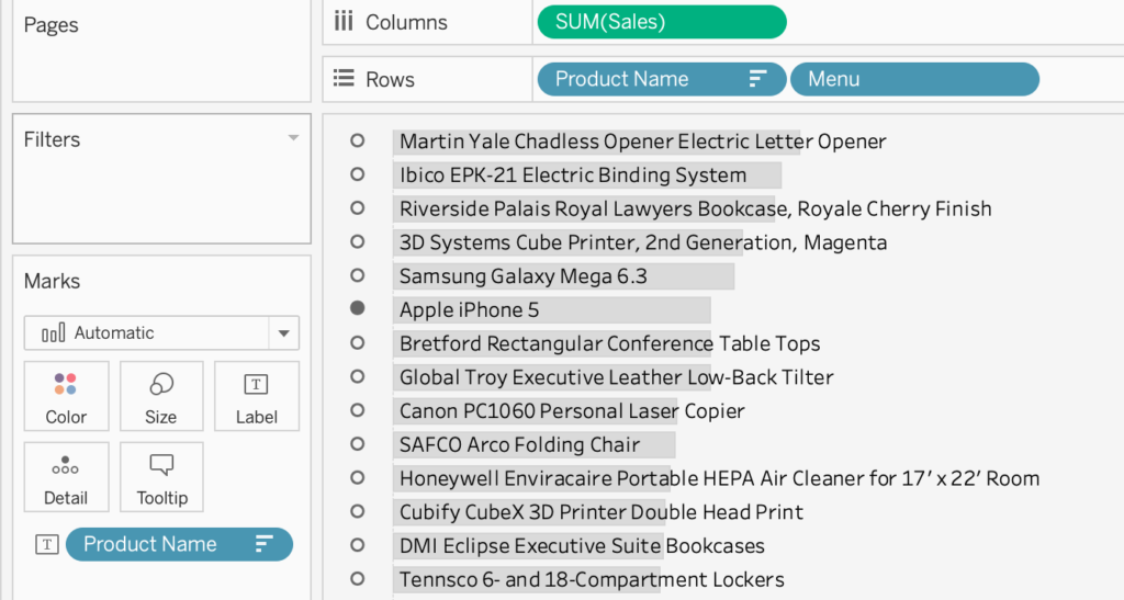
5. Create a new calculation called “Menu”. This will serve as the fake radio button and is created by using unicode characters for a closed and open circle
if [Product Name]=[Selected Product] then “•” else “◦” end
6. Add [Menu] to the rows shelf after product name. Format the circles to be bigger (I did size 20, bold, Arial font). Resize the width of the menu column so that it is closer to the bar. Then remove the row and column dividers. Lastly, click on where it says menu right above the circles and hide field labels for row.
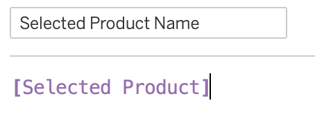
7. Create a new calculation called “Selected Product Name”. The calculation should only be the name of the parameter created in step 4.
8. Create a new worksheet. Add the calculation created in step 7 to the text mark. Format the text to the desired design – this is what the user will see as what is selected. I chose size 16, bold, center aligned.
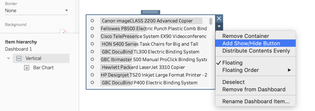
9. Create a new dashboard. Add a vertical container and then put the bar chart menu visualization into it and hide the title.
10. Click on the container in the item hierarchy. Then select add show/hide button.
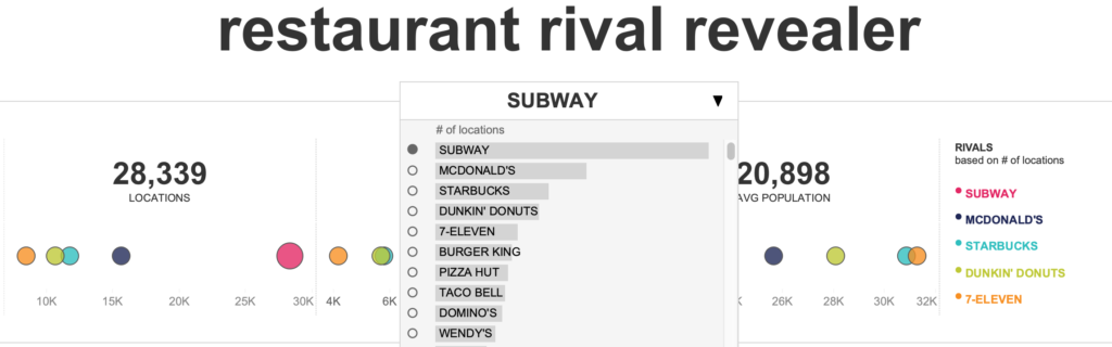
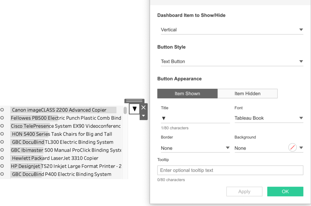
11. Click on the button and select edit button. Change the button to your desired style. I chose to change it from an image button to a text button. For both item shown and item hidden, I chose a triangle unicode, ▼. To test the show/hide button, you must be in presentation mode.
12. Add the second worksheet with the name of the selected product. Now it is time to build what the user sees when the dropdown is collapsed.
13. Add a text box. Change the border to light grey and place it around the selected brand name. Make sure to leave a little bit of space for the show/hide button.
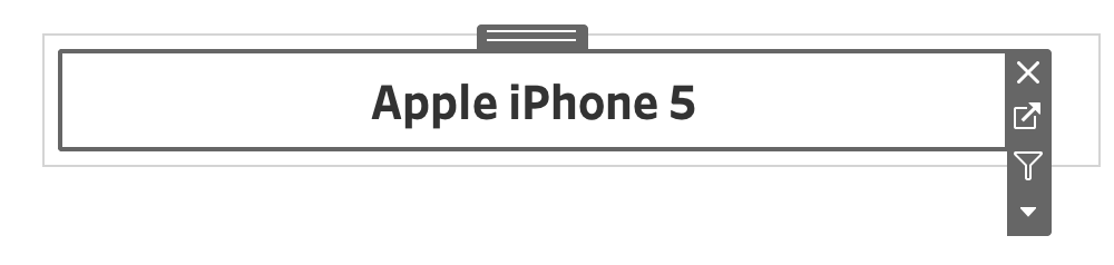
14. Move the show/hide button into the space next to the selected brand work sheet (and make sure it is floating in front of the border/text)
15. Move the container the bar chart worksheet is in so that it aligns exactly with the width of the border. Additionally, add a border around the container. Be sure the container is floating on top of any worksheets in the dashboard.
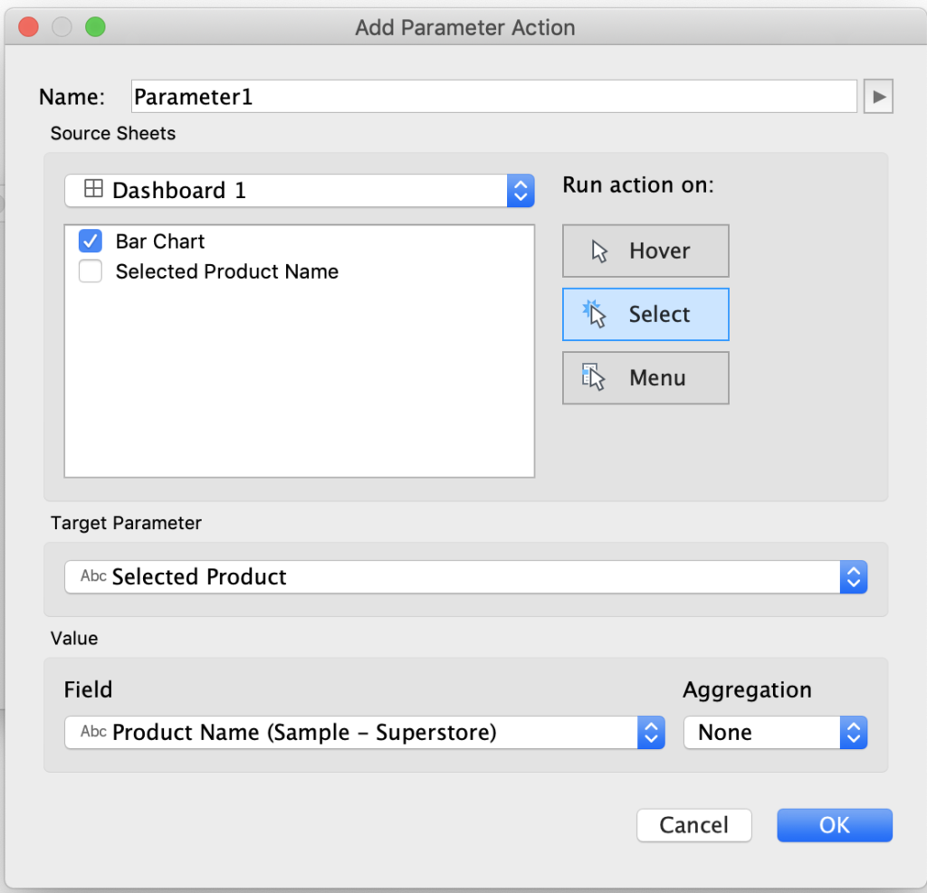
16. The last step is to add the parameter action to make it all work! Go to dashboard > actions > add action > change parameter. Select the worksheet with the bar chart visual as the source of the value that will change the parameter. The target parameter is what we want to update, which is the parameter created for the selected product. The field we want to send to the parameter is the product name.
Done!